


How to design a user Interface in Photoshop with an example + video
Photoshop is great for turning your work from an idea into a final product, which is why it is chosen by many industry experts.
You can set up a consistent workflow for almost any scenario, be it photography, graphic design, web design or mobile application design.
In this tutorial, we will explain the process of creating a user interface in Photoshop.
Instructional video
If the video above does not help, continue reading:
Notes
Set items
Creating the foundation of a program really depends on where it is to be used. If it is supposed to be a desktop application, you will choose a different size and resolution than an iPod or iPad application.
In this example we are going to create an app for iPad.
Know the dimensions
If you design your iPad app and it does not display properly, it will not work well for anyone. Content will be deleted or the user will not be able to make the correct selection. When creating an application for any particular device, it is best to always be aware of its dimensions.
You can usually find technical specifications on the manufacturer’s website or in the documentation. The iPad measures 1024 x 768 in landscape mode and 768 x 1024 in portrait mode.
Consider the content
The design of your program also depends on its content. You can not create a plan that is a final solution for every situation, so it is a good idea to consider the easiest way to prepare your content and adjust your structure based on this idea.
Keep the app simple
We may have heard this millions of times, but it is very true in app design. You should consider the user experience as low as possible. Adjust the program visually so that any user – experienced or novice – can do their job through it.
Consider competition
It does not mean abusing the work of others, but an opportunity to see what has been done so far, so you can add things to the program to make it unique. You pay attention to the main features of competing programs as well as what does not exist in them. You can learn good things.
Consider the natural flow of elements
When creating an interface in the United States, we know what we are doing. We have a visual understanding of where certain elements should be. However, when designing for other countries, things may not be so intuitive. For example, Arab countries read from right to left, which is the opposite of the United States. When creating an app for English users, we usually read from left to right, so key elements like navigation should start from the left and work in a stream from left to right. You also have to move from top to bottom, because this is the most intuitive flow you can follow when reading content. For example, think of it as reading a book.
Consider how the platform works
Most mobile devices today are designed to work in both landscape and portrait mode. The iPad is no exception. You need to consider this when designing the user interface for your application. Do you want to design your application only for portrait mode? If your goal is for your app to respond to the rotation of the device to fill the screen horizontally, then you need to consider both directions.
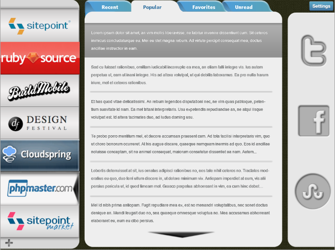
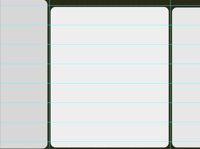
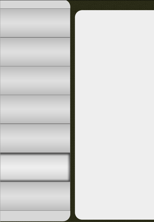
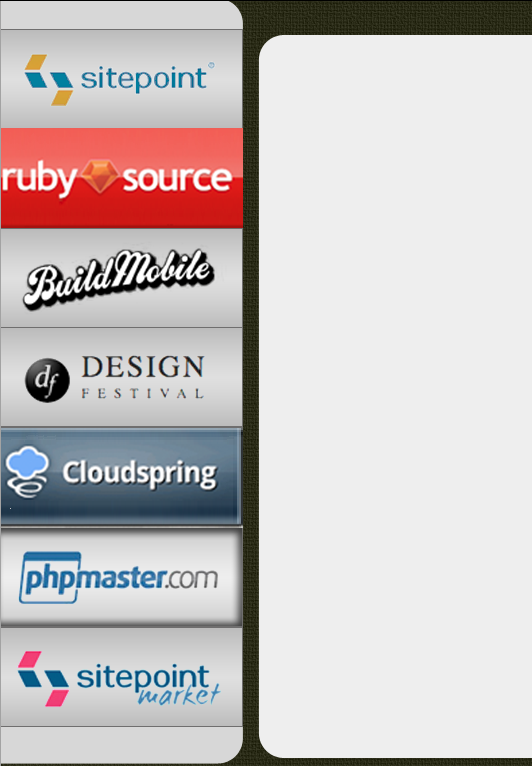
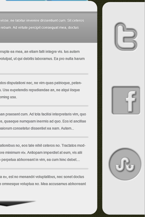
Step 1: Divide the canvas
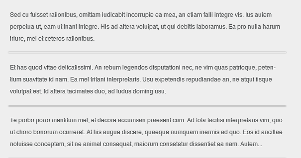
Our sample project will be a program that takes the umbrella site and integrates all of its subdomains and articles in one place. The goal of this program is to be able to read several different site articles in a single program without having to jump from one site to another. Our first step is to divide the canvas into main areas for our content. For site navigation we will need a vertical area and a horizontal area for sub-navigation. We will also need an area to preview the actual article, and the last area will be to tweet the article or share it on Facebook or StumbleUpon.
Step 2: Add texture for visual impact
When designing any kind of user interface, it is better to have visual contrast. We already know that most of our programs will be smooth, shiny and possibly sleek. Adding a little rough texture to the background area can add a good visual effect to the background without distracting the viewer. We added a tan with a texture pattern. The main thing is finesse, so we reduced the opacity to 30% and the scale to 25%.
Step 3: Block in your main area and adjust according to taste
A good idea – even if you have done the initial designs – is to build blocks in the main area with different colors. This way, you can get a visual preview of the overall look. This is a stage where you can play with the width of each column and make sure there is enough space for the logo in the left column, enough space for the content in the middle and enough space for the icons in the right column.
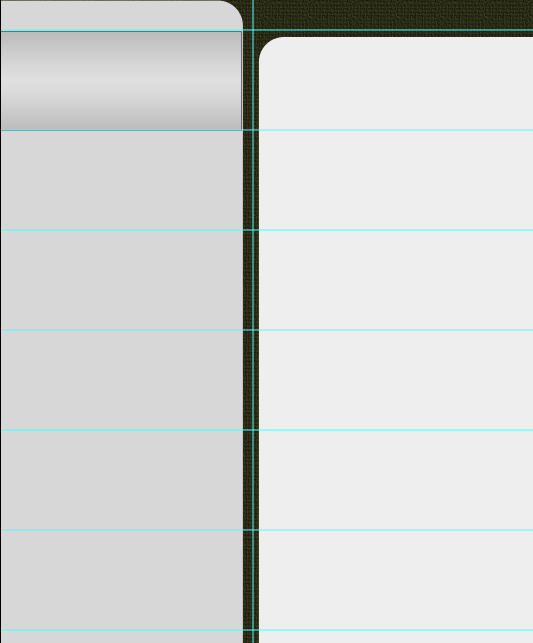
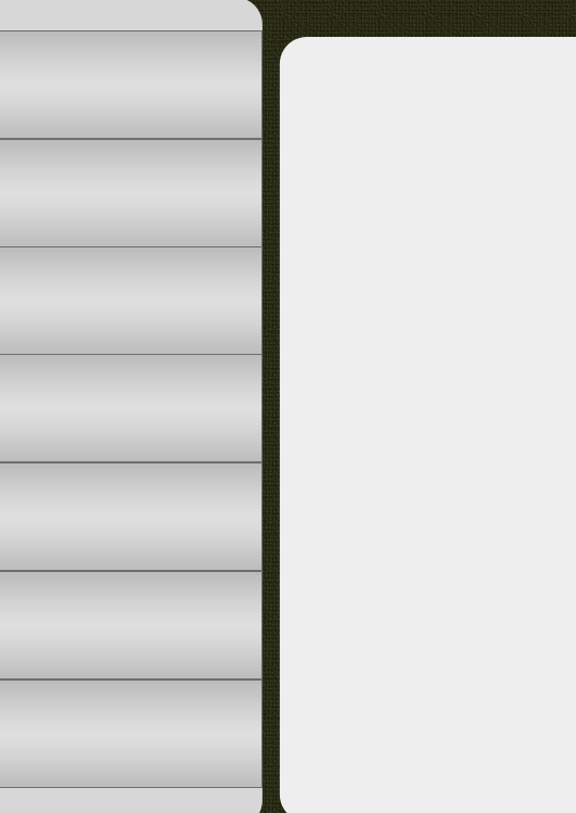
Step 4: Create a framework for your icons
We are going to do mathematical calculations to create a vertical menu on the left. It may sound daunting, but we can help you analyze it. This example has seven different icons, so we need to know how much space we need to be able to put them evenly together and put the extra space up and down. One of the reasons we want to leave about 50 to 75 pixels of free space at the top and bottom is to leave space for submenus, other menu buttons such as highlights, options and settings, and anything else that might be in Let’s integrate it.
Such as social media integration, account details and more. In this example, the height is 768 pixels, so we need to reduce at least 100 pixels for our menu bar at the top and bottom. The value of 668 pixels of space remains and we will divide that number by 7. The resolution is approximately 95 ۲ 42 pixels. If you want the right buttons for each site to fill the space vertically, then each button is approximately 95 pixels long. Keep in mind that you do not need to fill the space vertically. You can expand the space later.
Step 5: Draw the guidelines
We like to use rulers to adjust everything and pixels instead of inches. To change the ruler measurement, right-click on the ruler and change the inch to pixel. You can draw your top guidelines to make room for the menu we mentioned earlier.
Step 6: Use a pattern rectangle to save time
We know from the calculations that each nav button on the left should be 95 pixels high, so we can now use the marquee tool and guide lines to create a pattern rectangle and easily copy and paste it. To specify the exact size of the marquee tool, go to the menu bar at the top of the page and change the normal setting to fixed size.
You will then see the width and height options activated, so you can enter dimensions. Fill the selection with the color you want as the background. Be sure to choose a color that matches each of the symbols, or decide to use plain text as the name for each menu.
Step 7: Copy and Arrange
Copy your rectangle layer and paste them on top of each other to arrange the 7 rectangles vertically.
Step 8: Don’t forget to organize your layers
When you create your user interface, eventually Photoshop files become very large and difficult to work with. Fortunately, Photoshop has the ability to organize layers by grouping them. You can select all the sections of your work that contain countless layers and group them into one folder. Simply select the layers you want to group in a group and go to “Layer”> “New”> “Group From Layers”. You can even name a group for easy access to content. You will love this feature when you want to work on deep details. One part of our model consists of 75 layers.
Step 9: Add some dimensions
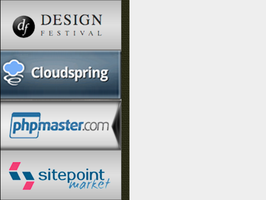
We need a way to visually show that the user is inside the app. A user needs to know which program it is in. Indicators do not have to be large and prominent. They can be subtle, simple and noticeable. In our program, the normal mode for the left menu is a slight gradient. For when the mouse is placed on the menu or an item is selected, we created a shape that was against our gradient. We added inner shadow and highlighted the middle area to make it brighter.
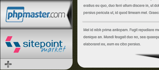
Step 10: Add logos or create a static text menu
If you add Lego, you can add several different file types. You can import Illustrator vector files and you can import them as smart objects. Open the Illustrator file, select Lego, copy your selection, and return to Photoshop. Then go to “Edit”> “Paste”, you can paste it as different options, but usually we choose “Paste as a smart object”. This makes the files clear, clean and editable. Do the same for your other logo.
You can also use clear PNG files. They have no background and are usually of good quality in terms of resolution and color. Try not to use low-resolution files such as GIFs or bitmaps, as they may cause problems. If you have space, place them in the center sidebar on the left, you can also shift them slightly to the left because you have to leave space for the navigation arrow, which we have to show which site article is selected, We will use.
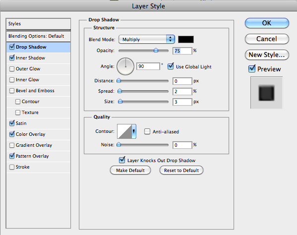
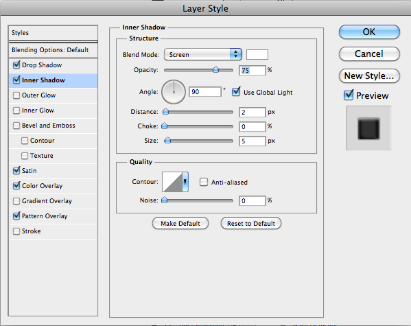
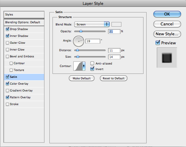
To create an arrow, select the custom shape tool and select the triangle. Size and shape do not matter, because we can manipulate them through the anchor points. Adjust it to the size and shape of the area where it is located. Now add a layer style to give it dimensions.Drop shadow, white inner shadow and a layer of satin style to make the arrow shine.
As you can see, with the built-in shadow on the button and arrow, it will not be difficult for the user to know which program is inside.
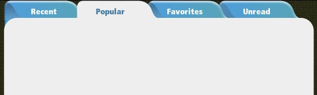
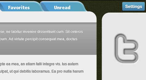
Step 11: Top navigation
Instead of using the fixed buttons above, try to create a tabbed menu to enhance the look of the site. This changes your design and is a great way to let users know where they are because the tab is highlighted in dimension.
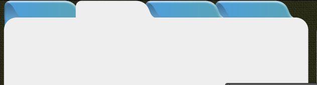
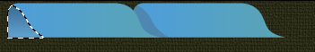
To create any tab or tab, start by selecting the Rounded Rectangle Shape tool. Use the Pen and Selection tools to create the rounded shape shown in the image below. Copy and paste the shapes to create the required and adjacent tabs.
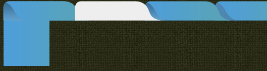
We whiten one because it acts as an active fever. To create a shadow on the left, hold down the ctrl key and click on the layer icon to select a tab shape. Create a new layer and fill it with a darker blue. Use the arrow keys to move the dark blue tab until it lands on the main tab.
You can paste the dark blue shadow tab into the bottom tab layer, or you can press ctrl to load the regular tab as a selection. Then select the dark blue tab layer and click on “ctrl + shift + I” to reverse and select the extra and only the shadow part remains.
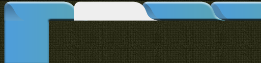
The tab on the left is displayed, so we need to add a section to the blue tab to match the appearance of the content area. Using the Marquee tool, draw a box large enough to fill the area of the left-hand corner that shows the white circle. Merge this layer with the lowest tab. Add some style to any tab by adding a slim, prominent layer style.
Add a smooth inner bevel of 5 pixels to round each corner tab. To save time, right-click on layer style, select Copy, then right-click on any of the other layers of the Blue tab and select “Paste layer style”. This will prevent you from reusing each separate layer style.
Step Twelve: Content Area
Each article will be very light gray by default, but will change to a darker gray when you select it. Create a rounded corner rectangle that expands the empty space into which your content is transferred. Be sure to match the white fever.
Step 13: Text the headers
Use the Text tool and select the bold sans serif font to use for the text in the tabs. sans-serif shows the best and it is usually a good idea to choose bold letters. Good fonts are usually Verdana, Arial or Helvetica. Place them visually in the center of each letterhead.
Step Fourteen: Excerpts from the text
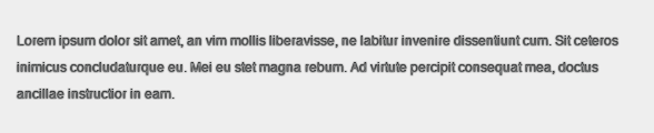
Draw the text area using the Text tool. You can simply click and drag to create the box you want for the text area. Here, we used plain text because this is just a test. You can find this type of text on any lorem ipsum production site.
We knew we wanted to show almost three lines of text and the user had to double-click on the excerpt to be able to read the whole article.
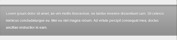
We created a bolder version to show that the user has selected an article. When an article was selected, we created a dark rectangle and white text to eliminate any doubts about which article to choose. We added an internal layer style to add to the selected version later.
Step 15: Content Separation
When there is a lot of text, the user should be able to specify where the summary ends and another begins. To make this easier, it is a good idea to use horizontal or vertical rules. To create a rule in the example, we used the Pen tool and drew a horizontal line from left to right where the text starts and ends so that it is aligned with each edge.
Select a 1 pixel hard edge brush and in the Paths panel, click on the second icon labeled “Stroke path with brush”. It does not matter what color you choose, because in the Layers Panel, we set the fill to 0. and added a slight drop shadow.
Be sure to set the distance to 0 to get a uniform shadow. Press ctrl + J ”” to copy the layer as many times as needed to split each selection.
Step 16: Inform the user about more content
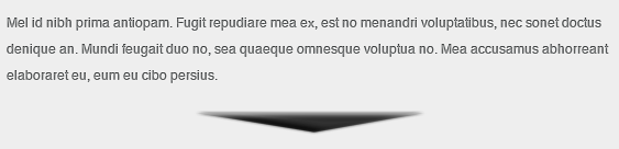
Select the custom shape tool and create an inverted triangle. Fill it with your favorite color and add a small, thin layer style highlight. Put it at the end of the last excerpt to indicate there is more content.
Step 17: Add a social network
You can create your own social media buttons or you can download them for free from the internet. There are literally hundreds of free Facebook and Twitter icons that you can download for free. The trick is to look for items that are made with a shape or path or items that are made in illustrator. You can enter them as a path and it will give you clean and clear symbols.
In this example, we wanted to have a quick look, so we used shapes with the right negative space to make the inner edges positive.
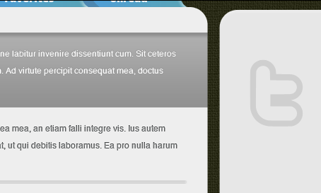
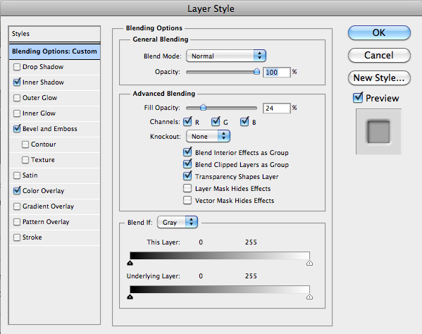
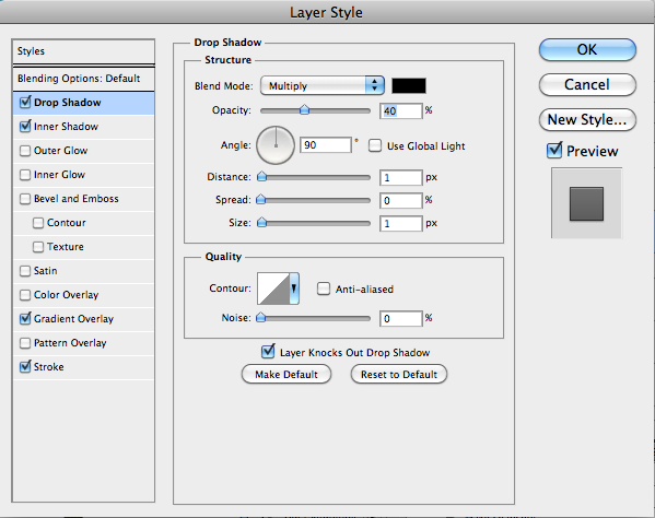
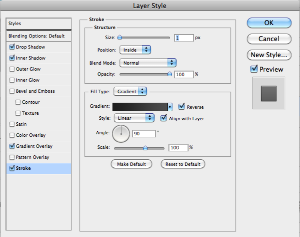
Enter your shape and double-click on the layer to display layer styles. Select inner shadow and set the distance to 1 pixel and the size to 5 pixels. Select Bevel, Emboss, and Ovel Bevel. Scroll down and set the size to 5 pixels. Then select Color Overlay and select black and you should have a little Twitter icon attached.
Enter your other icons and copy layer styles from the Twitter icon and paste them onto other social media icons. Place them evenly apart and in the center of the right column.
Step 18: Add a button for Settings / Options
Let’s use the Rounded Rectangle Shape tool to create a settings button in the upper right corner of our application. Sample the same water you used on the tabs before to make them uniform. Add a slight drop shadow with distance and size of one pixel in each case. Then set the Opacity to 40%.
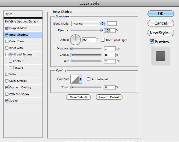
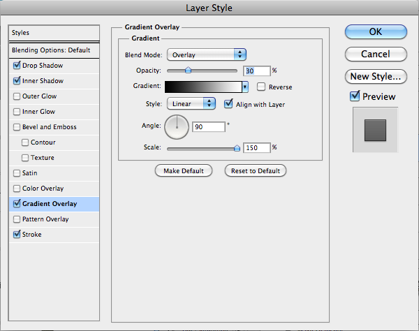
Add inner shadow but whiten it and set the blend mode to “normal”. Set the distance to one pixel and the size to two pixels. Add a partial gradient coating, with 30% opacity to add dimensions. Add a small stroke of one pixel and set the type to gradient and change the gradient from gray to charcoal.
Copy one of the text layers to the tab and reduce the size to fit the button you created. drop shadow Add a pixel to your layer styles.
Step 19: Add a button to add sites
We want to add a button so we can add sites to our reading list. To do this, just drag a thin rectangle, copy the layer and press “ctrl + T” to change the second rectangle. When rotating, hold the shift to rotate it 45 degrees to make it horizontal. Press “Ctrl + E” to merge two rectangles into one plus sign.
Then copy the compressed layer style from one of the social media icons we used before. The effect is very strong at first, so we want to reduce the size in bevel and emboss to two pixels. This scales the effect with a smaller symbol.
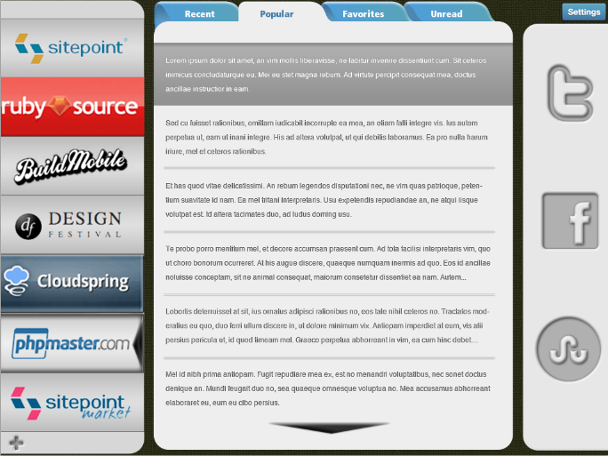
Result
By applying the techniques we have provided in this tutorial, you can quickly and efficiently create a model of your program. Adding subtle textures, gradient layers, and repetitive elements creates an interface that enhances usage because it’s visually appealing and simple. Save time by copying and pasting layer style on the same elements and remember to allocate space to each section. The final result is shown below: