What Is Responsive Design & Why It’s Crucial for SEO & User Experience
In the digital era, a responsive website is not a competitive edge—it is a fundamental requirement. The rise of smartphones, tablets, foldable devices, and varying screen dimensions means that the modern user expects seamless experiences across all platforms. Websites that fail to adapt to these expectations risk losing traffic, credibility, and revenue. Responsive web design (RWD) addresses this need by allowing a single website to automatically adjust and optimize itself according to the user’s device.
This article explores in depth what responsive web design entails, why it matters more than ever in 2025, the technologies and strategies behind it, its profound influence on SEO, and how it shapes the future of digital presence.
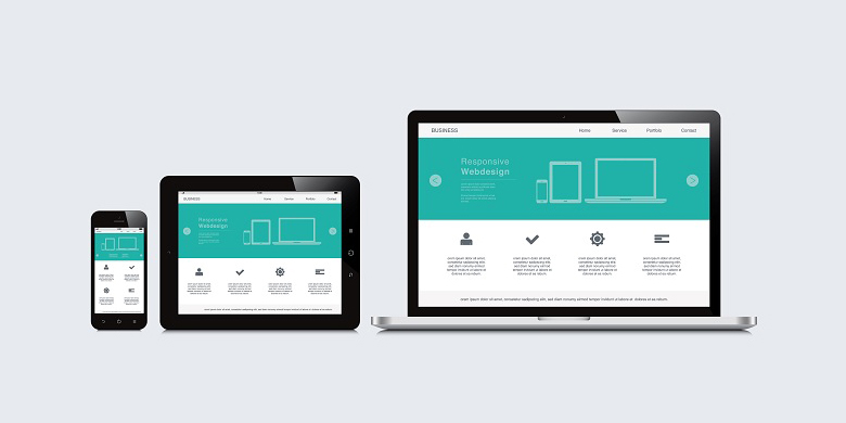
Defining Responsive Web Design
Responsive web design is a methodology that allows a website to alter its structure, layout, and content presentation depending on the screen size, resolution, and orientation of the device accessing it. The goal is to provide a user-friendly and visually coherent experience regardless of whether the user is on a desktop monitor, a laptop, a tablet, or a smartphone. It achieves this by employing a combination of flexible grids, adaptive images, and CSS media queries.
At its core, RWD does not just shrink or expand visuals—it recalibrates them for usability. Menus may collapse into icons, content blocks may stack vertically instead of horizontally, and fonts and buttons may scale for better accessibility. This transformation is not cosmetic but essential for modern web usability.
The Growing Necessity in 2025
In 2025, mobile traffic accounts for an overwhelming majority of global internet usage. With 5G networks and increasingly powerful handheld devices, users now expect websites to behave like native apps: fast, responsive, and intuitive. The rise of foldable screens and multi-device journeys (where users begin a task on one device and complete it on another) only increases the demand for a unified and responsive digital experience.
Ignoring this shift is no longer an option. A non-responsive website not only frustrates users but also suffers in search rankings, leading to diminished visibility and decreased ROI. Brands are increasingly judged by their digital presence, and responsiveness has become a core component of that perception.
Core Principles and Technologies
Responsive web design relies on a few foundational technologies. The first is fluid grids, which use proportional rather than fixed units to allow elements to scale smoothly. These grids form the skeletal framework of responsive layouts. CSS media queries then apply different styling rules based on device characteristics, dynamically adjusting the layout to match the screen environment.
Another vital component is flexible images and media. These must resize without distortion or overflow, maintaining visual coherence across varying resolutions. The “mobile-first” approach has also gained traction, emphasizing that design should begin with the smallest screen in mind and scale upward, rather than retrofitting desktop designs for smaller screens.
JavaScript also plays a supporting role in modern responsive design, enhancing interactivity and functionality. Progressive enhancement ensures that websites remain usable even if certain scripts or advanced features fail.
Strategic Benefits for Businesses
A responsive website is not merely a technical upgrade; it’s a business strategy. First, it significantly improves user experience. Visitors are more likely to stay longer, engage more, and return in the future when the interface feels intuitive and the content is easy to consume.
From a cost perspective, responsive design reduces overhead. Instead of maintaining separate sites for desktop and mobile users, a single codebase serves all audiences, streamlining updates, content deployment, and analytics tracking.
It also plays a pivotal role in conversion optimization. Whether the goal is signing up users, selling products, or generating leads, consistent and user-friendly interactions across devices build trust and reduce friction; every second of delay or every misaligned element on a small screen could be the difference between a bounce and a conversion.
SEO and Responsive Design: An Inseparable Pair
Search engines prioritize mobile usability. Google’s mobile-first indexing means the mobile version of your site becomes the primary version in its algorithm. Responsive web design aligns naturally with this policy, ensuring that content is accessible, fast-loading, and semantically structured across all platforms.
Responsive sites also benefit from having a single URL for each piece of content, simplifying search engine crawling and avoiding issues with duplicate content. Link equity is preserved, and backlinks point to one destination regardless of device. Furthermore, improved page load speeds—especially when optimized for mobile—contribute positively to SEO rankings.
User signals such as bounce rate, time on page, and interaction depth are also critical SEO factors, and responsive design directly improves these metrics. When users find it easy to navigate, read, and interact with a site, they are more likely to stay, return, and share.
Avoiding Common Pitfalls
While responsive web design brings immense benefits, it is not without challenges. One common mistake is prioritizing aesthetics over functionality. A site may look impressive on a desktop but become cluttered or confusing on a mobile screen. Prioritization of content becomes essential: what must users see first? What can be hidden, collapsed, or removed?
Another frequent issue is performance. Simply shrinking a desktop site does not automatically make it mobile-friendly. Large images, unoptimized scripts, and excessive animations can degrade mobile performance. Developers must strike a balance between design richness and technical efficiency.
Testing is also critical. A responsive site should be evaluated across multiple devices, browsers, and operating systems. Emulators are helpful, but real-device testing reveals how sites behave in everyday use conditions, including touch responsiveness, gesture control, and accessibility.
Looking Ahead: The Future of Responsive Design
As technology evolves, so do user expectations. Several emerging trends shape the future of responsive design. One is AI-driven personalization, where the layout and content adjust not just to device specs but also to user preferences and behavior.
Progressive Web Apps (PWAs) are also redefining responsiveness. They combine the best of web and mobile applications, offering features like offline access, background syncing, and push notifications—while remaining inherently responsive.
Voice interfaces and wearable devices will further stretch the boundaries of responsiveness. Navigation without touch, reliance on speech commands, and screenless interactions require designers to think beyond traditional visual layouts. A truly responsive design will adapt not just to screens but to contexts.
Conclusion
Responsive web design has matured from a design trend into a foundational standard for digital presence. It impacts everything from brand credibility and user retention to SEO performance and conversion rates. In 2025, the decision to adopt responsive design is not about staying ahead of the curve—it’s about keeping up with user expectations and technological demands.
Businesses aiming to remain competitive must treat responsiveness as a strategic imperative. It’s not merely about compatibility; it’s about delivering coherent, fast, and delightful experiences wherever the user is. Whether you’re building a new platform or upgrading an old one, responsive design should be central to your digital roadmap.
If scalability and speed are your priorities, investing in high-performance hosting—such as VPS or dedicated servers—is the natural next step. Your website’s responsiveness deserves a hosting environment that matches its ambition.
FAQ
What is responsive design?
Responsive design is a web design approach that ensures websites automatically adjust and display properly on all screen sizes and devices, including desktops, tablets, and smartphones.
Why is responsive design important for user experience?
It improves readability, usability, and navigation across devices, making sure users have a consistent and comfortable browsing experience regardless of the screen they use.
How does responsive design impact SEO?
Google favors mobile-friendly websites in its search rankings, so responsive design can boost your site's visibility and performance in search engine results.