6 Clear Definitions of a Mobile‑Friendly Website
Since 2015, Google has been pressuring website owners to make their sites mobile-friendly. Over the past few years, the answer to the question: What does mobile-friendly mean when it comes to website design and development?
In general, mobile-friendly means that your website works well on mobile devices such as phones or tablets. However, different terms may be used, such as mobile-friendly, first mobile, responsive web design, adaptive design, separate mobile website, separate mobile website (or m dot site), and applications. Listen to mobile apps.
A quick definition of any mobile site experience
1. Mobile-friendly
What does it mean for a website to be mobile-friendly? A mobile-friendly website is when your regular website is scaled down enough to be displayed on a mobile device. It looks like a small version of your website. Much zooming and scrolling is going on, but the site displays and works. It can be a pleasant user experience, and your site is visible.
2. Mobile first
Mobile-first web design starts with the most basic functions and features of the smallest and least powerful devices – cell phones.
This type of mobile web design allows designers to focus on the most important functions and features for end users. As the screen size (and processing power) increases, you can add new design elements, but the smallest and least powerful device still works well with mobile first.
Are you curious to know how it’s done? Mobile-first programming starts with all the CSS, HTML, and JavaScript styles necessary for the smallest screens. Then, it rewrites that code with exceptions for larger screens. Why is this important? Well, laptop and desktop code may have large animations or more complex functions. If that complex code is written first, a smaller device like a smartphone will load all that code before realizing it doesn’t need any of it, resulting in a slower user experience.

3. Responsive Design
While mobile-first design and development is the strategy, responsive design is how those strategies are implemented. Responsive design uses flexible elements controlled by style sheets, JavaScript, and HTML to fit the width of your site’s screen. It doesn’t matter what screen and size the user is using, the text, images, navigation, and graphics will be displayed according to the screen size and not specific to a specific device or browser. Designed to display well and function properly at any size.
You can see how a responsive site looks on a mobile device by zooming in and out on your browser.
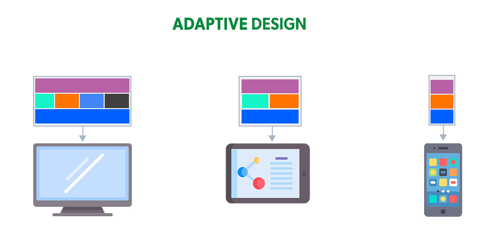
4. Adaptive Design
Adaptive design is similar to responsive design but uses specific layouts for different devices. Where a responsive website simply serves the same content for both mobile and desktop, adaptive websites may serve specific content when a mobile device is detected.
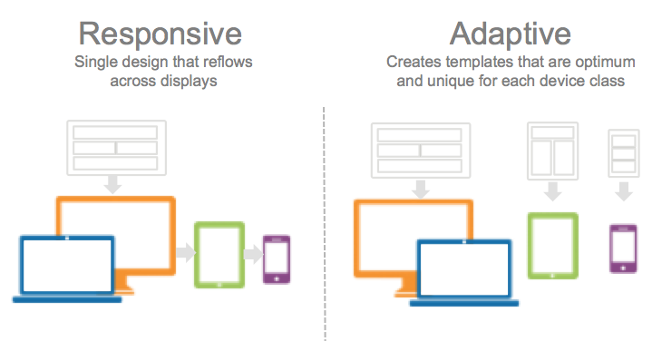
The main technical difference is that an adaptive site typically uses a set of predefined layout sizes based on the device’s screen size to scale fluidly.
5. Separate mobile site (site m dot)
When an existing website cannot effectively be converted to a responsive site, developers can create a separate website and host it in a subdomain. So if your regular, non-mobile site is http://mywebsite.com, your mobile site could be http://m.mywebsite.com.
A separate mobile site has its own HTML and does not need to look like the main site. The Facebook mobile site is a site m dot.
6. Mobile application
Large retailers like Amazon have both a mobile site and a mobile app to meet the needs of all their mobile customers.

A mobile app requires users to download it from the app store and install it on their mobile device. Depending on the type of business and website, consumers may prefer an app to a mobile website experience. However, this is usually only the case for large brands that consumers visit regularly, and not for retail or business sites that consumers only occasionally visit. They visit it.
FAQ
What does “mobile-friendly” mean in web design?
It means a website works well on smartphones and tablets, with readable text, touch-friendly buttons, and no horizontal scrolling.
Why is responsive design important for mobile-friendly sites?
Responsive design ensures layouts adjust seamlessly across all screen sizes for a consistent user experience.
How does mobile-friendliness affect SEO?
Google favors mobile-friendly sites in mobile search results, improving rankings and visibility.