What You Need to Know About Responsive Website Design
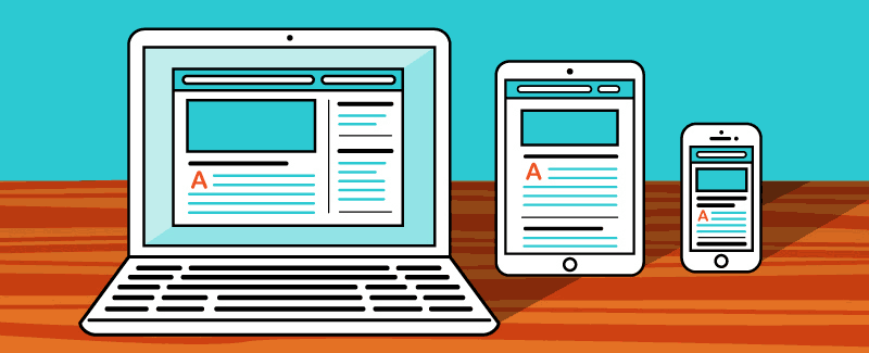
A responsive website is a website that reacts according to your screen and adapts to it. The design of these sites is usually so that it is possible to view all their elements easily on all display devices.
What is a responsive site?
With the introduction of smartphones and tablets, a new and attractive way to surf the Internet was found. In the past, websites were often designed in such a way that they could be viewed on monitor pages. Hence, working with these sites on smartphones with small screens was challenging.
This made responsive website design very important. A responsive site can adapt itself to the pages of different devices. Therefore, this site will be easy to use with any available device. The user experience of these sites is lovely.
In general, it can be said that a responsive site is a method or approach by which the designer designs the pages of the site in a way that matches the screens of different devices. The design and development of this site are done in a way that provides the best work experience for users.
In responsive website design, images, grids, and flexible layouts are used along with clever and logical CSS. With the creation of this site, changing the user environment makes the speed, size, and resolution of your screen match the device’s support for different scripts.

Responsive site specifications
One of the essential features of a responsive site is the context-aware images in it. This technology in the responsive site means that the position of different ideas will change on small to large display screens. These thumbnails will be changed through manipulation using special developer tools and coding programming languages. This makes the website design stand out. Since the techniques and format of the responsive site are different from traditional methods, caution should be taken when designing it.
Advantages of a responsive site
The responsive site will be opened on a mobile phone in a way that does not damage the structure and appearance of the site design. The pages of these sites are in perfect harmony with the mobile or tablet screen size and have made it easy for the user to use the site. The size and layout of the responsive site are dynamic and will adapt to the device on which the site is opened.
Therefore, the user can view it easily on different devices. Flexible images and templates are usually used to design these sites. The programming language used when creating this site is CSS. These sites are typically designed to respond to user preferences.
In general, it can be said that responsive sites are a fundamental evolution among the types of site design. It is possible to open these sites using different gadgets. Therefore, you will not need to design a dedicated website for other devices.
Flexibility
One of the essential advantages of a responsive site is its considerable flexibility. By using this type of site, you can easily see your site’s flexibility for desktop and mobile. This type of site can be accessed and used by different tools.
Great user interface
Among other advantages of the responsive site is its unique user interface. Research on millions of websites shows that a responsive site can be used on various devices. Since its use is simple for the user, it will convey a good feeling. Therefore, the number of users of this type of site is higher than that of regular sites.
Reduction in costs
With responsive site design, we will not need to design separate websites that can be used for mobile and desktop. Also, by creating this site, the need to develop an application will be removed because the site can be easily used on different phones.
Increase users
The most critical impact of responsive website design is the increasing number of mobile users. The most crucial advantage of responsive site design is increasing the number of users; if your site does not have this feature, you will lose many users.
Increase site ranking
With adaptive and responsive site design, you will be able to increase the rank of your site. According to the statistics from the Internet, there are more than 45 million Internet users in the country, 60% of whom use mobile phones to search in this space. This will help you understand the importance of responsive website design. These users will be lost if your site is not optimized for mobile phones and tablets.
The increase in mobile phone users has made a responsive site critical. The user’s enjoyment of responsive sites and meeting their needs are the main goals of Google’s attention to this issue. If your site is not responsive, it will be difficult for the user to work with it, and as a result, you will lose a vital SEO point.

What occasions are a responsive site suitable for?
By checking your website’s traffic, you will see that many users use mobile devices to view your site. These empirical statistics will help you understand the importance of responsive website design.
A wide range of users can be covered by designing a responsive website. In fact, with the design of this type of site, there will be no restrictions on the use of your site because the site design will match different devices, technologies, and screen sizes. By using this site, the needs of users who use laptops and old instruments, as well as users of updated appliances, can be answered. This will achieve a good user experience for your site visitors. If you are looking for a website designer and owner to create a good user experience, you should use this type of website design.
Last word
The growing use of portable and mobile devices to browse the Internet has made responsive website design necessary. It should always be remembered that an adaptive and responsive site will not always solve problems. Adaptive website design cannot always protect you against the continuous changes of the mobile world. The correct execution and implementation of responsive website design will bring better results for the user. Still, it will not be able to solve all the problems faced by the users automatically.
Hence, it is recommended that new technologies, devices, and resolutions be kept up to date to follow the changes. Familiarity with the latest technologies will also help you to provide the best experience for your visitors.
FAQ
What does “responsive design” mean?
Responsive design means a website’s layout adapts dynamically to different screen sizes — from desktop to mobile — using flexible grids and media queries.
Why is responsive design important?
It improves usability on all devices, enhances mobile‑SEO, and ensures a consistent user experience.
What are common practices when building a responsive site?
Use fluid grids, CSS media queries, flexible images, and mobile-first design to ensure your site works well on any device.