What Is a Landing Page — Purpose, Types, and Best Practices
Certainly, one of the critical and key factors in attracting the audience and increasing the conversion rate is to use an attractive and optimal landing page. But how can we be sure of the quality and attractiveness of our landing page, and what can we do to improve it? In this article, we discuss all the things that can help us in the design of the landing screw or the landing page.
Before starting, keep in mind that creating a page is not the whole story. In order to have an attractive page, you must continuously check user data and optimize your pages according to this information.
What is a landing page?
The landing page refers to the pages of the site that users enter by clicking on your ads on Google or other sites. This page aims to get leads from the user or convert the user into a customer.
Types of landing pages
- Click-Through Landing Page: This landing page redirects users to another page when they click through.
- Opt-In Landing Pages: In this type of landing page, there is a header, footer, and sidebar.
- Lead Generation Landing Page: This page collects the visitor’s name and email address information.
Application of the landing page
- Lead generation
- Selling services and products
- Advertising
- Demo
Designing an attractive landing page by following 13 important points
In the rest of the article, we will discuss 13 important points in the design of landing pages:
1- Providing attractive offers
Good marketing makes the company look smart, but great marketing makes the user feel smart.
To achieve this goal, you can excite users by writing attractive headlines. These titles can combine your business’s features and strengths, short-term discounts, and reasons for users’ purchases.
If you want conversion rates to change, reinforce this feature on your landing pages.
2- Simple landing page design
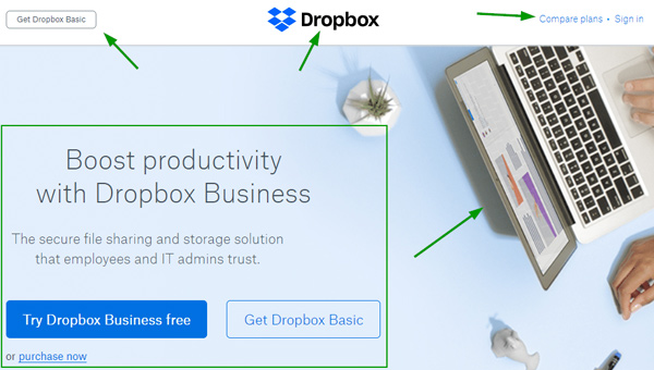
When designing a landing page, avoid adding extra elements as much as possible. The arrangement, number, size, and color of the elements on the page should be based on your strategy and purpose. For example, if you want to fill out a form, you can make this item more prominent than others.
Dropbox follows this well in its landing pages. In the image below, there are only five main elements on the page; three are small enough, the fourth is a pleasant but subtle image, and the last focuses on the call-to-action or CTA buttons.

3- Using contrasting colors
This technique can increase the number of CTAs on the page. The more negative space between the call buttons and the text, the more inclined users are to click on them.
This is visible in the image below! The black-and-white background makes the title and CTA stand out.

4- Limited-time technique
One of the landing design techniques that many sites use to increase their sales is the limited-time technique. Digikala’s daily or occasional discounts, which are related to certain days, are a good example of this. If you want to persuade users to buy within a certain time frame, use this technique on your pages.
A countdown timer can let users know how long they can take advantage of your offer.

5- CTAs Simple
Write the text of the call to action or call buttons simply. Avoid writing fancy and complex texts that are dumb and incomprehensible! CTAs should complement the desired action. You can check the above images again to understand this.
6- Contact information
Be sure to use contact options on your pages. This helps a lot in optimizing the landing. You can communicate with your users on the page in different ways (email, chat, phone number).
7- Various titles
One of the most important parts of any page is the titles. On a page, the title of each topic is usually read first, and then the description is checked. Try to use titles on the page that are more attractive to users.
Also, since most users use mobile devices, avoid writing long paragraphs. If a topic needs to be covered too much, separate it from the initial display on the page with a link to continue reading or more explanations. Change your titles in different time frames and analyze users’ behavior in different situations.
8- Related content
If you use ads for the landing, ensure that the page’s content is related to and identical to the advertising content.
If the advertising content and the page content are not the same, users will leave the landing quickly. This is one of the most important things you must consider when optimizing your landing. Try to use as many pages related to the topic of the advertisement as possible.
FAQ
What is a landing page?
A landing page is a standalone web page created for a specific marketing campaign to prompt visitors to take a targeted action, such as signing up or purchasing.
How is a landing page different from a website homepage?
A landing page focuses on one goal and minimizes distractions, while a homepage serves broader navigation and information purposes.
What is the main purpose of a landing page?
The main purpose is to convert visitors into leads or customers by aligning content and calls‑to‑action with campaign objectives.
