30 Important Colors in Website Design (Part 1)
What are the most important colors in website design? What are the best colors in website design? When building a website, pay attention to the visual elements, especially the color scheme. Choosing the right colors is important because 21% of visitors leave a website with strange colors. Choosing the right one can be challenging since many website color schemes exist.
This article presents 30 inspiring website color schemes, including names and hex codes. But before we get into the list, we’ll explain why choosing a suitable color scheme for your site is important.
Although colors are often considered for aesthetic purposes only, choosing the right palette can benefit your site. Here are three reasons website color schemes are essential: Increase conversions. According to one study, adjusting your website color scheme can increase conversion rates by 24%. A conversion happens when a visitor takes a desired action on your website, such as purchasing a product or filling out a subscription form.
Choosing the right website color scheme can influence the decisions of your visitors. If important elements like a call to action (CTA) are highlighted, visitors will be more inclined to engage with them. A CTA is the part of a website that compels visitors to take an action that leads to a conversion. It can be a text, an image, or a button. A study shows that red works better than green for a CTA button. Red contrasts more with the website’s color scheme than green, allowing visitors to recognize the CTA more easily.
In addition, according to color psychology, red evokes energetic, fast, and passionate emotions.
Therefore, red CTAs create a sense of urgency and encourage interactions. Create a Brand Identity. Your website color scheme should reflect your brand personality. For example, bright color schemes suit a brand with an energetic, fun, and youthful personality. Using a unique color palette will help your brand stand out. If your website’s color scheme is similar, it can confuse customers. Since people often associate a brand with a certain color,
Keeping your website’s color scheme consistent will help improve brand awareness.
Website color schemes also help build customer relationships by evoking the right emotions. An emotional connection with customers increases brand loyalty and benefits your business. Expert tip: When designing a website, you must consider the project or brand as a complete unit. The designer must first assess the target audience and understand where the brand stands visually. To avoid future mistakes, you should consider how the choice of color will affect the brand’s future development.
Retaining Visitors For a web designer, knowing the right website color schemes can improve the user experience and keep the website audience longer. Combined with a well-designed user interface, colors help visitors navigate your site. For example, distinctive colors allow users to find navigation elements quickly. They also allow you to separate website content visually based on its importance. Since visitors tend to ignore most website content, visual hierarchy draws users’ attention to more important content first. Conversely, a random selection of website color palettes may interfere with usability.
For example, having black text on a dark background worsens readability.
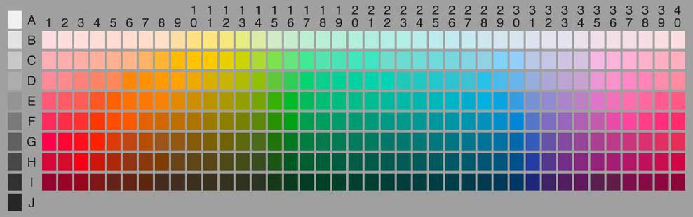
Top 30 Website Color Schemes. To inspire you, we have listed the top 30 website color schemes. We’ll also use the color picker to get color names and hex codes. You can combine colors and create your website color scheme with the following information.
1. White and black
Use a black and white color scheme to emphasize important content. This combination of two colors will make your website look modern and minimal. The artist keeps his website’s color palette simple, using white and black backgrounds as accents for the text. The dominant white space allows visitors to focus on the artwork immediately. Otherwise, their attention will be drawn to the colorful background. Minimalist web design shows that the visual artist wants the site to replicate his artistic style and highlight his work.

Colors used: white (#FFFFFF), black (#1D1D1)
2. Dark green, ivory, and yellow
Use a website color scheme that helps convey your brand voice. For example, khaki colors are suitable for websites with environmental messages. Manda’s website is a great example of using earthy colors to establish the brand as an environmentally conscious entity. This color palette is easy on the eyes and makes the website look relaxing and organic.

Colors used: green (#009B4D), tangerine yellow (#FFCC00), ivory (#FAF5E9)
3. Light green and hot pink
Knowing the design of hot pink and bright green colors will make your website energetic and happy. They stimulate the brain and evoke strong emotions. With pink and light green colors, the 3 Sided Cube creates a lively site that aligns with its fun and passionate corporate values. To contrast the vibrant colors, the company. The development of the application uses white and black colors as prominent colors. It also has shades of pink and green that add more depth to the website. This bright color palette is effective in attracting the attention of visitors. This color combination is unusual for a tech company and sets the 3-sided cube website apart. Knowing 30 important colors

Colors used: malachite green (#31EC56), racematase (#EF036C), heliotrope (#EE72F8)
4. Dark gray and yellow-green
Vibrant colors emphasize important information, especially when integrated into a muted website color scheme. An example of a website that uses this vibrant color combination is GolfSpace. The GolfSpace website uses a uniform color palette: mostly darker shades of gray. Use yellow-green or umbrellas to highlight essential elements such as buttons, prices, and offers.
On the gray background of the website, yellow-green can easily catch the eye. Using yellow-green allows visitors to see CTAs better, resulting in better conversions. Additionally, this color evokes energetic feelings, making it perfect for a sports-related website. Expert Tip: The easiest way to choose a CTA color is to look at the opposite side of the dominant color palette and pick one from there. In addition, the contrast between the background and the CTA Button plays an important role. Therefore, every designer should follow WCAG 2.0 and APCA guidelines, as each palette may give different results depending on its usage.

Colors used: yellow-green (#BAFF39), pale gray (#6E6E6E), white (#FFFFFF)
5. Blue and white shades
An image of the Drone.io website with a blue color scheme often conveys stability and reliability, making it popular for tech company websites, including Drone.io. This color test software on the Automation company’s website uses blue and white colors. It uses a light blue color with a white gradient as the background. As for the text and CTA buttons, the website uses royal blue and lighter blue, respectively. Despite using similar colors, these shades of blue make distinguishing essential elements from the light blue background easy.

Colors used: light blue (#E9F1FA), light blue (#00ABE4), white (#FFFFFF)
6. White and lime green
Green is perfect for an eco-friendly website company like Lime. This company’s website consists of only green and white colors. Using only two colors keeps the website minimal and tidy. Using green against a neutral background also ensures all critical information is visible. For Lime, using lime green creates consistent branding. The electric car startup also uses a green-and-khaki image that mirrors the website’s color palette. A background image is a great way to make your website more attractive.

Color used: lemon (#00DD00), white (#FFFFFF)
7. Beige and dark gray
Consider using neutral colors like beige for a minimal and calm website. Beige goes well with many colors. Depending on the composition, it can appear warm or cool. Beige is also neutral and easy on the eyes, which is ideal for website backgrounds. Using it with a contrasting accent color makes the foreground elements easily recognizable. Wells’s e-commerce site is a great inspiration for a beige website color scheme. It pairs beige with dark gray to create a muted palette that goes well with simple web design.

Colors used: beige (#DDD0C8), dark gray (#323232)
8. Black and neon blue
Blue is suitable for a futuristic and high-tech-themed website due to its association with modern technology. The Neuro Symbolic Lab website’s color palette consists of neon blue and a mostly black background. This combination sets the blue color apart and emphasizes the futuristic theme of the website. A simple color combination also simplifies a busy web design. Using more colors complicates the website and distracts visitors. This website also uses white text to complement the dark environment and improve readability and user experience.

Colors used: neon blue (#2272FF), black (#1D1D1)
9. Orange and blue shades
Consider A Short Journey’s orange and blue color palette for a unique website color scheme. This website uses different shades of orange for the background. This primary color gives the website more depth and matches the 3D web design. The shade of orange is usually associated with happiness and enthusiasm. This is great for this website’s recognition, encouraging visitors to vacation. Foreground objects mainly use blue and white. This contrasting color allows visitors to focus on the interactive elements of the website. Knowing 30 important colors

Colors used: orange (#F9B872, #FAE7A5), powder blue (#B6E1E7)
10. Pale pink and sea blue
Some Knowing websites offer products, services, or content for a specific gender. These websites may use a specific color scheme as a reference. Color schemes for women’s websites usually include pink. An example is the Pink Oui website by Jean Dousset. This e-commerce website sells diamond jewelry designed for women, hence the predominant pink palette. This website uses different shades of pink to separate sections. To add more dynamism, navy blue is used as a complementary color. Knowing 30 important colors

Colors used: pink (#E1B0AC), light pink (#F2D4D6), navy blue (#213F99)
FAQ
Why are certain colors considered “important” for web design?
Because they appear frequently across successful websites and carry strong visual and emotional impact.
Can I use all 30 colors together on one website?
No — it’s best to select a few that align with your brand identity and use them consistently.
Is this list only for part 1?
Yes — further parts will cover additional colors and deeper usage guidelines.