Knowing 30 Important Colors in Website Design – Part 2
What are the most important colors in website design? What are the best colors in website design? When building a website, pay attention to the visual elements of the site, especially the color scheme. Choosing the right colors is important because 21% of visitors leave a website with poor color choices. Choosing the right one can be challenging since there are so many website color schemes. In the previous article, we explained the second 10 items for your companions, and now the last 10 items are at your service:
11. Pastel and neutral purple
Keep the website’s background simple to highlight other elements. For example, the Empathy Experiment website uses a light pastel purple gradient background. Gradient colors make the background of your website attractive yet simple. The desaturated background contrasts the vibrant colors of the 3D moving objects and makes them stand out. It uses neutral colors, such as white and black, for texts and buttons. Contrasting colors help visitors recognize important information and maintain focus.
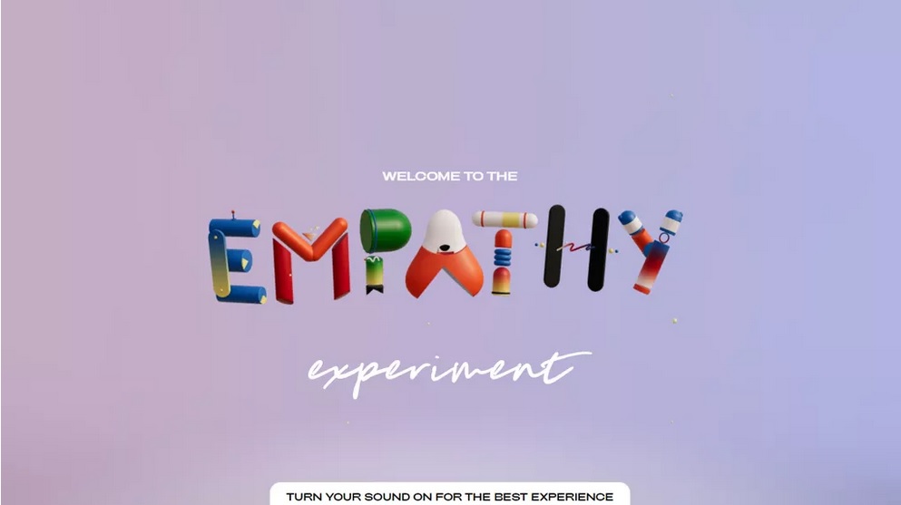
Colors Used: Pastel Purple (#C5ADC5), Light Steel Blue (#B2B5E0)
12. Sea blue and electric blue
Blue is generally considered the color of trust, making it a popular choice for important business website color schemes. Finlor’s website is a great inspiration for a blue color scheme. The website’s color palette is primarily blue. Navy blue dominates the background, with electric blue and white as complementary colors. Different shades of blue allow the logistics company to show itself as trustworthy. Brighter secondary colors improve the visibility of texts and CTA elements, resulting in a better user experience.

Colors used: dark blue (#01257D), electric blue (#00FFFF)
13. Color gradient, white and dark blue
If you want to add colors to your website, use color gradients. You can experiment with important color schemes with gradients without overwhelming your website. A website that makes good use of color gradients is Stripe. Half its homepage background is a dynamic color gradient, while the other half is white. Uses white for elements on colorful backgrounds, including navigation menus and images. As for the text, white and very dark blue have been used to ensure legibility. The combination of gradients and neutral colors makes the website lively yet clean.
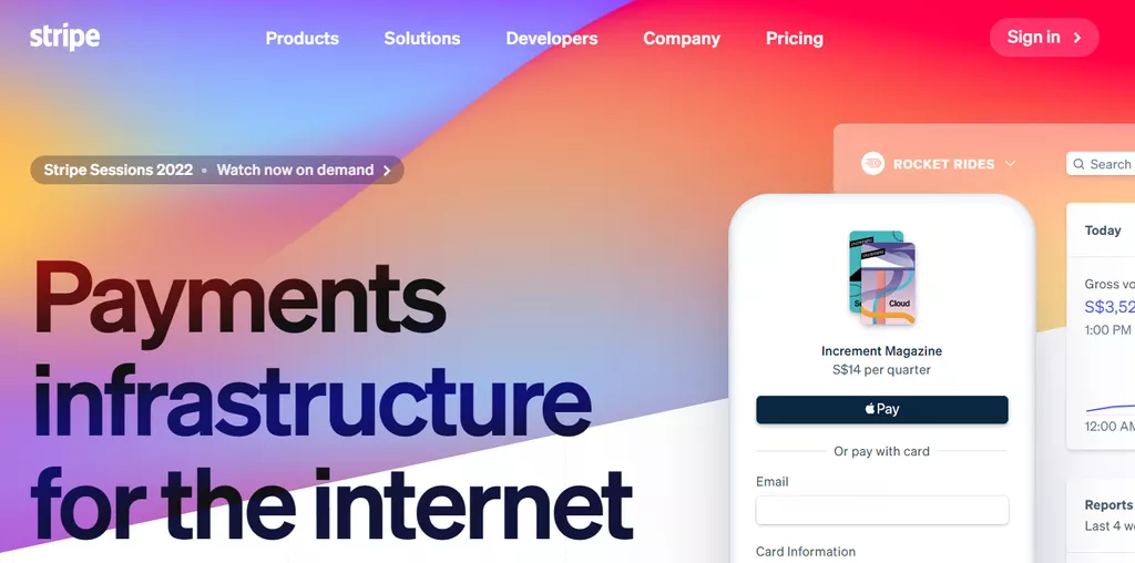
Colors used: white lilac (#F8F8F9), dark blue (#111439), color gradient
14. Beige, orange, and white
The company’s website’s color scheme consists mainly of beige shades, with orange and white as complementary colors. These warm colors are reminiscent of human skin and are perfect for a skin care e-commerce site. The skin only uses orange for important elements. Combining an attention-grabbing color like orange with neutral colors makes CTAs more attractive. To achieve better readability, it uses white color for text for beige and orange contrast.

Colors used: beige (#CD9C8A), orange (#FF5100), white (#FFFFFF)
15. White and blue gray
Blue evokes a sense of calm, which is perfect for the Blue Lagoon website. This website showcases the company’s relaxing hotel experience. The color scheme of the hot spring resort website uses subtle shades of blue-gray and white, reminiscent of the water and steam of a hot spring. Grayish blue works better for a calm color palette than other blues because it is less vibrant. Pairing a white background with blue-grey results in a minimal site with a subdued look. As for the text and buttons, Blue Lagoon uses gray and dark brown. Despite using a muted, important color, the CTAs still stand out thanks to the white space.

Colors used: blue-gray (#96C2DB, #E5EDF1), white (#FFFFFF)
16. Bright red and white
Some website color schemes emphasize the website design, such as two-tone colors for a two-column web design. As the best horror scenes website shows, bright red and white can complement the website design. The two-column site highlights it. Using contrasting colors together can help visually separate website content. In addition, the combination of red with a neutral color such as white makes the first color more striking. The unusual red and white color palette makes the best horror scenes unique. This color combination differs from other black and red horror website color schemes.

Colors Used: Smoky White (#F0F0F0), Bright Red (#E7473C)
17. Classic blue, turquoise, and gold
As Slumber shows, a dark palette is perfect for a calm-looking website. Slumber uses a darker classic blue to mimic the night sky. This darker blue evokes a cozy and calm feeling and matches the slogan “The app that lulls you to sleep”. The Audio Library app avoids vivid colors to maintain the calm vibe of the website. Instead, he chooses dark turquoise and gold for accent colors. Although not vibrant turquoise and gold, these colors are visible above the dark blue background. Visitors can still read the text and navigate the website easily.

Colors used: classic dark blue (#0A1828), turquoise (#178582), gold (#BFA181)
18. Yellow and blue
Yellow is the color of optimism, creativity, and wisdom – a good choice for a business website. However, web designers may want to avoid bright yellow as the primary color. Bright yellow can quickly grab the attention of visitors and overpower other colors. If you plan to use yellow, use the bank website color scheme as inspiration. The banking service company uses yellow as its background and blue as a complementary color. Blue is the opposite of yellow on the color wheel, allowing the first color to stand out when used together. Using blue as the accent color increases the visibility of CTAs against the vibrant environment.
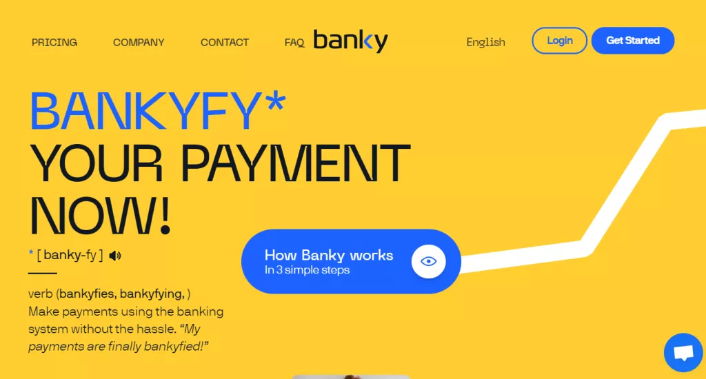
Colors used: yellow (#FFCE32), Prussian blue (#1D63FF)
19. Dark royal blue and gold
The Sotheby’s website color scheme is a great option for a website that aims to look professional and ready. This website mainly uses a dark royal blue shade with white and gold accents. Royal blue is stylish due to its history with the British monarchy. Meanwhile, gold symbolizes prestige, wealth, and success, which is perfect for the luxury real estate company’s website. When paired, the combination of dark royal blue and gold creates a classy and neat website. This website’s color scheme also helps the company build its reputation among visitors.
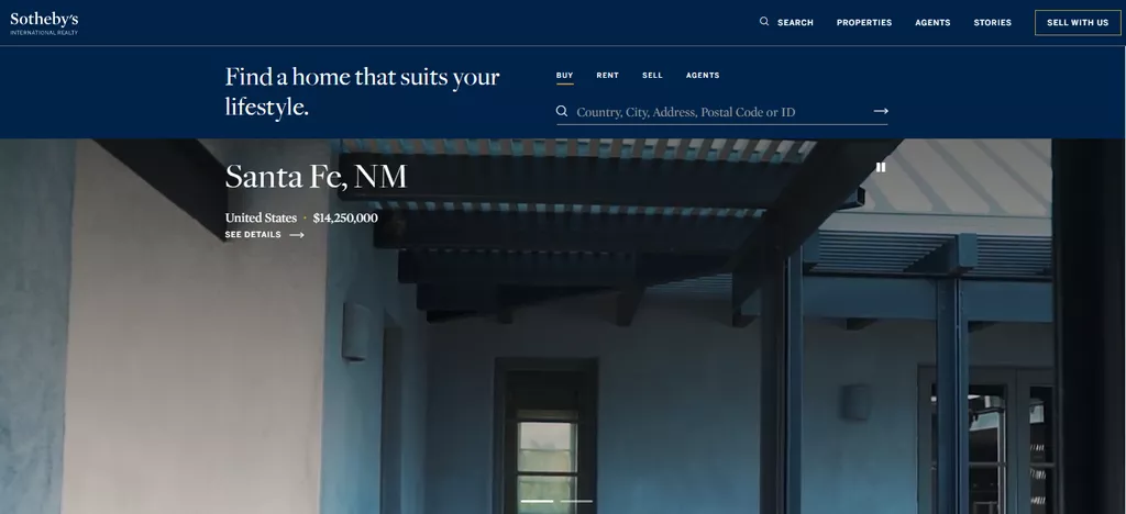
Colors used: blue (#002349), gold (#957C3D)
20. Blue, beige, and coral red
Combining three colors can be tricky because some colors are likely to clash. But when done well, the result can be surprisingly pleasing. Dollar Shave Club is a website that does the tricolor combination well. The color schemes of the personal care company’s website are centered around coral red and beige. Although coral red and beige are usually paired with neutral colors, Dollar Shave Club opts for blue instead. The personal makeup company uses dark blue as the website’s main color to contrast the beige and coral red, allowing important elements to stand out more. Blue is also ideal for this website, which mainly sells men’s grooming products. Men may prefer blue because the color is usually associated with masculinity.
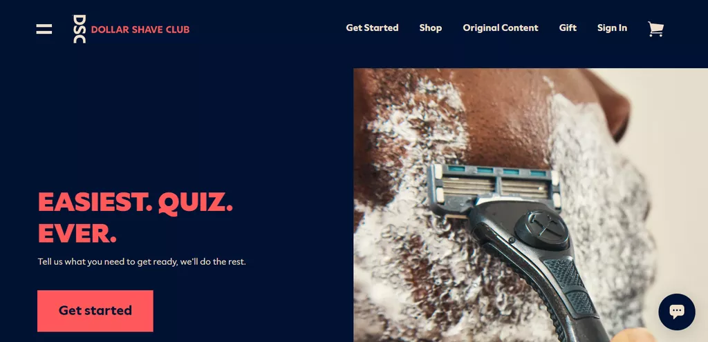
Colors used: dark blue (#001233), light coral red (#FF595A), beige (#CAC0B3)
FAQ
What does this article cover?
It presents ten important color combinations for website design, showing how they work in real sites and why they matter.
Why is choosing the right color scheme important?
Because appropriate colors improve readability, focus, and visual appeal, helping visitors stay engaged.
How are these color examples presented?
Each palette includes specific hex codes and design context to inspire your own web color choices.