Step-By-Step Tutorial On How To Use Spss In Descriptive Statistics (Video)
This article shows you how to use SPSS software version 12.0 to 2017 to infer data analysis and descriptive statistics.
You use this software to create histograms, sequence distributions, stem and leaf diagrams, Tukey box diagrams, calculate the standard value of centrifugal indices such as (median, mean and mode), calculate the standard value of scattering (amplitude, quadratic amplitude, standard deviation and variance). ) And calculate the standard amount of stretches and skewers you can use.
Sequence command
This command or instruction is used to calculate quartiles, percentiles, centripetal indices (mean, mean, and mode), scatter indices (amplitude, standard deviation, variance, minimum, and maximum), elongation, and skewness, and histograms. As: Analyze / Descriptive Statistics / Frequencies which says:
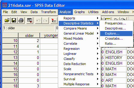
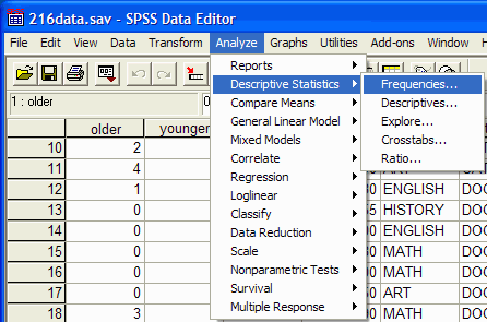
1. Click on the Analyze item at the top of the window, then select Descriptive statistics from the drop down menu and Frequencies from the pop up menu.
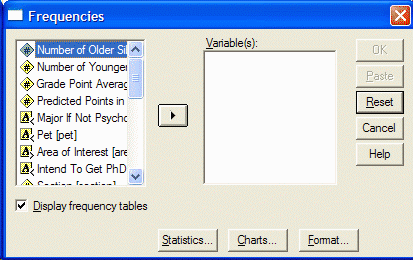
2. The Frequencies dialog box appears:
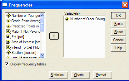
3- Select the variables you want to analyze by clicking on the left side of the Frequencies dialog box, then click the arrow button so that you can move the variable into the right box of Variables.
4. If you want to have a sequence distribution, make sure the Display Frequency tables option is selected and specify the statistical processes you want to run by clicking the Statistics button. The Statistics dialog box appears:
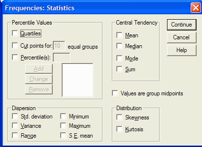
5- To calculate a percentile, click in the box to the left of the percentiles section. Type the desired percentile and select Add. When you have selected all the desired statistical indicators (mean, mean, mode, standard deviation, variance, range, etc.), click Continue and select the chart you want to display by selecting the chart button. The chart dialog box appears: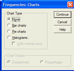
6. Click on the desired chart (usually a histogram) and select Continue and then OK from the Frequencies box. The SPSS output appears. In SPSS output you will see the statistical indicators and charts you want. This output provides central statistical indices, dispersion, elongation, skewness, quartiles and percentiles.
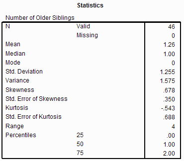
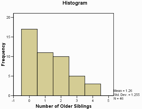
7- The output has two columns. The left column shows the statistical process and the right column shows its value. For example, the data center is 1.26 (for your data it may be another number).
When the data distribution is skewed, the skew value is greater than zero. In a normal distribution, the amount of elongation is zero. The positive elongation of the elongated distribution break and the negative elongation indicates the wide distribution. If you scroll down the mouse you will see the sequence distribution.
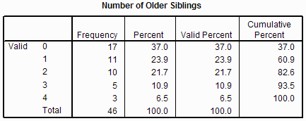
8- If you scroll down, you will see the histogram or chart you want.
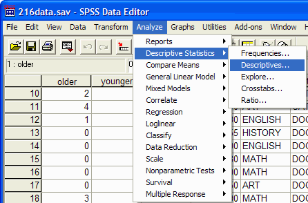
Descriptive instructions can be used to display indicators such as (middle), dispersion (range, standard deviation, variance, minimum, maximum), and elongation and skewness. As: Analyze / Descriptive Statistics / Descriptives
1. Select Analyze at the top of the window, select Descriptive Statistics from the drop down menu and Descriptives from the pop up menu.
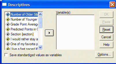
2. The Descriptives dialog box appears:
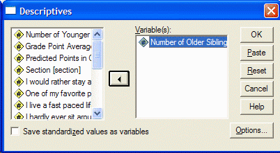
3- In the left part of the box, click on the variables you want to analyze and select them and move them to the right of the box by clicking on the arrow option.
4- Click on Options to select the desired statistical processes to display the Options box:
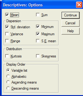
5. By selecting any desired statistical index (mean, standard deviation, variance, range, minimum, etc.) in the Descriptives dialog box, click OK to display the SPSS output with its results. The following figure is an example of an output:

An output provides arbitrary statistical values.
Search command
This command can be used to determine center indices (mean and median), scatter (amplitude, quadratic amplitude, standard deviation, variance, minimum and maximum), elongation, skewness, and histogram, stem and leaf diagram, and Tukey box diagram.
1. Analyze / Descriptive Statistics / Explore .

2. The Explore dialog box appears:
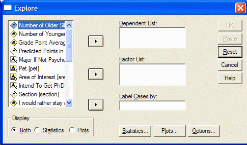
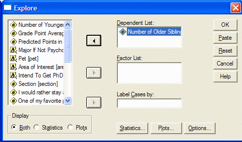
3- In the left part of the box, select the desired variables and click on the top arrow to move them into the Dependent list.
4- Select your favorite charts by clicking on Plots until the Plots box appears.
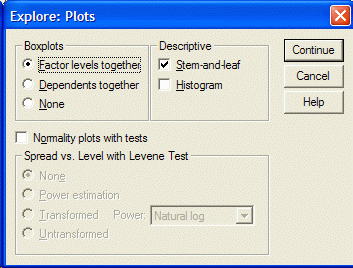
5. Select the required charts by clicking on them (such as stem-and-leaf charts, histograms, etc.), then click Continue and then click OK. SPSS output appears with its results. The following figure is an example of an output for descriptive statistics.
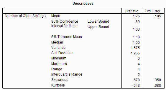
6- Output provides you with the necessary values. Scroll down to see your favorite charts.
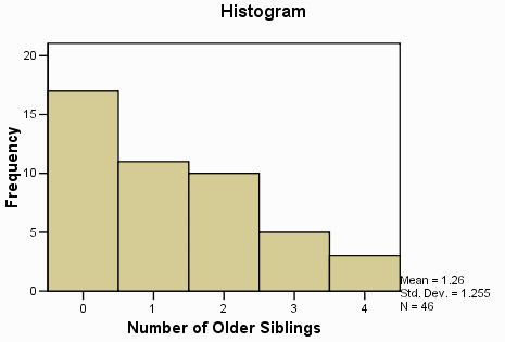
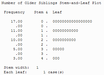
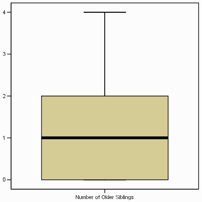
7. The Tukey box diagram shows the first (bottom) and third (top) boxes. (25th and 75th percentiles) Middle (horizontal line of the box), Amplitude (excluding dots and end cuts) (Lines extending from the box indicate the range) Drop points (perimeter of the dotted line Gives – the next number for the throw point is the same visible number).
A point is defined as a notch that is 1.5 to 3 times the length of the box farther from the top or bottom edge of the box). Remember that the box diagram shows 50% of the notches. An end notch is a notch that is 3 times the length of the box farther from the end edge of the box.
If you have any problems in using the descriptive statistics of SPSS software, raise it quickly in the comments section, we will answer you as much as possible!


