


Comparison of responsive web design with adaptive web design
We use our mobile phones for an average of 4.8 hours a day. Part of this time is spent surfing the web, and it is very important for us to see a website in the same order and order as we see it on a laptop. Responsive
This request of ours has made business managers adapt their sites to mobile phones and other smart gadgets so that they don’t lose their audience. They have two ways to achieve this goal: 1. Responsive web design 2. Adaptive web design.
What is the difference between responsive and adaptive web design?
Screen sizes vary from large corporate monitors to smart wristwatches; So when you want to design a website, you should pay attention to the dimensions of the different devices that will display your site to users. This issue is very important in designing the user experience of the website. In order to have a website compatible with all kinds of smart gadgets, you must either use responsive web design or adaptive web design. In the following, we will explain each one in order.
What is responsive web design?
If you design your website responsively, the pages of that website will be displayed according to the size of the user’s screen. In fact, this type of web design automatically adapts your website layout to any screen.
Yadak Lee’s website is one of the websites that has a responsive design. It doesn’t matter what device you use to view this website. Thanks to the responsive design, the content of all the spare pages of Lee is displayed well on different gadgets of different sizes.
In order to get more familiar with the concept of responsive design, we suggest you take your phone, tablet and laptop and open Yadak Lee’s website with all these tools. After doing this, you will see that the spare screens are properly adapted to each of your screens.
You should note that in responsive design, some content is reduced or enlarged to better fit the user’s screen. Additionally, some functionality (such as how horizontal scrolling works) varies based on the device the user is using. In fact, in responsive design, CSS codes detect the characteristics of the user’s screen and then display the website according to its dimensions.
Tip: Responsive web design technique is useful for both users and businesses. This feature allows users to do more with their phones and other smart gadgets. On the other hand, it allows businesses to reach more customers.
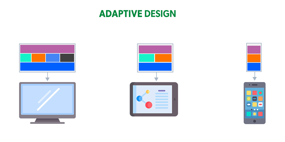
What is adaptive web design?
In adaptive web design, the website designer designs and loads multiple templates based on different screen sizes. By identifying the characteristics of the user’s device, browsers display the specific design of that device.
In order to design your website adaptively, you need to know the common sizes of screen widths. We have listed them below in terms of pixels:
- 320
- 480
- 760
- 960
- 1200
- 1600
Apple’s website is one of the sites that has an adaptive design. The structure of this site is more or less the same in different devices; But the number of website sections is the same on all devices. However, the display of images and websites is slightly different between desktop and mobile.
If Apple’s website design were responsive, the same content would likely be displayed on each visitor’s page in the same order; But adaptive schemes are not dynamic.
Here you may imagine that adaptive design makes you create a poor user experience for users; But it is not! The user does not lose anything. In fact, adaptive design allows the designer to use images and other content more accurately.
On the other hand, Adaptive design is very attractive for company managers; Because they are interested in controlling how their website content is displayed on smart phones.
Is responsive web design better or adaptive web design?
It’s a good question! When it comes to website design techniques, we can’t say whether responsive or adaptive is better. In fact, a better technique is one that matches your needs, desires, and resources.
Advantages and disadvantages of responsive design
Advantages:
- It displays the website content equally in all operating systems;
- Works on all new devices (even those with non-standard screen sizes).
Disadvantages:
- We have less control over how the site is displayed on different devices;
- If the website elements are in the wrong order or size, it will negatively affect the visual hierarchy;
- You need to know programming;
- may disrupt the functionality of the website; Because it makes the content of the website dynamic.
Advantages and disadvantages of adaptive design
Advantages:
- It creates a suitable user experience for any audience with any device they have;
- It has powerful performance because it is optimized for different devices.
Disadvantages:
• If the content is displayed inconsistently on all devices, it will negatively affect SEO.
points that you should pay attention to when designing a website
So far, you are familiar with the concepts of responsive and adaptive design and you know the difference and advantages and disadvantages of each. Now we are going to tell you 10 special tips about designing a mobile friendly website.
Here, you should pay attention to the optimization of different parts that we will talk about so that changing the shape of your website on different screens does not have a negative effect on its performance.
1. Header content
The header remains like a shop sign. This sign gives you information about the shop you are about to enter. The header should also give good information about a website to the audience; Like:
- Your brand name;
- the services you provide;
- the product you sell;
- A box to search for content.
When your website is displayed on the desktop, it has a lot of space to display all this information; But this space is less for the mobile screen and it is necessary to consider this point during responsive or adaptive design.
In order to design a better header for the mobile version, you need to ask yourself what elements you want to include in the header. For example, you can add your logo to help highlight your brand identity. Or if you have an online store, add the shopping cart icon. In general, what you want to have in the header depends entirely on your own taste and the nature of your website.
2. Readability of the text
What do you expect from the shape and image of your website texts? You probably want it to be awesome and reflect your brand identity . Very great! But you must make sure that the text of your website is readable enough for the audience.
To ensure this, you should pay attention to the size and style of your website texts to adapt to different screens. You should test this before launching your site.
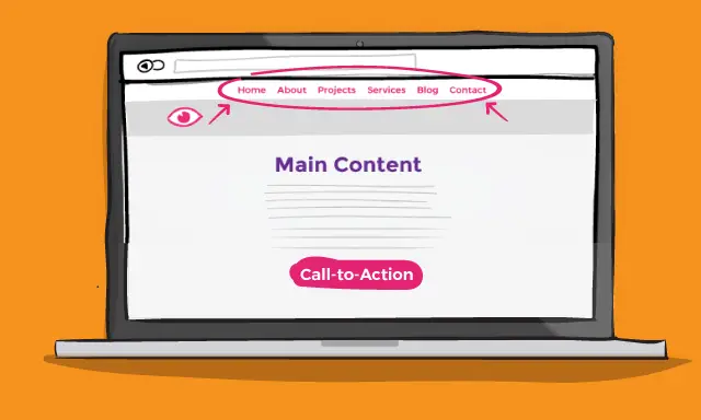
3. Navigation hamburger menu
It is the path that is specified on your site and users move between different pages of the website according to that path. The main part of the site navigation is the site menu, an example of which you can see in the image below.
The presence of interactive navigation plays a very important role in any website; Because it helps build a powerful user experience and reduces bounce rates. We also suggest you to use the hamburger menu to make a useful navigation.
A hamburger menu is a three-line icon that is usually placed in the upper right or left corner of a website. Most users know what these horizontal lines do; Therefore, it can be a simple and attractive choice for your website design.
4. Installing navigation
The popularity of mobile applications has had a great impact on the navigation structure of websites. Currently, we see designs in the mobile version of websites that are more attractive than hamburger menus.
For example, some websites move the navigation links to the bottom of the page and display them in the form of a horizontal menu. Some have put it in waste. Another popular method these days is to create a full-screen pop-up menu using a lightbox.
5. Sticky header
In adaptive design, you can make the pages of the mobile version of your website short; But in responsive design, all desktop content is transferred to the mobile web page. Unless you change it.
If the pages of your website are long in the mobile version, it is better to think about a sticky header. With this, users always have access to your website’s navigation and menu.
6. Visual Hierarchy
Visual hierarchy is the path the visitor’s eye follows on a web page. The existence of a regular visual hierarchy is very important in the design of the mobile version of websites; Because the messy design of a website makes visitors lose their focus and eventually leave that website.
To have a logical and attractive visual hierarchy, we suggest adding a header, menu, images, white space and navigation tools to your website. Adding these tools will:
- Separate a large amount of content and topics;
- Create a logical structure for the information on the pages;
- Make sure you have a standard website design;
- Communicate between different departments.
In adaptive design, you can design the visual hierarchy separately for the desktop or mobile version; But in responsive design, you don’t have this possibility and you have to be careful about changes. Because the size of the elements may change as the screen gets smaller.
The last question and answer: Which one should we choose? Responsive or adaptive?
In this article, we compared responsive design with adaptive design and told you the features of each along with their advantages and disadvantages. Then we mentioned 10 important points about powerful website design. You may ask here, which type of design should we choose? Responsive or adaptive? As we said at the beginning of the article, the answer to this question completely depends on your goals and needs, and you should choose a technique that matches your needs, desires and resources.