


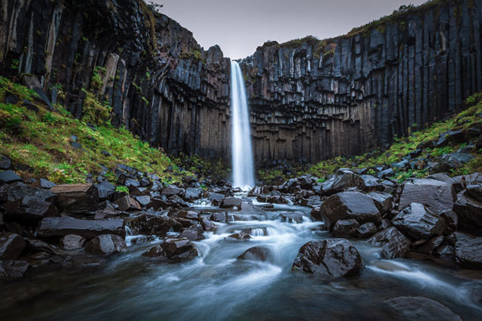
Color Theory In Photography; Everything We Need To Know About Colors
olor is one of the most important components in photography, and photographers must learn color theory to maintain the aesthetic and balance aspects of composition.
In photography, in addition to composition and lighting, we must pay attention to color. Undoubtedly, color theory plays a major role in photography; But many people do not know anything about basic knowledge or how to use color in photography.
Whether you are a professional photographer or have just started photography, you need to be familiar with color theory and how to use colors correctly to achieve better and different results.
Along with light, color is one of the most important elements of photography. Color affects the whole composition, visual appeal and ultimately the feeling of the audience.
To become proficient in this area, we need to learn tips such as color order, color scheme types, color variables, color psychology, color combination, light and air, tools, and final editing. Color is a wide-ranging and challenging discussion, and there are many points about it; But in this article, we will focus more on a summary of the definitions and practical aspects of color in photography.
Mechanics and history of color
The presence of color depends on light. The visible spectrum of light is part of a wider spectrum called the electromagnetic spectrum. A red car is seen as red because its surface absorbs the entire spectrum of visible light except the red spectrum. This spectrum is reflected from the surface and hits the viewer’s eyes. In fact, the process is a bit more complicated; Because objects are more a combination of colors than a pure color.
The scientific basis of color is a wide-ranging discussion and several books have been written about it; But as a photographer, you do not have to go into too much detail. We owe our current information about color to Isaac Newton.
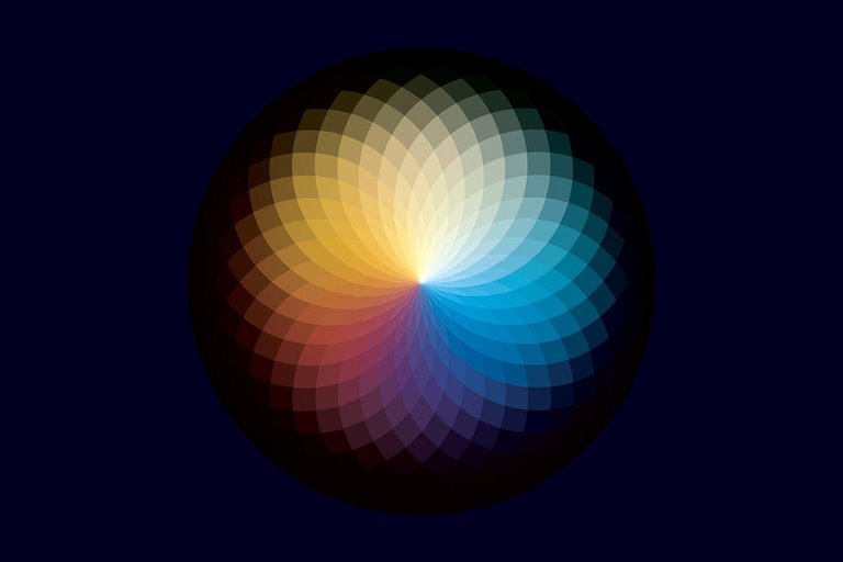
His experiments on the refraction of visible light with a prism led to the invention of the first color cycle. It was from this time that a large number of color cycles were published, and the German theorist Johannes Eaten developed the color cycle we know today.
This color cycle was created based on the main colors yellow, blue and red, which are the main colors in the painting. Ethan’s color cycle attracted the attention of Johannes Wolfgang Goethe, who hypothesized the emotional value of colors. According to this theory, blue was attributed to calm and red to warmth.
The basics of the color wheel
Color theory may seem easy, but the deeper you go, the more complicated it becomes. Over the centuries, artists, theorists, philosophers, and many others have tried to describe colors in different theories and systems. However, there are still differences today over color theory. In color theory, colors are divided into three main categories: secondary, secondary, and tertiary.
A primary color is a color that is not made from any of the other ingredients. The main digital colors are green, red and blue. In printing, cyan, purple (Magenta) and yellow colors are used as the main colors of the printing ink. On the other hand, the main colors of painting are yellow, blue and red.
Each of the above color systems is used in different industries. In general, all three color systems have their place in photography, especially art photography. The traditional primary color system (yellow, red, blue) is used for color combinations and visual aesthetics; RGB and CMYK color systems are used to improve digital color quality and print quality, respectively.
In the YRB color system (yellow, red, blue), secondary colors are obtained by combining two primary colors.
- Orange = yellow + red
- Purple = red + blue
- Green = blue + yellow
On the other hand, third colors are obtained by combining primary colors and secondary colors. The naming of these colors is as follows: The name of the main color in addition to the secondary color. These colors can be orange-yellow, red-orange, red-purple, blue-purple, blue-green and yellow-green.
Color model
Color model, the system includes a full color, the color of the original in takes place. There are two color models: incremental and decremental. The model for how to make the colors depend. Colors that contain color beads physical type is usually reduced because the colored objects absorb light and color of the wavelength of the visible spectrum are there.
The paint obtained direct light, color additive called up. This type of color by adding the wavelengthTo each other to produce different color build up. All these definitions theoretical basis for the theory of color, but does not include this data will be applied to images. As a result, we need another way to understand color .
Color space
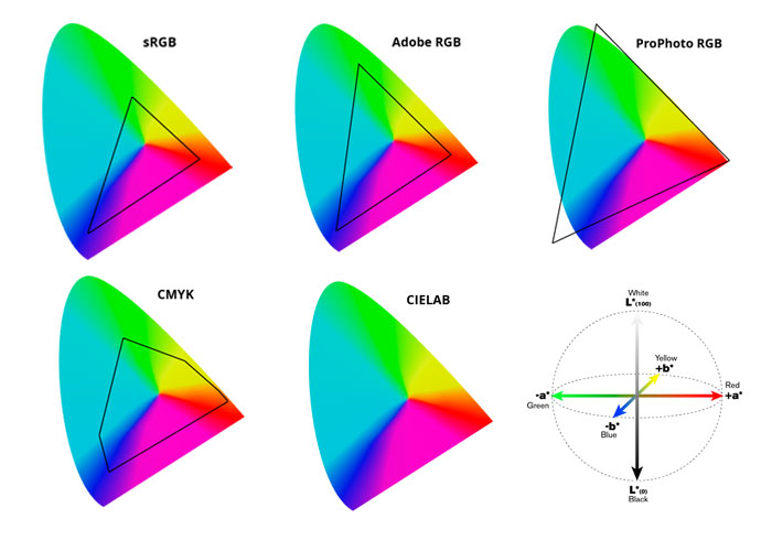
Color space is commonly used in photography. According to mathematical definition, set color space defined by the colors that a device can display or print it is. The space in photography, final processing and release of pictures on the Internet or in printed form used to be. There are several spaces for color. For example : sRGB color web display, CMYK for printing, Rec.709 for HDTV and many more; But only a few of which are linked to photography .
When comparing the color spaces of the color space CIELAB (CIE – Committee of the International brightness) as the reference standard used to. Color space CIELAB total color range of human vision encompasses. For photography, you should be familiar with the color spaces of the table below. Black triangle on each showed that the area of each color space in the CIELAB is .
sRGB (Standard RGB)
- The standard color space is the display of pages on the Internet .
- This space is only 35% of the colors of the visible CIELAB cover up .
- Each eight-bit image file or by a program of eight-bit can be in color space sRGB be considered .
- Space sRGB especially in the colors of turquoise , green and usually less extensive professional printing of the work is .
Adobe RGB
- This color space that Adobe developed in 1998 by the most colors in the CMYK for printing the cover off; But only for display on the monitor to the river .
- This space is more than 50 percent of total visible light can take place .
- View color shining more on print provides , but without conversion to sRGB not be displayed on the web is accurate .
- This space can be sRGB conversion, but the reverse is not possible .
PROPHOTO RGB
- PROPHOTO RGB or ROMM Rgb ( criterion by output reference) was developed by Kodak .
- This color space is more than 90% of the colors of the visible cover up .
- ProPhoto RGB to work at a depth of 16 bit recommended to be .
- The option is ideal for final processing and can be used to sRGB for the web or CMYK for printing turned .
CMYK
- Turquoise short of (Cyan) , purple (Magneta) , yellow (Yellow) and K means the key color or black . CMYK is a subtractive color model used in printing it .
- CMYK is technically more of a color model than a color space; But can be used to refer to the color spaces RGB in CIELAB mapping .
- Compare direct view RGB and print CMYK because of the features and technology of different output is difficult .
- CMYK the power of images ProPhoto RGB or Adobe RGB is extracted. For best results, you should consult your printing company or service .
LAB
- CIELAB as L * a * b * known to be . L -letter abbreviation lightness or brightness white is the white to the darkest black to show off . A thrust from green to red to the axis B from blue to yellow moves out .
- This color space of all colors in the visible cover up .
- Color in this space are absolute and independent of the device .
- The LAB space is used as the backbone of color management and to communicate between different devices.
Set the correct color space
Managing color space can be a little confusing for beginners. There is no standard for using a specific color space. Every photographer has his own priority. Some photographers shoot in Raw mode and do the final 16-bit editing in ProPhoto RGB space. You can also set the output color space to sRGB to publish images to the web.
To adjust the color space in Photoshop, go to Edit> Color Settings and select your desired color space under the Working Space option. To adjust the output color space, go to Edit> Covert to Profile and select the color space under Destination Space.
Lightroom uses ProPhoto RGB space by default to manage all images and you can not change it; But you can change the output space in Lightroom. Go to Lightroom> Preference to change the color space of images that are transferred to Photoshop. To output images in any other environment, go to File> Export and select the desired color space under File Settings.
Does your monitor display color correctly?
Most monitors do not display color correctly. As a result, you may have trouble printing the photo. Without calibration, the print color will look different from the color on the screen. The solution is to use a color calibration device.
Application of color in photography
Each color has a wide range of colors and shades that turn the primary color wheel into a full color palette of 10 million colors in the human visual range. Each of these unique colors on a palette has a specific name, color, and shade, known based on the color variables Hue, Saturation, and Lightness. The abbreviation for these variables is called HSL, which you probably know by the same name in Lightroom. In Photoshop, there is an application layer called Hue / Saturation to adjust these variables. During photography, it is usually not possible to control the color completely; But in the final processing process, the overall effect of the color can be edited.
Where are the HSL settings?
HSL is known in Photoshop as Hue / Saturation. You can see these settings in the Adjustments panel at the bottom of the Layers panel, or you can go to Layer> New Adjustment Layer> Hue / Saturation. In Lightroom, HSL sliders are in the Develp module. L in Lightroom stands for Luminance.
Hue
Hue is the same color. Some define it by the name of color or the color of color. For example, red is red, and it stays red even if you reduce its saturation or brightness. Colors are divided into hot and cold. Warm colors evoke a sense of activity psychologically. Cool colors evoke a sense of calm or distance. While working with color, you will learn how to change and manipulate color.
Red
Red is one of the warm colors that can be seen along with other colors. Even a small amount of red has a great effect on the compositions. Red is one of the main skin colors in the RGB system. By converting this color to CMY, the details tend to cyan.
Choose the right skin tone in Photoshop
In the Selective Color option layer, select Reds from the drop-down menu. Use the Yellow and Magenta sliders to adjust the skin tone and Cyan for the color saturation.
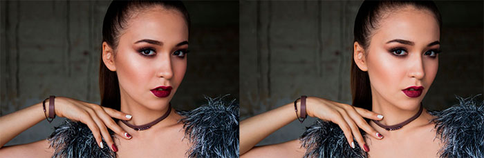
The skin looks darker and more saturated before the changes. After Selective Color settings with the following values: Cyan -23, Magenta -26, Yellow 22 and Black 0
Green
Green is one of the cool colors. The green channel in Photoshop is the default channel for black and white. Green is the natural color of the leaves; But if you select the sheets in Photoshop, you will notice that their color tends to be more yellow than green. This is due to the direct reflection of sunlight.
Note: When improving leaf color, use the Targeted Adjustment tool instead of selecting a standalone color channel.
The Targeted Adjustment tool in Lightroom can be found in the HSL panel. Before using the Targeted Adjustment tool, make sure you select the Hue correctly. There is also an option to use the Targeted Adjustment tool in the Camera Raw filter in Photoshop. You can find the same option in the Hue / Saturation setting layer.
Blue
Blue is one of the cool colors. By watching the unconscious blue color, we remember the sky. Blue is associated with space, distance and tranquility. Pure blue (R 0, G 0 and B 255) is not available to the human eye. The color of the sky is not pure blue and forms a collection of shades of light and shades of blue. In the final processing process, you should pay attention to this point and do not over-saturate the sky color. The Blue channel is the busiest channel in the entire RGB collection.
Eliminate the blue sky saturation to emphasize the background
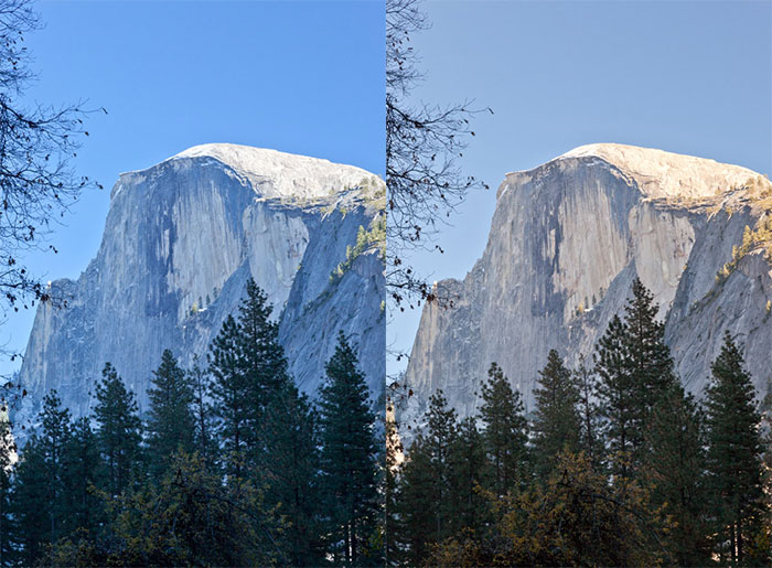
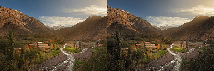
Many photographers oversaturate the sky blue in the final editing process, especially if the image was captured in daylight; But reducing blue saturation can increase the emphasis and attention to the background. The warm background color (red / orange / yellow) helps this sample.
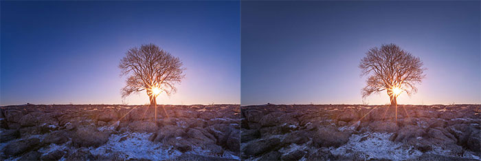
In the left image, the yellow / orange color of the sun competes with the blue of the sky. Blue saturation is reduced by using HSL glass in Lightroom. Blue -35. The image to the right of the image has a more pleasing appearance.
Increase the whiteness of water by adding a blue tint
By adding a little blue dye to the water, the whiteness of the water can be increased. This effect is especially useful in the long exposure mode to induce a silky and soft water feeling. Use ACR in Lightroom and Adjustment Brush in Photoshop to select images. After making the selection, move the Temp slider to the left to add a little blue to the water.
Yellow
Yellow is one of the warm colors and one of the main colors in the YRB color system, but it is not the main color in the RGB system. The Yellow has the highest brightness of all colors; So it is a bit difficult to separate the saturation level. And Yellow, like red, appears in the middle of the image, especially if the background is darker and less saturated. This color can be used when finalizing autumn images. When retouching the skin, the yellow should be balanced against Magenta or purple.
Orange
Orange is also one of the warm colors. The yellow / orange color emanates from sunlight and evokes a sense of warmth. Orange is very similar to red and can enhance your images.
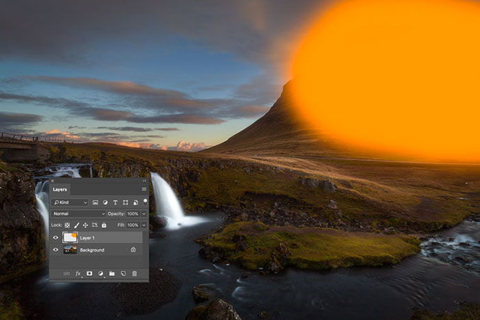
Improve the color of the sun by painting
In Photoshop, you can improve the color of sunlight by adding a new color layer. This technique can be easily done in the final editing process. Create a new layer first. Select the Brush tool and hold down the Alt key to display the color picker. Then sample the orange-yellow color of sunlight. Slightly change the color to achieve the same color and saturation and different brightness.
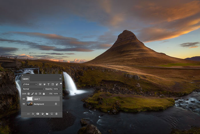
In the next step, use the Brush tool with Opacity equal to 100 and Hardness equal to zero. Drag on a new layer in the desired location.
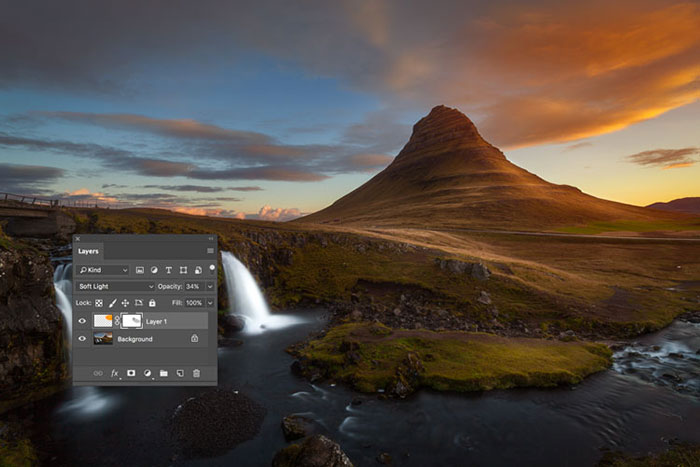
Blend mode Change the new layer to Soft Light. Reduce the opacity of the layer to about 20. Mask the unwanted parts.
Understand color temperature
The subject of this article revolves around color; But you need to know some things about color temperature, which in photography is known as white balance. By adjusting the white balance, you can change the color values to simulate different types of ambient color temperatures; But what effect does this have? Proper white balance adjustment allows image colors to be displayed without unwanted color rendering.
Tip: Always shoot in Raw mode.
Automatic White Balance (AWB) Modern digital cameras perform well in predicting the right color temperature, which ranges from 3,000 to 7,000 k (daylight is approximately 5500K). You usually need to adjust the white balance of the camera based on shadow lights, interior space, especially artificial light or flash.
You can also purchase white balance cards (such as ColorChecker Passport) or clear white lens caps (such as ExpoDisc) to customize white balance. Always shoot in raw mode to preserve the color information of the image.
You can also set the white balance pattern from the WB drop-down menu in Lightroom or ACR in Photoshop. In JPEG mode, you have to manually adjust the white balance using the Temperature slider bar.
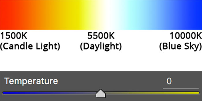
Color temperature is measured in Kelvin (K). The color temperature is from yellow (coldest) to blue (warmest) and white is in between. It may seem confusing and the question arises why blue should be the warmest color? Consider the following example:
When a metal heats up, it first turns red. As the temperature rises, its color turns white and when it reaches its maximum temperature, it turns blue. Even the hottest fire is blue, while the hottest fire is mistaken for red.
If cold is red and warm is blue, why are Temperature objects in Lightroom and Photoshop the opposite?
The reason for this is the visual display of color balance.
For example, an image taken indoors with indoor lighting. It has yellow and orange color distribution. Your camera raises the temperature to correct white balance.
This is easier to understand when finalizing the image. When you have a blue image or a yellow playback, you only need to move the Temperature slider in the opposite direction to adjust the white balance. The image below is recorded in the shadow environment of the park. In the first image, we see a blue color that is corrected by adjusting the white balance in Lightroom. All you have to do is select Shade from the WB drop-down menu.
Apply digital filter in final image editing
Gone are the days when you had to carry a lot of color filters with you. These filters are usually mounted on the front of the lens. The most common filters are hot and cold filters, which are obtained by decreasing or increasing the color temperature of the image.
But today you can easily apply color filters in the final editing step with just one click. In Photoshop, go to Image> Adjustments> Photo Filter. You can also click on the Photo Filter icon in the Adjustments panel.
Select the filter from the drop-down menu. You can select Color and any color as a filter. Change the density (0 to 100%) of the filter and check Preserve Luminosity to prevent the image from turning black.
In addition to the built-in filters in Photoshop, you can apply other filters as a preset or through other software. Color Efex Pro is such software. This software is one of the plugins of Photoshop, Photoshop Elements, Lightroom and Apple Aperture.
Manual white balance correction
One of the challenges of using a Temperature slider for color balance is that it depends on speculation. If you prefer to adjust the white balance more precisely, you can use the Color sampler tool in black, gray and white. You can find this tool in the Curves, Levels and Exposure Photoshop installation layer. Easy to use tools. The hard part is finding the pure black, white and gray in the image.
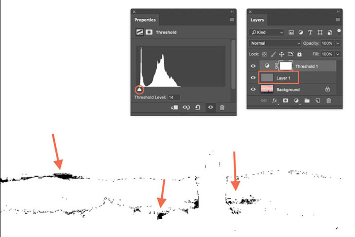
Find black, white and gray pixels in the image
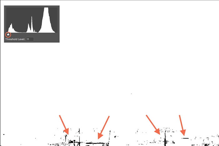
The secret to finding true black, white, and gray is using the Threshold instrument. Add this layer to the top of the Curves, Levels or Exposure setting layer.
Black Pixel: Move the arrow (red circle) in Threshold from the middle to the left until the image is completely white. Then turn the arrow gently (toward the middle) until the blacks appear (red arrows). Check the graph to make sure the pixels are displayed. These pixels are black. Zoom in and sample the black pixel using the Color Sampler tool.
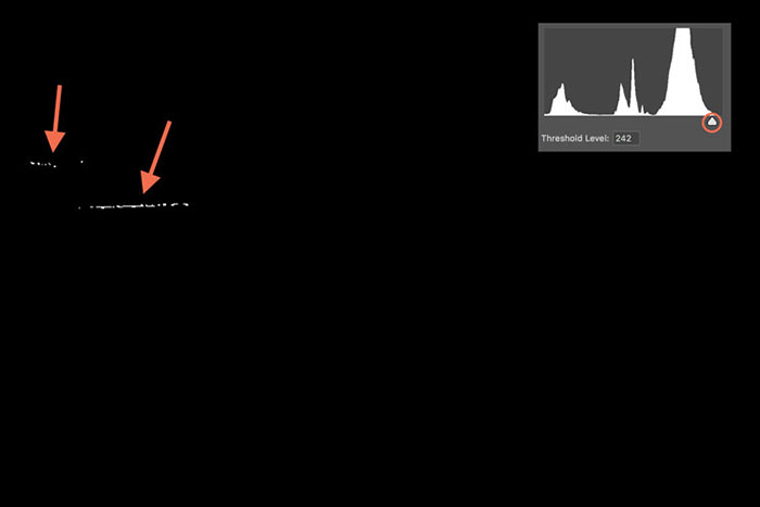
White Pixel: Cut the arrow (red circle) in Threshold from the middle to the right until the image is completely black. Turn the arrow slowly (toward the middle) until white appears (arrow pointer). Check the graph to make sure there are pixels.
These areas are white pixels. Zoom in and use the Color Sampler tool to specify white pixels.
Gray pixels: The steps for finding a gray pixel are similar to finding a black dot. The only difference is that at this point, you need to add a new layer to the top of the image and the Threshold Instant sublayer and fill it with 50% gray. Then change the blend mode to Difference. Move the Threshold arrow to the left and then gently move it to the right until black colors appear. These colors are the same as 50% gray. Zoom in to select a gray pixel with the Color Sampler tool.
You can adjust the white balance or white balance by selecting the black, white and gray pixels. Using the Select tool, click on the Color Sampler tool for black. Repeat for the gray and white dots. This corrects the white balance.
Saturation
Saturation is called intense color. The higher the color saturation, the purer the color. In photography we rarely deal with pure colors; Because in the real world, colors are displayed with different saturation, brightness, and shades. Therefore, the human eye is attracted to more saturated colors, and low saturation indicates greater distance. More saturated colors increase their competition for attention. Here’s how to control the color saturation to improve the depth of the images.
Maximize Saturation
You can change the color saturation of a scene or subject after capturing an image. Polarized filter can improve transparency and color saturation. This filter works well when the camera’s line of sight is perpendicular to the direction of the sunlight.
In the final editing process, Levels and Curves are common tools for applying contrast changes in Photoshop. You can also use Brightness / Contrast, Vibrance or Hue / Saturation. In Lightroom, the Contrast and Clarity settings help adjust the contrast.
What is Clarity and how does it work?
Clarity is not part of color theory, but it is important to know a few things about it. Increasing clarity improves edges, especially in the middle. An edge is usually a place where light faces darkness. In other words, increasing the clarity improves the contrast by darkening the darkness and brightening the light in the middle body. It also gives the image a better look.
Saturation reduction
Saturated colors are not always good for images. Sometimes you can reduce the saturation of selected parts of the image. By doing this, you give a three-dimensional depth and appearance to the two-dimensional image. The natural distribution of color saturation is achieved through fog or dust. In this climate, light is distributed in such a way that color saturation is reduced. In this way, a mysterious or even exciting effect is added to the work.
Selective saturation with mask
Colorful images have many fans; But sometimes overuse of color gives the image an unnatural appearance. To solve this problem, you can change the color saturation of the desired parts of your image. You can use the Adjustment brush in Lightroom or the Hue / Saturation tool in Photoshop with a mask layer to change the saturation in some areas.
But with saturation mask, you will have a more accurate choice. The difference with the saturation mask is that it targets the most saturated areas and creates a softer setting for less saturated areas. In this way, color editing is done seamlessly.
The image below shows the appearance of a saturation mask compared to a luminosity mask. In this image, you can see that sunlight is the most saturated color part of the image.
Saturation mask Adjusts white in more saturated areas. In this image, the sunlight and part of the sky and the background are white.
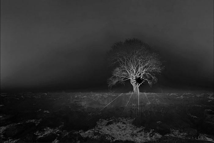
You can find these areas by adding an element layer of saturation along with a saturation mask. In this way, the less saturated areas remain unchanged. Compared to the luminosity mask, which makes the selection based on the brightness of the image. In this example, the sun is a bright region.
How to create a 16-bit Saturation Mask
To create a saturation mask, do the following steps:
- Upload the image in Photoshop.
- Use the Ctrl + J key combination to make a copy of the layer.
- Then go to Filter> Other> HSB / HSL.
- In the window that opens, leave the settings unchanged and press the OK button.
- Go to the Channels panel and select the Green channel. This channel represents the most saturated part of the image.
- Click the Green channel by pressing the control key to select saturation.
- Go to the top layer and select the hue / saturation object from the bottom.
- Now you have a saturation mask.
- Now change the settings in the main saturation layer. In this way, the color saturation changes precisely.
Lightness
Lightness is usually used synonymously with words like luminosity and value. In color theory, brightness and luminosity are two independent definitions. Clearly, the physical experience is the glow of an object. In other words, the degree of darkness or light color depends on it. The brightness of the colors varies in the same brightness.
For example, the main colors red, blue and yellow have 100% brightness; But in terms of brightness, red has 61% brightness, blue has zero% brightness and yellow has 100% brightness. Each color has an inherent brightness and among the colors, yellow has the highest degree of brightness. In general, the human eye is more sensitive to light than to shadows.
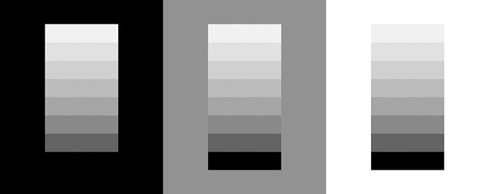
Which of the above images caught your attention the most? Images with a black and white background have the highest contrast, but the eyes are more attracted to the black background. You can apply this principle to get more attention to the subject in the image.
Create depth through saturation and clarity control
Read the scene. Find the source of light. Shadows and shadow areas are usually less saturated. As a result, try to increase the saturation in the light areas. Use Vibrance to saturate matte colors when increasing saturation. In this way you would get a more natural look; But how can color saturation be eliminated?
In Lightroom, use the Adjustment brush to paint in the desired areas. This creates a selection and you can create the desired setting with the Saturation slider. On the other hand, you can create the same effect with the Radial filter.
In Photoshop, one of the easiest ways is to remove saturation globally and mask unwanted areas with a layer mask; But if you want to do it more carefully, try a luminosity mask, zone mask or Color Range. Use these methods to create a selection.
Dodge and burn tool on a layer with 50% gray is another good way to create light and artistic shadow.
In the image on the right, the color is more saturated and everything looks brighter. The difference between light and shadow is not very significant and the image has a uniform appearance.
In the image on the left, saturation and brightness settings were selectively applied using the above methods. The image has become more natural and three-dimensional.
Color, shade and tone
Understanding color, shadow, and tone is even more important for painters who need to control physical colors; But photographers can also use this information. The color, shade and tone of the product are a combination of color with black, white and gray. The use of colors, shadows, and color tones in monochrome images is common, which we will discuss below.
Color harmony
Color harmony is the theory of color composition with the aim of creating a composition that is pleasing to the eye. The Color harmony indicates color balance and integrity. The human brain forms a kind of dynamic balance when distinguishing visual interest and harmonious order. In photography, there is little control over the composition of the colors.
The human eye is usually attracted to colored and bright objects. However, it can control the degree of color harmony. Examining the color harmony gives an interesting perspective on the attractiveness of the photos.
You can use the Adobe Kuler tool to check the colors in images. With this tool, you get clues about different landscapes and their color themes.
Use Adobe Kuler to study image colors
Step 1: Go to the Extract Theme tab, find and select the desired image from the select a file section.
Step 2: The image is analyzed based on five colors in large rectangular boxes. From the Color wheel section, you can see the colors of the photo on the color wheel.
Complementary colors
Complementary colors are opposite in the color wheel. There are three reasons for the popularity of complementary color schemes in the photographer: First of all, the contrast of two colors creates a bold image with clear colors and high contrast; Secondly, complementary colors inherently balance each other; And thirdly, they look good together.
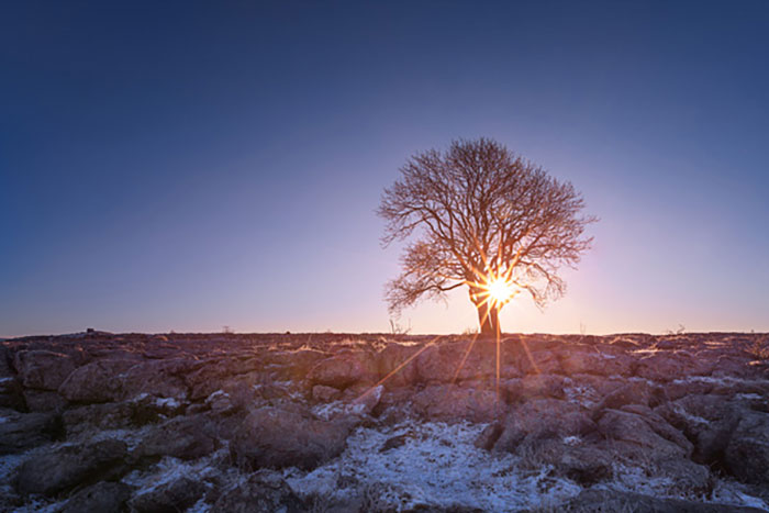
Sunset, for example, is a typical landscape with complementary colors of blue, yellow, and orange. In the final editing step, be careful not to overdo the saturation of the two complementary colors.
Create depth with cool and warm colors
It is better to use cold and warm complementary colors to make the image more effective. In the example above, you can saturate the colors yellow and orange more than blue. The lower the saturation of the blue, the more yellow and orange show.
Triad
A triad is created when three colors in a colored circle have the same spacing. Triad and complementary colors are similar in visual impact: they both evoke a sense of unity and balance. Matte colors are usually better displayed in triad than saturated colors. When the number of color combinations increases, it is best to let one color dominate the other and use a small amount of other colors to draw attention to the competition.
Similar colors
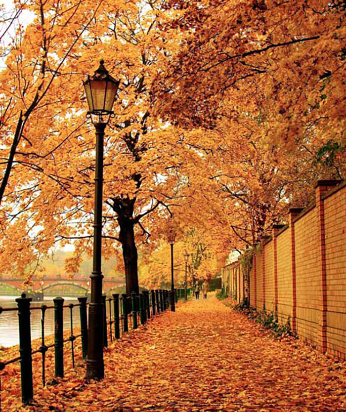
The same color combination has three colors that are next to each other in a color circle. This combination has a high harmony and is usually seen in autumn nature. Similar colors are usually displayed as a connection between the primary colors. The colors of this combination have the same brightness or shine, have no contrast and are less visible than complementary or triad colors.
Monochrome composition
Monochrome is any combination that has only one color with a variety of shades and shades. This type of image can be very effective; Because the subject is usually dominant in the image and at the same time a sense of harmony is induced around it. In recent years, monochrome color combinations have become one of the most widely used combinations in Instagram photography.
Improve images with color grading
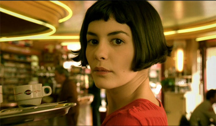
Color grading is the process of improving or changing the color of an image. In photography, this can be done in the final editing stage. Color grading is widely used in the film industry. Take Amelie, for example, where only one specific color is seen throughout the film. The general idea of color grading is to give the film an identity.
With the right color grading, you can strengthen the relationship between the subject and the background and direct the viewer’s attention to the desired point. Color rating is beyond the scope of this article and should be addressed in a separate article.
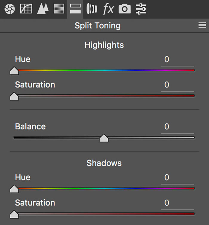
Improve color harmony with split toning
Dividing the image tone involves adding a single color to the shaded and light sections. Dividing tones in Lightroom and Photoshop is easy with ACR. As shown below, you can use Hue and Saturation sliders for Highlights and Shadows. Using Balance you can shift the weight of the changes to shadows or highlights.
In Lightroom you can find Split Toning in the Develp module. In Photoshop, after opening the image, go to Filter> Camera Raw Filter. The Split Toning panel opens as shown above.
Tips on color harmony
- When the image has more than one dominant color, reduce the saturation or brightness to avoid competitive and simultaneous contrast.
- Matte colors perform better on equal terms than saturated colors.
- Try different levels of saturation and brightness in each color to get a deeper image.
- The visual effect is always greater in light colors than in dark colors.
The coexistence of colors
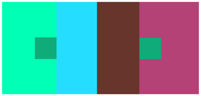
The combination of colors causes the visual effect of the colors to change based on the surrounding colors and take on a different appearance. For example, the two small green squares in the image below have different degrees of brightness (the left is darker than the right); But their color is actually the same.
A color looks different when it comes in contact with different colors. According to this definition, in photography, you can achieve the desired appearance by applying changes in color saturation or background colors, and define the color based on the environment.
Color psychology
Color psychology is dedicated to the study of the effect of color on human behavior. The psychology of color has been extensively studied in marketing and branding. Color affects how people perceive a product and encourages them to buy or not to buy the product. In photography, colors affect the way emotions are conveyed and the work of art is perceived. Color perception is influenced by factors such as culture, geography, religion, time of day, season, gender and many more. Because of this, colors can have different meanings. Here are some messages hidden in the colors:
-
Red: This color is related to concepts such as interest, love, excitement, trust, anger and danger. Red is an emotionally intense color; And it is easily seen even in small quantities. This color also evokes a sense of anger and passion. Red is very effective when used with dark backgrounds. You can use this color sparsely in your image.
-
Pink: Pink is a symbol of young and playful girls and has a feminine quality. It is less intense than red. Pink can be used sparsely because large amounts can be a symbol of weakness and vulnerability.
-
Purple : Purple is an inviting, friendly and soothing color. It has a very similar appearance to pink and often refers to emotional and spiritual balance. Use purple, like pink, sparsely
-
Green: A color associated with nature, growth, success, purity, health and harmony. It is the natural color of nature that conveys a sense of calm and comfort. This dye releases histamine and soft muscle contraction and relieves stress.
-
Turquoise: This color induces emotional balance and peace. The combination of green and water often evokes a sense of calm. Using it can induce a sense of self-centeredness.
-
Blue : The color is associated with calm, space, distance, eternity, masculinity, trust and sadness. Blue color with more saturation and radiance conveys a sense of vitality.
-
The Yellow: It is associated with warmth, radiance, optimism, happiness, wealth and prudence. This color stimulates mental processes in the nervous system; Activates memory and encourages people to communicate. This color with a high level of gloss can surpass the surrounding colors.
-
Purple : The color is associated with aristocracy, wealth, luxury, sophistication, excellence and serenity. This color is rarely seen in nature and is a symbol of magic, mystery and spirituality. Purple evokes a sense of unease and uneasiness and is a favorite color of teenage girls.
-
Orange: Orange is associated with energy, fun, creativity, joy, excitement and adventure. This color stimulates activity, appetite and social communication. Pure orange can indicate a lack of serious mental values and bad taste.
-
Brown: The color is related to the whole, the house, the earth and nature. Commonly used in the food and beverage industries to stimulate taste. Accompanied by green in nature, it is a color with positive relationships.
-
Black: The color is associated with beauty, complexity, status, power, death, night, satanism and Sufism. This color creates strong emotions in people; But too much can be confusing. It induces a mysterious sensation through probability.
-
White: The color is associated with purity, innocence, purity, simplicity, brightness, emptiness and neutrality. White is a symbol of power, domination, peace and surrender. It helps to clear the mind. Encourages people to break down barriers. It cleanses thoughts or deeds.
-
Gray: The color is associated with balance, knowledge, neutrality, boredom and depression. Gray is the most important color in photography. Dark gray can evoke a mysterious feeling and indicates compromise.
Concluding remarks
You can’t learn color theory overnight; But you can digest new information at the same time as your photographic experience and use it in your work. Understanding color and color properties help to draw attention to better image production.
You will definitely improve your photography step by step by learning color theory.