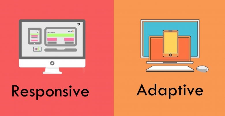
Adaptive Website Design — Tailored Layouts for Optimal Multi-Device Experience
Adaptive and responsive website design are different types of web design methods. As a web designer, if you want to do your job well and achieve the desired results, you must know which website design is right for you. The development and diversity of smartphones have forced website designers to consider the dimensions and size of the phone screen when designing websites. If you are looking to design your website in a way that displays well on different devices, you should choose one of these two templates. In the following, we will learn more about adaptive website design.
What is adaptive website design?
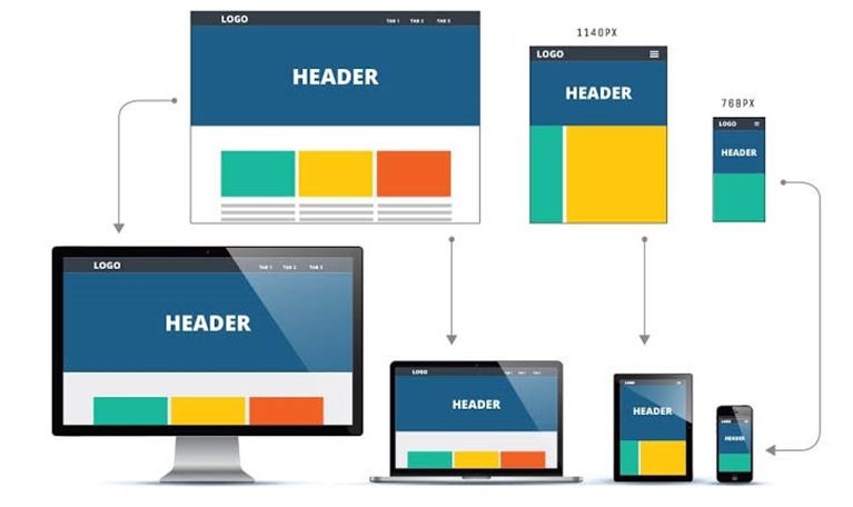
The designer loads several templates in an adaptive website design according to different screen sizes. In this case, the browser is required to identify the features of the user’s device and display the design specific to the desired device. It is essential to know the common width sizes of different display screens for adaptive site design.
One of the websites with adaptive design is Apple, which has almost the same structure on different devices. Although the number of sections of the Apple website is the same on all devices, the way of displaying images and websites on desktop and mobile devices is slightly different. If the Apple website is responsive, the content will be displayed on the page of different visitors based on a specific order.
Some people think that responsive site design creates a poor user experience for users, but this doesn’t seem right. Adaptive website design will allow the designer to use images and other content more accurately. Since company managers tend to control how their website is displayed on different smart devices, website design Adaptation attracts them.
What are the features of the matching website?
The following are the most important features of the comparative site:
- Dealing with multiple layouts of fixed size
- Choosing the most suitable design for the screen after identifying the available free space
- Display the best possible layer of the site on the desktop screen
- Resizing the browser does not affect the design.
- The possibility of differences in the mobile and desktop versions of a comparative site
Advantages of adaptive web design
The following are the most important advantages of adaptive website design:
In adaptive website design, the experience will be optimized for different devices, which plays an important role in the positive user experience of visitors. This site will adjust and deliver the content according to people’s location and connection speed. Designers in adaptive sites can optimize advertisements according to user data on smaller pages.
Other advantages of different websites with adaptive site design include the possibility of reusing sites. In these sites, the designer will not need to return to the design page and code the existing website from scratch. This advantage is of particular importance. Complex websites may be built with old code over time and can’t start from scratch. It will be loaded by itself when downloading the required version on these types of sites. This will increase the page load.
The difference between an adaptive site and a responsive website
If you have no experience in website design, it will be difficult for you to understand the difference between adaptive and responsive website design. In the following, we will compare these two types of website design. In responsive site design, the browser window will be executed correctly for the site visitor.
No doubt people don’t like slow sites. If a site takes more than 2 seconds to load, the user will get bored and upset. Adaptive site design usually has a higher loading speed than responsive sites. Because only the necessary and specific codes of different devices will be transferred, if you view the adaptive site on a high-quality screen, the images will load faster for the user according to the functional screen.
People think responsive website design is more difficult because they will need different layouts for different devices. Suppose you need only one design in responsive design. Therefore, some people believe that it is easier to implement responsive sites. Although responsive website design has only one design for all devices, it requires more effort and time. In responsive design, special attention is paid to the site and CSS to ensure the site’s full functionality in all page sizes.
Google often recommends responsive website design. Mobile websites achieve higher rankings on search engine results pages if adaptive website design may challenge SEO.
Comparison of responsive and adaptive websites in terms of flexibility
Responsive web design is less flexible because a new device with a screen size that is not planned for may destroy your design. In this situation, you will need to edit the old plan or create a new plan. The screen size is constantly changing, creating a lot of variables.
Responsive site design requires less maintenance for a long time. Responsive sites are more flexible, so they perform well if a new device with a different screen size is on the market. Adaptive websites, however, sometimes require maintenance.
Responsive website definition
In the article comparing the advantages and disadvantages of adaptive and reactive websites, it is necessary to define being reactive or responsive. Today, almost all customers request a responsive website. Responsive design means that the performance of the website designer should be based on the user’s behavior, environment (screen size), and the platform they are using.
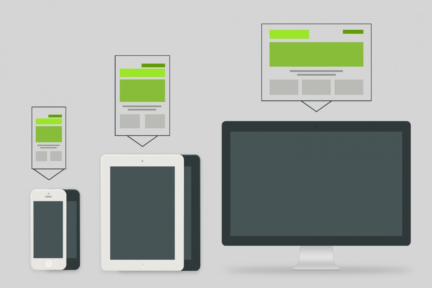
The concept of responsive design can be considered inspired by responsive architecture. In this architecture, a space or room adapts to the number of people present and the event. An example that can be given in this regard is smart glasses. These glasses are the main material for the construction of the space. Still, as the population density increases and they reach a certain level, they become opaque to provide privacy for those in it. New devices with different screen sizes are expanding every day. In each of these display screens, there are different resolutions and orientations.
Responsive website design not only looks good on the desktop but also changes its size dynamically according to the screen on which it is viewed. In this change, the quality of content and other elements will remain unchanged.
Examining the advantages and disadvantages of the adaptive website
One of the advantages of the adaptive site is that it takes less time to load the website page compared to responsive sites. Because in responsive design, the codes are not handpicked according to the type of device. Rather, it is necessary to load all the codes. While in the adaptive design, only the information related to the device used by the user is loaded. How to become a professional web designer? A professional website designer should be able to use adaptive and responsive websites correctly and appropriately. Click on the link to get the answer to this question.
Examining the advantages and disadvantages of a responsive website
An adaptive and responsive site will make the user feel good about being on your website. Because you have considered the needs of the user and the tools they use for web browsing, the site has been optimized according to that. In addition, due to the ease of user access, the range of people who use the services and products offered on your website will increase.
This increase in customers will ultimately increase sales and profits. In addition, the website’s responsiveness makes it load faster on small devices such as mobile phones and tablets. The presence of these things together will improve the site’s ranking in search engines, and the site will receive better SEO.
Maintenance costs are much lower in adaptive and reactive websites. Because, despite the adaptation of the website to various screens, all the necessary changes and uploads are done only on one site. Considering the low cost of maintenance, it can be said that the website’s responsiveness will save time and money.
Even though adaptive and responsive websites have many advantages, there are also disadvantages related to these websites, which are worth paying attention to. First, the development of such websites takes time. Because several devices should be considered in the design process. In addition, sometimes, it isn’t easy to create a website optimized for all devices. The difficulty of the design makes it more expensive for this work.
Also, the website will be harder to navigate on small devices, as more scrolling is required. In addition, sometimes loading pages will take longer due to the increase in the number of codes.
What jobs are the matching website suitable for?
Note that having a responsive and adaptive site is essential for some businesses. But some websites do not have to be adaptive. If the competition in your field is very high, you should create a comparative site. Because in these businesses, the competition is for seconds, and the adaptive website will be better for your business due to fast loading. Shopping websites and websites from which it is possible to download songs and videos are among the most competitive websites.
What jobs are a responsive website suitable for?
A responsive site is suitable and necessary for almost all businesses. Note that in choosing between a reactive and adaptive site, in addition to the type of job, you should also pay attention to the work policies in your job.
If your users use a single device to visit the website, there is no need to pay to optimize the website on other platforms.
Adaptive site or responsive website?
Examining the adaptive and responsive site finally raises the question for the audience: which one is better? Adaptive and responsive sites are both capable of meeting your needs. Therefore, it is up to you to decide in this regard. Of course, it is necessary to consider the advantages and disadvantages mentioned for the responsive and adaptive site in this decision.
Last word
As more new devices enter the market, people will quickly adapt. This makes it difficult to choose between adaptive and responsive web design. Responsive website design will be the best option for you if you are looking for an affordable and convenient way to create a great user experience. Responsive sites require less maintenance in the long run. Of course, it should be noted that adaptive website design also brings great benefits, such as a personalized and targeted user experience. The most important component of determining the website design type is correctly planning and understanding the needs, goals, and available budget.
In recent years, websites did not care about reactivity, while in the new era, mobile friendly is one of the most important features of different websites. Google also gives a positive rating of responsive sites compared to non-responsive sites.
In general, it can be said that the choice between one of these two methods largely depends on your goals and needs. Choose the technique that suits your needs, desires, and resources. Finally, you should seek to hire a web designer familiar with the type of design you want.
FAQ
What is adaptive website design?
Adaptive web design creates multiple fixed layouts for different screen sizes and devices, then detects the user’s device and loads the layout designed for it.
How does adaptive design differ from responsive design?
Adaptive design uses predefined layouts for specific screen widths, while responsive design uses a single flexible layout that automatically adjusts to any screen size.
What are the main benefits of adaptive web design?
Adaptive sites often load faster and deliver device-optimized experiences because they serve only the tailored layout and assets needed for each device.