Bootstrap Responsive Design: What It Is & How to Implement It
When responsive website design is so important to user satisfaction and SEO rankings, it makes perfect sense for front-end developers to create responsive pages using popular frameworks like Bootstrap.
The Bootstrap framework is a complete set of CSS and JavaScript tools and libraries that help developers create pages compatible with all types of devices quickly.
So, if you also want to increase the stability and speed of your work, and instead of focusing on the difficulties of designing responsive pages, it is time to learn Bootstrap.
Of course, by reading this article, you will not understand all the intricacies and details of the Bootstrap system because this framework includes a comprehensive set of files that require more time and effort to learn. But if you’re still a beginner and want to learn more about how this excellent framework works, its features, and how to use it, then you’ve come to the right place:
What is Bootstrap?
Bootstrap is a free and open-source front-end framework that dramatically increases the speed of coding or changing the style of various page elements and is one of the most prominent tools for developing responsive and mobile-friendly websites and web applications. Is known.
If you learn how to use Bootstrap, you no longer need to spend a lot of time writing CSS code because it provides a ready-made set of syntax necessary for designing website templates, using which the process of creating essential elements such as Buttons, forms, navigation, and action fonts is much easier and faster.
In general, the framework provided by Bootstrap makes it possible for programmers to create responsive pages with Bootstrap by filling its various sections with their desired content and more convenient settings of the elements on the page.
Of course, the numerous features of this framework are included to create more attractive and functional pages, which, if you learn them by referring to the Bootstrap documentation and implementing them on your website, will satisfy users more when they use the content of interactive pages. The personalization of your website continues; this is where positive SEO signals flow to search engines, and the potential of your website pages to appear in higher ranks increases.
Of course, if you are thinking about faster page loading speed in addition to responsive website pages and don’t want to lose users due to slow page loading speed, you should also consider getting a powerful server to run your website.
The smartest thing you can do is to know your needs, and after you are sure of them, buy a virtual server because it also provides the resources you need, but at a lower cost! So, if you have decided, you can go to our virtual server purchase page and draw a brighter future for your business with the right choice.
It is better to go back to the main topic. So far, we have understood what Bootstrap is, but it is a review of how Bootstrap works that provides a clearer perspective of this framework:
What exactly does Bootstrap do?
If we want to summarize the function of Bootstrap in one sentence, we should say,” Bootstrap is a framework for building responsive websites. “:
“Website design with Bootstrap has made the dream of responsive design a reality.”
This framework makes the website page or web application adapt to the size and direction of the user’s screen, and there is no need to do things like zooming when viewing the page’s content.
Also, if we want to look at the matter from the aspect of saving time, it is better to proceed with an example:
Suppose you will design a website page about a Python training course. To put together the main elements of this page, you need to use HTML. Of course, you don’t want your page to be book-style and black and white; that’s why you use CSS to style the elements, but if you want to do this faster and are concerned about the screen size, and don’t have the user and page elements, it’s time to go for Bootstrap.
In this way, having the jQuery and Bootstrap files is enough. Then, by referring to the Bootstrap documentation for each element, for example, buttons, choose the appropriate classes and apply them to your code.
We talk about this in detail in the section on how to use Bootstrap, but know that Bootstrap is ready to make many things easier for you; you need to ask.
That is why front-end developers resort to Bootstrap instead of getting stuck in the cycle of building essential site elements, because this framework provides them with everything needed to create a clean and responsive website. And by using ready-made codes, this process can be completed much faster and, of course, with better quality.
Faster website launch, reduced coding workload, improved work stability, and direct control of the elements on the page are the results of using Bootstrap, which, if you go through the whole learning process, you will certainly have more features for more advanced customization of your pages.
Why is the Bootstrap framework so popular in the front-end world?

In this section, we discuss the outstanding features that make this framework attractive:
Easy to learn and use process
One of the most important reasons for the popularity of this framework is its simple structure. In this way, the files are presented in a ready and compiled form that beginner developers can easily use, and professional developers can easily customize and make them as they like.
So, if you already have basic knowledge of HTML, CSS, and JavaScript, using Bootstrap is not a complicated task for you. Of course, let’s say you are thinking of starting a simple and essential website that doesn’t need to customize Bootstrap files; maybe your work will be solved overnight.
But if you have bigger goals and like to customize Bootstrap elements to your liking, you may need more knowledge and time. Overall, Bootstrap will make the impossible possible for you, provided you have a deeper understanding of its capabilities.
Responsive grading system
The Bootstrap system is in the form of a grid and consists of ready-made columns and rows, which frees the developer from the difficulties of building a basic system. With these ready-made columns and rows, all you have to do is add the content inside the containers, and there is no need to insert media queries inside the CSS file.
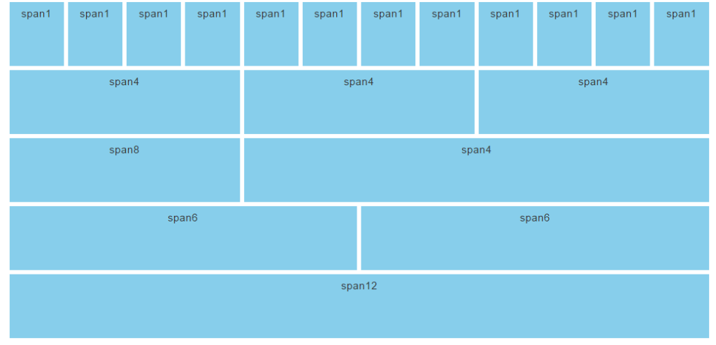
Also, this grid simplifies the data entry process because this framework has many media queries that allow you to define column breakpoints based on your needs.
This grid system has two separate container classes for desktop and mobile-based projects. One is fixed-width, suitable for desktops, and the other is compatible with all screen sizes by providing a full-width container.
In general, if you stick to the default settings of this framework’s Grady system, you will not get hit because your website’s needs will be met with these defaults, and Bootstrap’s containers and media queries will make your site compliant. Set with a viewport.
Responsive images
Images are among the most important parts of websites and web applications that make them look dull, but a fixed-size photo is not suitable for all screens, and you should also think about their responsiveness, which Bootstrap can do well.
Using ready-made HTML and CSS rules, Bootstrap provides ready-made classes such as img-responsive that automatically resize images based on the user’s screen size.
Of course, although changing the size affects the regular appearance, reducing the size of the images is also on the agenda of these classes, which increases the performance and speed of the pages and helps improve the site’s SEO.
If you want to change the images’ shape and fit them inside the page content according to your needs, you can use other classes such as img-circle and img-rounded.
Ability to customize
A beginner developer may meet their needs with ready-made Bootstrap classes, but you will not always have the exact conditions. With some knowledge of CSS, you can customize Bootstrap’s visual elements to your liking.
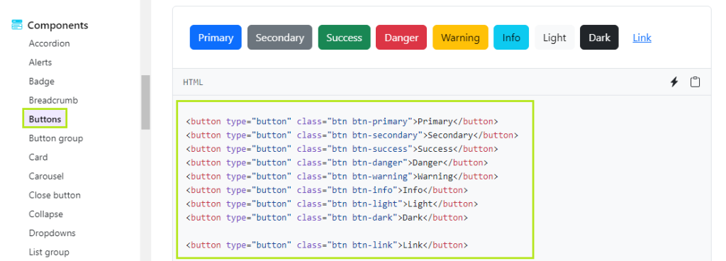
Buttons, navigation bars, menus, and tables are all re-designable, so if you need more information to customize them, don’t worry, because the Bootstrap community is so vast. Many websites provide Bootstrap customization codes for free, and you can take the first steps in this direction using them. CodePen is one of the most popular sites that shares creative ways to customize Bootstrap that you can use to take your Bootstrap project to the next level.
It is worth mentioning that if you have a problem with the size of Bootstrap’s CSS file and think that unnecessary features will slow down the page’s loading speed, the customization feature will still help you.
Go to its download page and select only the features you need for your project. In this case, the File size will be reduced, and the page loading time will be saved.
Compatibility with all browsers
Users can access your website through different browsers, which is a huge advantage that helps reduce bounce rates and increase page rank in search results. Bootstrap gives you this privilege quickly.
This framework uses internal tools that keep the pages stable and error-free, and following the latest trends and requirements of responsive and scalable design makes your website pages compatible with the latest versions of the most popular browsers. Be compatible.
Of course, the arrangement of sliding buttons and page models created with Bootstrap is sometimes limited in popular browsers such as WebKit and Gecko. Still, with all this, compatibility with popular browsers such as Google and Firefox is one of the most critical strengths of Boot. It’s a strap.
Comprehensive and complete documentation
The feature of “easy to learn and use” is thanks to Bootstrap’s comprehensive documentation, which is among its main features.
The Bootstrap documentation includes descriptions and code for each element you can use in your project. You can copy and paste any of them into your project according to your needs.
So, thanks to this documentation, almost anyone can learn Bootstrap and get started as quickly as possible because the explanations for each are convenient and come with their code, which makes it easy for the user to understand why and how to use the desired element.
In addition to Bootstrap’s documentation training, many developers have created templates that speed up the website development process. So, be sure you will not face any shortage while learning this framework because the Bootstrap community is by your side with all its strength.
Bootstrap 5 is the latest version of Bootstrap.
Bootstrap 5 is the latest version of Bootstrap, an excellent framework platform for HTML, CSS, and JavaScript. You don’t have to pay to download and use this platform, and you can use Bootstrap 5 features for free to create responsive sites that are compatible with all types of devices. The essential features of Bootstrap 5 include the following:
- Using vanilla JS instead of jQuery because of higher speed, better performance, and more accessible learning
- Using a Flat style for a more straightforward and modern design
- Compatibility with different devices
- Using rem unit for more accuracy, responsive sizing independent of page size, and compatibility with old browsers.
- Sass support for faster and easier coding and high developability
- Better loading speed due to the use of lightweight files
- Providing a more user-friendly form template with a better user experience
- RTL support and compatibility with right-to-left languages
- Better control and higher flexibility due to benefiting from a more advanced network
- Support for new components with a better user interface
What is the structure of the Bootstrap framework?

Now that we’ve taken an overview of Bootstrap, it’s time to get into the details.
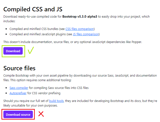
If you want to learn Bootstrap, the first step is to install this framework. If you are starting and don’t think about customizing the components, it is better to ignore the source code version and go to the Bootstrap site and download the compiled version.
When you open the compressed file, you will see two folders, CSS and JS, each of which has its own structure:
CSS:
CSS folder files manage the layout of website pages. When HTML specifies a website’s content and structure, CSS does the styling work.
The functions related to this folder help the developer to adjust the appearance of pages, tables, or… more quickly.
For the structure of the whole page, refer to the website page to Bootstrap.css, and apply the necessary changes in the CSS file itself.
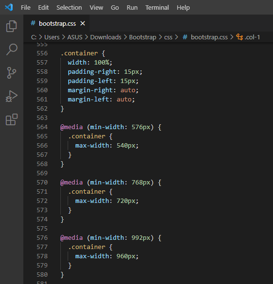
In general, the files in this section are your cheat sheet, and you can use them to determine the style of the grid structure, tables, images, and other elements on the page.
JS:
The files in this folder are responsible for the website’s interaction, so they are considered one of the most essential parts.
Developers use the jQuery library to avoid repeating JavaScript syntax and many tasks related to website development, such as creating widgets, creating custom CSS animations, and generally adding dynamic website interactivity. Go ahead with this library.
Although Bootstrap works well with CSS and HTML features, it needs jQuery to make a website look monotonous and static.
How to use Bootstrap in your project?
In general, there are two ways to use Bootstrap:
Download the Bootstrap framework
In this method, you download the Bootstrap file and use the CSS and JS files inside it.
You must call the desired file as follows in the Head section of the HTML file of the page:
<head>
<meta charset="utf-8"> <meta name="viewport" content="width=device-width, initial-scale=1">
<!-- Bootstrap CSS library -->
<link rel="stylesheet" type="text/css" href="css/bootstrap.min.css">
</head>
This library you have imported has different classes you can apply to style the elements inside the page according to your needs.
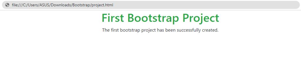
For example, in the example below, we have used the text-center class to create a div in the central part of the page, and the text-success class to determine the color (green) and size of the title, and named the file project, along with the JS folders. And we put CSS inside a folder called Bootstrap.
<!DOCTYPE html>
<html lang=”en”>
<head>
<meta charset=”utf-8″>
<meta name=”viewport.”
content=”width=device-width, initial-scale=1″>

<!– Bootstrap CSS library –>
<link rel=”stylesheet”
type=”text/CSS.”
href=”css/bootstrap.min.css”>
</head>
<body>
<div class=”container text-center”>
<!– Text color class used –>
<h1 class=”text-success”>First Bootstrap Project</h1>
<p>The first bootstrap project has been successfully created.</p>
</div>
</body>
</html>
This page will be as follows:
Of course, here, we only used the CSS library for styling, and if you want to use the JS library, you need to add two more lines to the code.
<!-- jQuery library -->

<script src="https://ajax.googleapis.com/ajax/libs/jquery/1.11.3/jquery.min.js"></script>

<!-- JavaScript library -->

<script src="js/bootstrap.min.js"></script>
Elements such as toggle buttons or sliders require JavaScript, and if you want to use these elements, you must first import the jQuery library and then call the JavaScript library.
2. Using a CDN
If you don’t want to download the bootstrap file and like to call the libraries using links, this method suits you.
In the CDN method, the desired library is downloaded from the nearest server so that accessing and displaying the page is done at a higher speed, which can benefit user satisfaction.
In this method, it is enough to find the link of the desired libraries on sites such as BootstrapCDN and put it in the Head part of the HTML file of the page as follows:
<!-- Latest compiled and minified CSS -->
<link rel="stylesheet" href="https://maxcdn.bootstrapcdn.com/bootstrap/3.4.1/css/bootstrap.min.css">

<!-- jQuery library -->
<script src="https://ajax.googleapis.com/ajax/libs/jquery/3.6.4/jquery.min.js"></script>

<!-- Latest compiled JavaScript -->
<script src="https://maxcdn.bootstrapcdn.com/bootstrap/3.4.1/js/bootstrap.min.js"></script >
So, if we want to implement the previous project with CDNs, its source code will be as follows:
<!DOCTYPE html>
<html lang="en">

<head>
    <meta charset="utf-8">
    <meta name="viewport"
          content="width=device-width, initial-scale=1">

    <!-- Latest compiled and minified CSS -->
<link rel="stylesheet" href="https://maxcdn.bootstrapcdn.com/bootstrap/3.4.1/css/bootstrap.min.css">

<!-- jQuery library -->
<script src="https://ajax.googleapis.com/ajax/libs/jquery/3.6.4/jquery.min.js"></script>

<!-- Latest compiled JavaScript -->
<script src="https://maxcdn.bootstrapcdn.com/bootstrap/3.4.1/js/bootstrap.min.js"></scvs
</head>

<body>
    <div class="container text-center">
        <!-- Text color class used -->
        <h1 class="text-success">First Bootstrap Project (CDN)</h1>
        <p>The first bootstrap project has been successfully created.</p>
    </div>
</body>

</html>
The page will be as follows:
This section is only for basic training on how to use the Bootstrap framework. It’s your turn to take advantage of the power of this framework as it deserves by creating unique pages.
How to start learning Bootstrap?
Before you think about Bootstrap, you must first understand the prerequisites of this framework.
This framework is not going to work miracles! Instead, it has been developed as a ready-made toolbox to simplify the front-end design of websites and web applications. So, first, you should learn the leading website design languages, HTML, CSS, and JavaScript, to a suitable level to have the confidence and knowledge necessary to start learning this framework.
Of course, it is worth pointing out that this framework is suitable for front-end design, and programmers working in the back-end field do not need it. So, if you are involved in front-end or full-stack website or web application programming, you should seek to learn this framework.
If you want to learn Bootstrap, several ways are ahead of you. Bootstrap’s documentation is a great place to start. If you know the basic principles but are looking for more experience and skills, it is better to participate in online or face-to-face training courses on this framework. It is essential to learn how to implement and customize various elements of Bootstrap by testing its multiple features and making the best designs according to the needs of your website.
The duration of learning this framework depends on your talent and abilities. If you are a professional developer, you can know and use Bootstrap in a few weeks.
If you are a beginner programmer and are not well-versed in programming languages, your self-learning process can be a bit longer and frustrating. In general, if you are new to programming and want to take more solid steps in this direction, it is better to participate in training courses and internships to advance your learning process under the supervision of experienced people.
Conclusion
Bootstrap is one of the most popular frameworks in the field of website design, which has made things easier for front-end programmers. Essential features such as ease of use, comprehensive documentation, and a solid support community have made all programmers more motivated and confident to learn this framework. Now is your turn!
FAQ
What does “responsive design” mean in Bootstrap?
It means layouts automatically adjust to different screen sizes using Bootstrap’s grid and breakpoints.
How do you make a layout responsive with Bootstrap?
Use container classes, rows, and column classes (e.g. col-sm-6, col-md-4) to define how content behaves at various screen widths.
What are Bootstrap’s breakpoints?
Bootstrap defines different viewport ranges (e.g. sm, md, lg, xl) to trigger layout changes at set widths.