How to test your Site with Google Lighthouse?
How to test your Site with Google Lighthouse?
By doing this test, you can benchmark your site from many aspects that cover almost everything and see how successful your site designer was in complying with professional principles and implementing standards.
You read in this article
1. Open Google Chrome in an incognito window
2. Enable the DevTools environment
3. Go to the Lighthouse tab
4. Hit the Analyze page load button
5. View the test result
Conclusion
In this article and training, the main goal is to learn how to measure the site’s speed without any extra organization and explanation and test any place you want without any tools. This tutorial is only about getting the results and scores of the site by Google Lighthouse. If you don’t have any information about this tool and this test, you can read the introduction article of Google Lighthouse and then proceed to this tutorial.
To learn how to test the speed and Performance of the first site, you need to know and observe a few points, which I will try to point out very briefly and quickly.
First, I must say that this test is done by the Google Chrome browser, a proprietary browser made by Google. Ta tool in the browser is embedded in the DevTools section, which we will use later. We get to know him. So you only need the Kerpak browser and be connected to the Internet; you don’t need anything else.
1. Open Google Chrome in an incognito window

You have to open your browser and open the site you want to take a speed test from. Usually, this test is taken from the main page of each website, but it is not harmful to know that this test is not applied to the entire website and it checks every page you open on its own, and you have this option, for example, a product list page. Open the site and follow the test. So, to get a complete understanding of this operation, open the first page of the website you want
The website’s main page can be a general test of the site because it is usually the heaviest page, and the facilities and elements placed on the main page are always like the extensive section at the top of the area known as Hero and the other regions and neighborhoods. Those with a rotating slider at the bottom are mostly seen on the main page, so testing from the main page is more logical than any other page.-
There is also a relatively important issue that you should keep in mind: some extensions installed on your browser may not affect this test and may have adverse effects on the numbers you receive. Still, there is a solution that you can use in an isolated environment. Take your difficulty without the impact of these extensions. Just open a new window called Incognito window created by Google and start testing as an anonymous person without login.
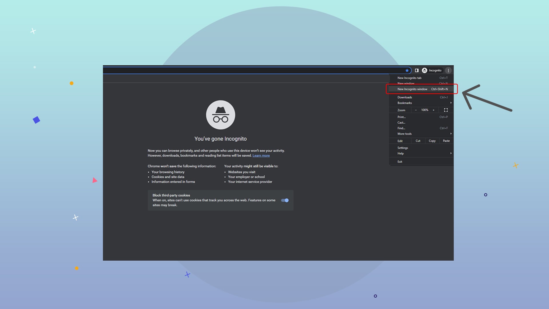
To open the site in an anonymous or private environment, click on the three dots icon at the top of the browser and select the New incognito window from the opened menu.
2. Enable the DevTools environment

Your browser is generally used for browsing the web and visiting the sites you efficiently use daily. But there is a hidden section in the Chrome browser called DevTools and an environment for more specialized work for programmers and website designers, which provides a few more features to the user to enable some additional codes and operations during loading. The page and testing of some principles and many other things are placed in this section that you have nothing to do with and only need a special quote called Lighthouse.
To see this section or Windows related to Developer Tools, you have three ways to do any of them, you will reach this environment, and I will tell you all three methods:
1. Hit the three dots on the top of the browser and open the More Tools menu and select the Developer Tools sub-menu
2. Open the desired site, right-click on the part of that site, and select the Inspect option, which is the last option from this menu
3. By pressing the F12 key on the keyboard, the DevTools section will appear
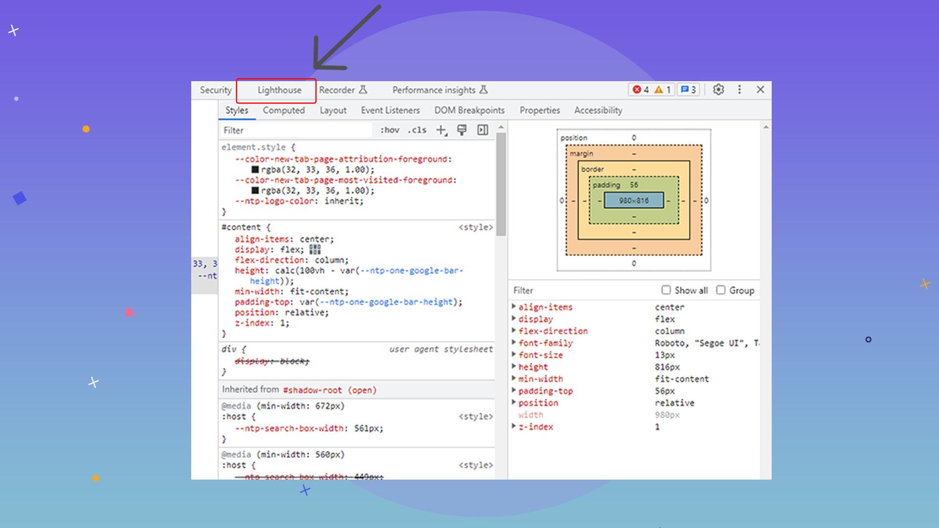
All ree paths above will lead to the same thing: to see more settings called the development environment, which includes various tabs, each of which does a specific job, and one of these is the Goga Lighthouse that we need.
3. Go to the Lighthouse tab

When you activate the DevTools environment, or in other words, you open the tabs related to development, you will see that there are many sections such as Console, Network, Element, Source, and a few others that may not be visible to you in the initial view of Lighthouse and should be in At the end of these tabs, press the >> sign and you can see more bills that exist and cannot be seen, and choose the Lighthouse option among them.
By finding, selecting, and opening the Lighthouse tab, you are 99% on the right track and only need one more click to get the test result. There is another tab in the same path called Performance, maybe its name misleads you, but we have nothing to do with that tab, and it is used for other work, so look for Lighthouse directly and select it.
4. Hit the Analyze page load button

Suppose you have done all the steps correctly in the tab you activated. In that case, there is a blue button that you should easily see, the title of which is the Analyze page load button, and you can press that button without manipulating the other existing settings. Wait for a thorough review from the browser side and receive the result.
The settings and options you see there may be needed to receive the test in other situations, but you will not see any changes and accept the same default settings and trust Google. The only option that might be useful for you is the option related to Device, which performs this test separately for desktop and mobile.
On the other hand, as it has been said everywhere and consistently that most of the entries of any site are made from mobile, you should also pay more attention to the results ready for mobile and consider mobile as the default, which usually has a low score in the speed test for mobile. It takes three, but we think the exact mobile test base because it is more important.
5. View the test result

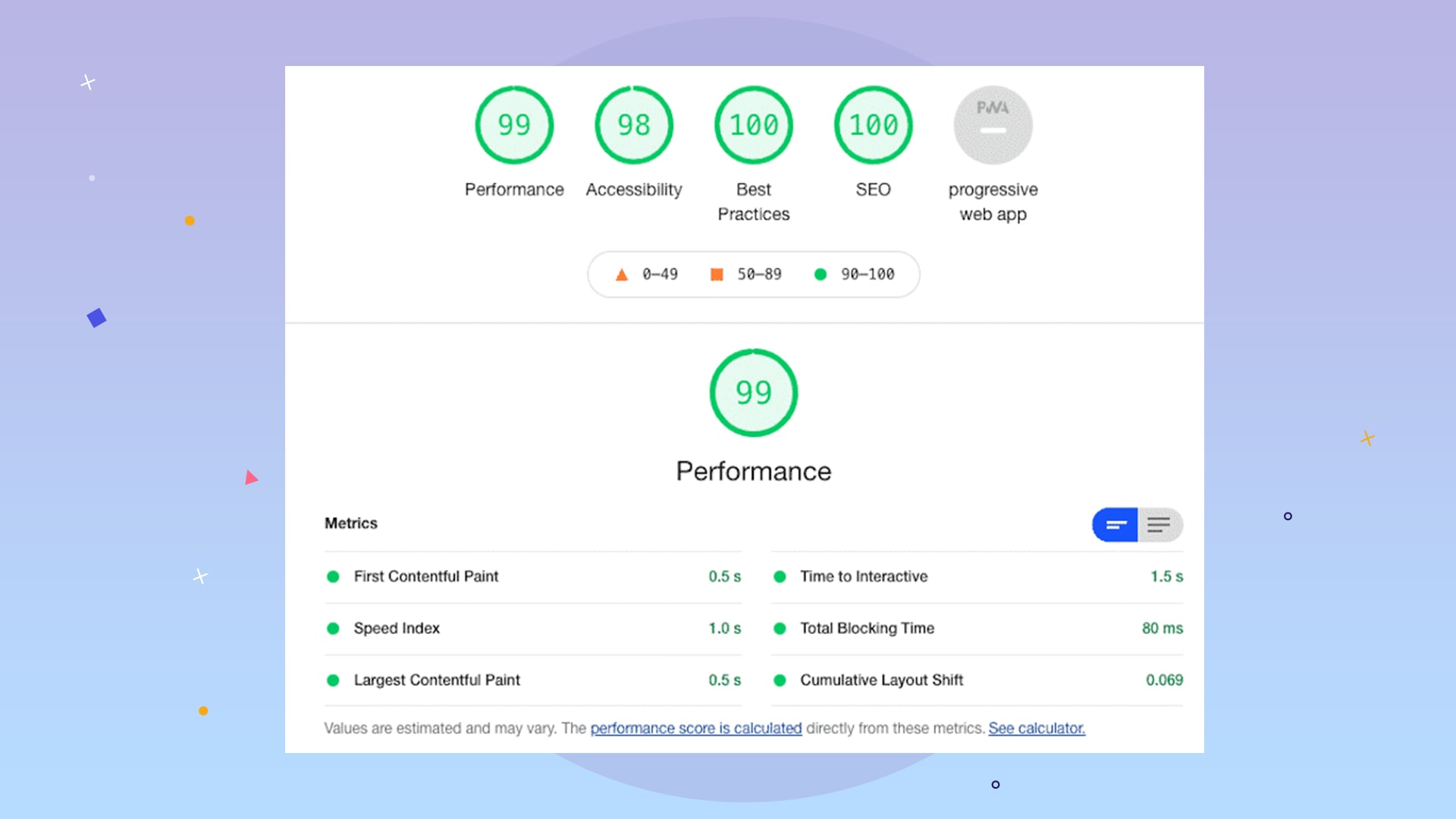
You need to wait about a minute or less until the desired Google analysis is done in the Lighthouse tool and the result is displayed. These results include five circles, listed in 5 separate categories for you, vast and clear at the top of your test. I will review these five sections in a very general and quick manner so that you know these categories as much as possible.
Performance test
The performance section is the most important result you should seek to increase; in other words, the real value of this test is in this section. The Performance section deals with the most complex operations and processes on the site during loading, and it pays attention to many issues in a very, very precise manner and within milliseconds, which every company and person can improve and work to raise this score. no
Most of the websites are in the range of 50-60, which are displayed in orange color. If your score is between 50 and 90, orange means it Needs improvement, and you should try to improve. Of course, your effort is useless if you are not a website designer, and this part should be wholly requested by the company that designed the website for you.
A score above 90, which we get a green score from Google, in your first circle, i.e., Performance, requires heavy expenses, and few people or teams can achieve a green score from Google.
For example, how long the user needs to wait and be able to work interactively with the site. It must have happened to you that you opened a place, and after clicking on the menu, nothing happened, and after a few seconds, the menu can be connected; this is the same time as Time to Interactive when you need to wait until the details are loaded, and the site becomes interactive.
Many other cases, such as Total Blocking Time, which are scripts that keep the page loaded and force the user to wait until these scripts are loaded, or Cumulative Layout Shift, which are appearance and content jumps during loading, for example, during At first, nothing can be seen. After the elements inside the page are loaded, they are thrown down until the top items are displayed, which is very important in this section.
There are a lot of small tests, 3 of which were only mentioned above, and the results of all these tests together, which are related to the coding, architecture, and technologies of your site, which are entirely the responsibility of your site designer company, and are complicated. Many things need to be improved, and they cannot be easily fixed and passed.
Accessibility test
Accessibility may not be familiar to you, and some standards are determined by some consortia so that websites or any other devices in the field of technology must be designed and built for all people, including those with disabilities. They are usable.
For example, for people who are color blind and cannot distinguish the difference between the colors of the text and the background, the color scheme should be such that the reader is placed on a contrasting background, or even for blind people, it should be usable in certain sections with the standard. There are pre-defined explanations so a blind person can understand the site’s buttons by voice.
Straightforwardly, if the shopping cart button is not defined behind the scenes and coding, a blind person will never be able to open it, but if these standards are met, the devices can read it for that person.
The accessibility section or web accessibility can be adjusted in straightforward and ordinary ways, and lowering this score will not be painful and expensive for you.
Best practice testing
There is a concept called Best Practice in the world of programming, which is even used in other industries, and it is called the best way to do any work, and problems that have many ways to be solved, and some elders already have particular and precise methods. It would help if you did what they recommended, did not reinvent the wheel yourself, and paid attention to them to get the best result.
I want to give some widespread and straightforward examples of these methods; we can point out that the length and width ratio of the image must be respected, that a photo should not be stretched on the site, which has come from the width or height and has deformed its content. Or, more quickly, if you leave a photo with a shallow resolution and the pixels are marked and low quality, you do not follow the best practices. Another particular and common thing is that your site must be loaded as HTTPS for the user, and a place in http mode is vulnerable, which is also considered as not complying with this parameter.
SEO test
We have reached the sweet topic of SEO. This score, shown to you under the title of SEO, checks things such as the existence of basic requirements and needs of the website. For example, does your website have a title or Meta Title? If you put a photo on the page, did you write enough description or Alt tag for that photo? Do you have a broken link on the page that leads the user to an error or a link on the page that does nothing and is boring?
As you understand, these things have nothing to do with the design of your site and inf, restructure, and technical structure of your site, and in general, SEO does not check the site’s infrastructure, so feel free to read and fix these reports and bugs case by case. You can also make this circle green and even reach 100 points.
PWA testing
The only tab that is off and inactive for you and most of the results, and there is no need to worry, is PWA or Progressive Web App, which is translated as “progressive web application,” and every site is not used as an application at all, and there is no need. It doesn’t have to be. You probably entered sites that ask you to add the site as Add to the home screen, which is added to your mobile like an application, PWA. I think it isn possible that the review of this section will be removed from the Lighthouse standards because it is not general and does not apply to all sites.
Of course, this section is evaluated separately, and sites that are not PWA and do not have application mode will not be negatively affected by this test and will be displayed as gray and inactive. So don’t worry; ignore this whole section and skip it.
Conclusion
All these points are essential; you should try to make all four circles green. There is a subtle point that if you pay attention to it, it can be very profitable and fruitful to pay special attention to the first circle, the Performance section, because it is practically the only thing beyond your control. You cannot do it without a little study and Time. Research about it to raise this score. Other parts will approach 100 with a bit of patience.

