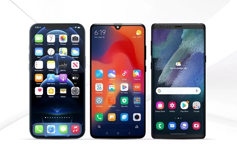
Compare Popular Android And ios User Interfaces On Smartphones
In This Article, We Will Compare The Three User Interfaces Of Samsung (One UI), Xiaomi (MIUI), And iPhone (ios) Phones And Examine Their Differences In Appearance.
In the article comparing Android and iOS, we explained the differences between these two operating systems in terms of functionality. We said that each of them has different views on its target users and meets the needs of users in unique ways, and in the end, it concludes that neither There is no absolute superiority and each user must choose one based on their preferences.
Although the fundamental differences between the two operating systems are so significant that they can not be compared in all respects, when it comes to the graphical interface, there are similarities between the Android and iOS operating systems.
On the other hand, Android does not have a single graphical interface like iOS. Because different manufacturers market their phones based on this operating system, they change their default interface and implement their skin, so Android comes in various forms in smartphones.
The critical point here is that Android has a lot of potential in personalization and user interface. In such a way, almost all the essential parts of the user interface can change in terms of the appearance and arrangement of different elements, and it can be said that there is no limit.
Therefore, each user can customize from zero to one hundred user interfaces according to their taste. There is no resemblance between the device’s default and personalized appearance.
But the personalization capabilities in iOS are not as extensive and diverse as in Android. In Android, even if the operating system itself does not allow changing items such as the quick settings panel, lock screen, task view, some applications can replace the default interface elements and change the phone’s appearance entirely through the accesses provided by Android.
However, the default user interface of phones such as Samsung and Xiaomi has unique features and design principles that guide users’ choices when buying a phone regardless of personal taste.
Therefore, in the following article, we will examine and compare the main parts of the two most popular Android user interfaces and the user interface of the iOS operating system, which the user deals with most during the day.
Lock screen
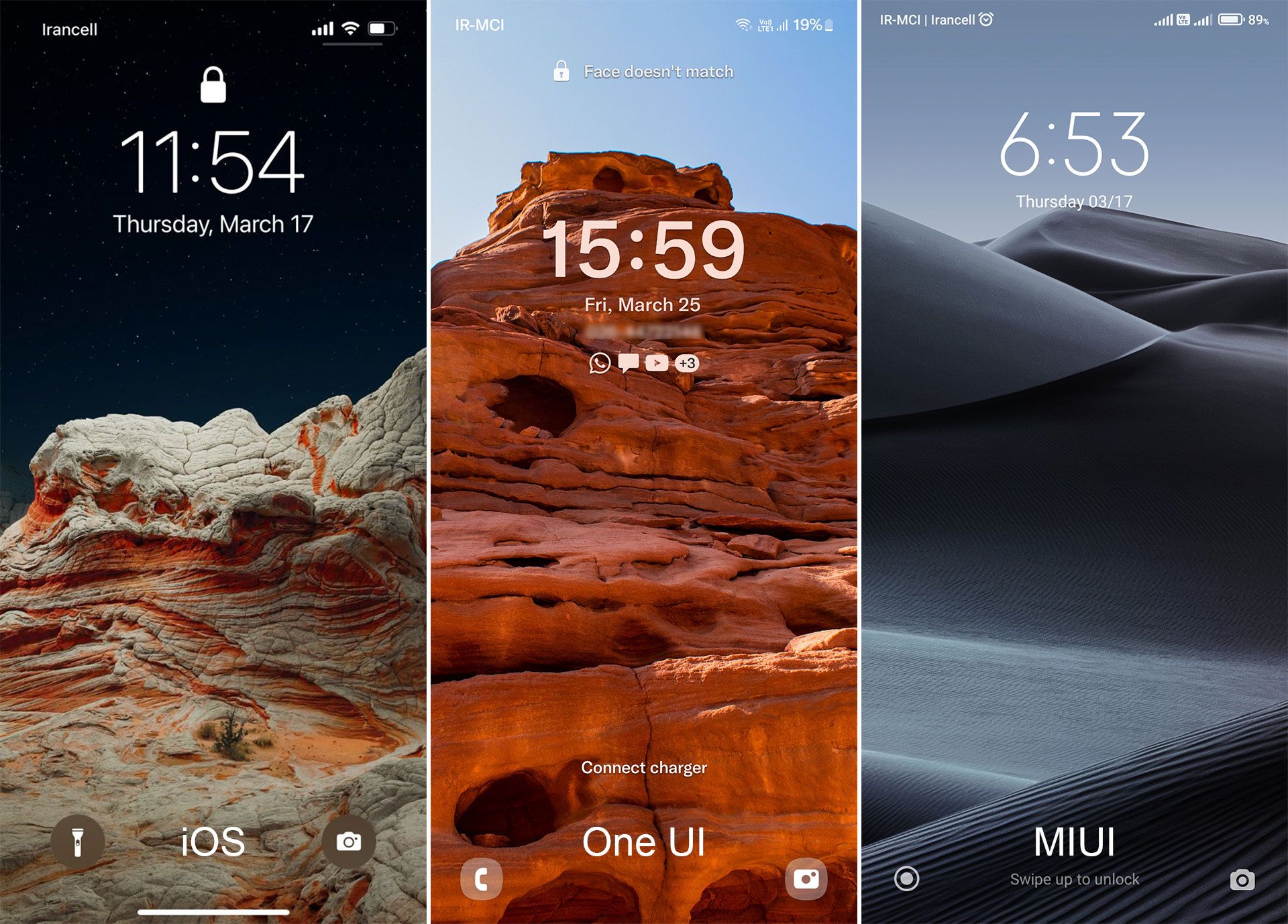
If we want to start the comparison with the first thing we encounter when turning on the screen, we must compare the lock screen. In the One UI lock screen, it is possible to change the clock style and add application widgets to the user’s choice, so you do not need to unlock the screen to view the information of the selected devices. You can also access the two most commonly used apps directly via the sidebar shortcuts, which can change the type of app.
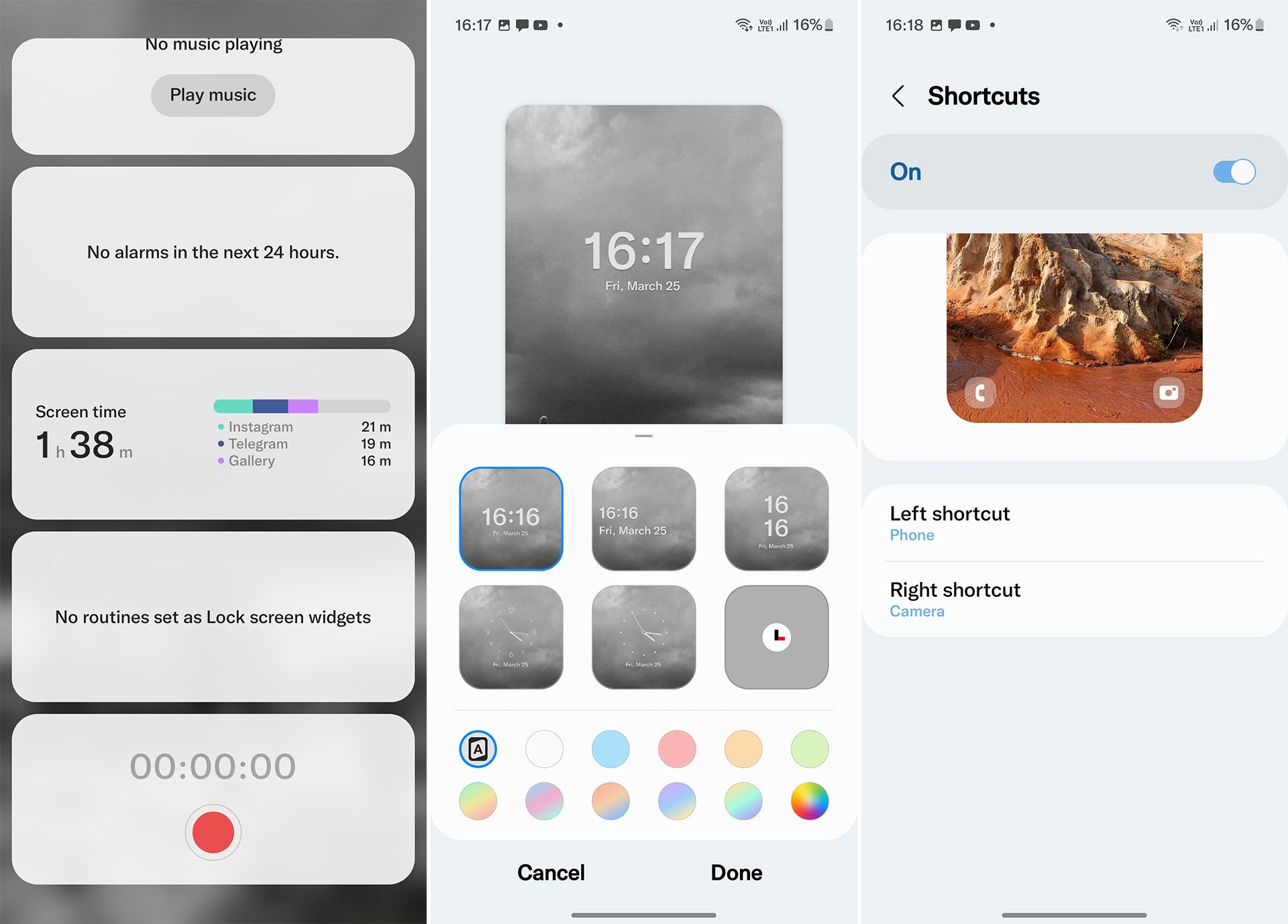
But on iOS, you can only change the background image of the lock screen, access the camera, and turn on the flashlight. Also, there are no lock screen widgets and customizable shortcuts in the MIUI user interface, which essentially takes advantage of iOS design principles.
The right shortcut accesses the camera, and the left shortcut only accesses some of Xiaomi’s default services such as news feed, remote control, and intelligent device management. However, there are two commonalities between MIUI and One UI: the possibility of changing the clock style and the ability to live and changeable wallpapers (Dynamic).
Main Page
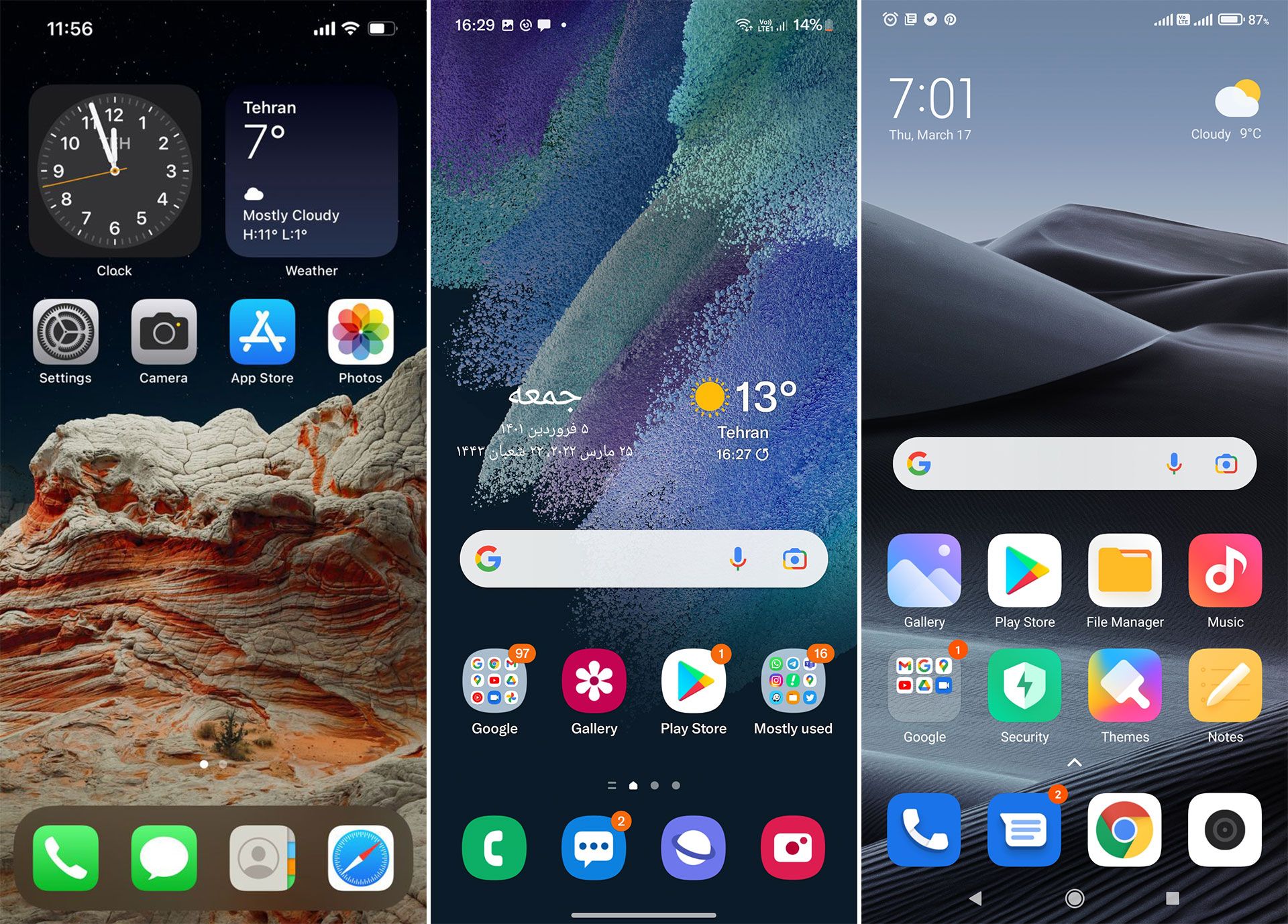 Before iOS 14, the home screen of iPhones consisted of only three main sections. The first part of the application page, where it was not possible to move the application icons freely and create a separate space outside the list of applications, the second part of the bottom of the page, which is called Dock and could not pin more than four applications, and a part called Spotlight. Swipe down to act as a search engine.
Fortunately, after the release of newer versions, Apple added more features such as widgets and the ability to create blank pages and customize application icons and closed the central gap between Android and iOS.
MIUI and One UI are not much different from the iPhone in this respect. However, the layout of the main pages of the two Android UIs can adjust to be a separate application page from the main screen, and widgets and application icons can place freely anywhere on the net. But this is still not possible on iOS.
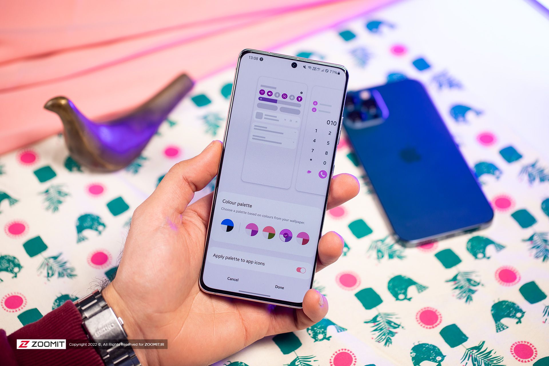
In terms of personalization, MIUI and One UI still appear more flexible and complete than iOS.
Samsung in 4 One UI, adding a dynamic theme feature to personalize the home screen, allows users to change the color theme of their phone based on the selected background. Thus, the colors of the icons will be based on the defined color palette according to the wallpaper. This feature is not currently available on MIUI, but as promised, it will also add to Xiaomi handsets.
The most significant potential of One UI and MIUI in the field of home personalization is to use a section called Themes (Themes and Galaxy Themes), which has an extensive and varied range of different themes by changing the color, symbol, and shape of icons, menus, and wallpapers, fonts And even applies the sound theme to any part of the system.
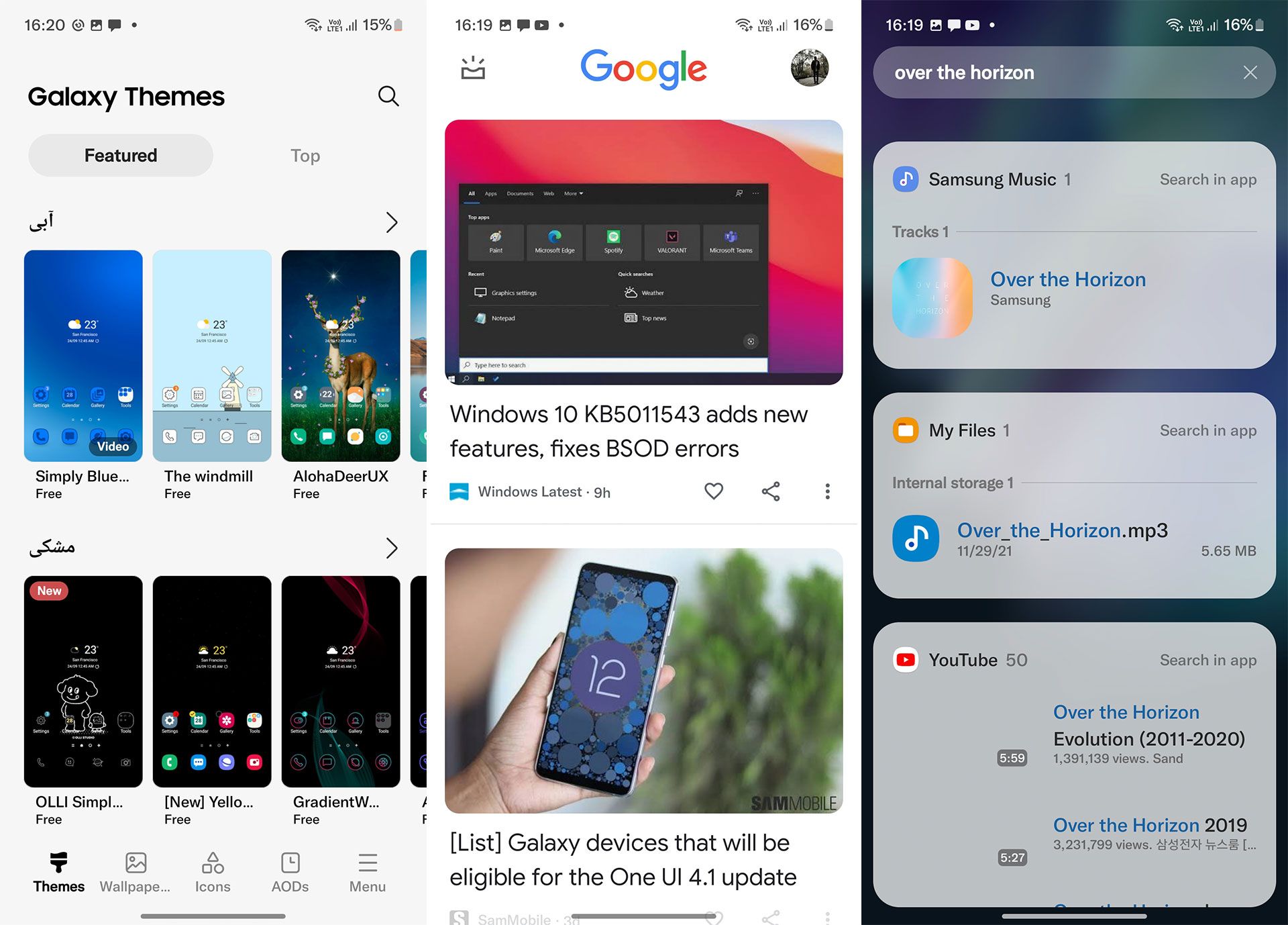
Both Android-based user interfaces have been equipped with a Google news feed page. It is also possible to search for the same Spotlight feature on the iPhone in the One UI and search for the desired keywords (for example, the name of a file or contact) in the default Samsung applications and some Google applications, the selected content can find.
View recent tasks or schedules
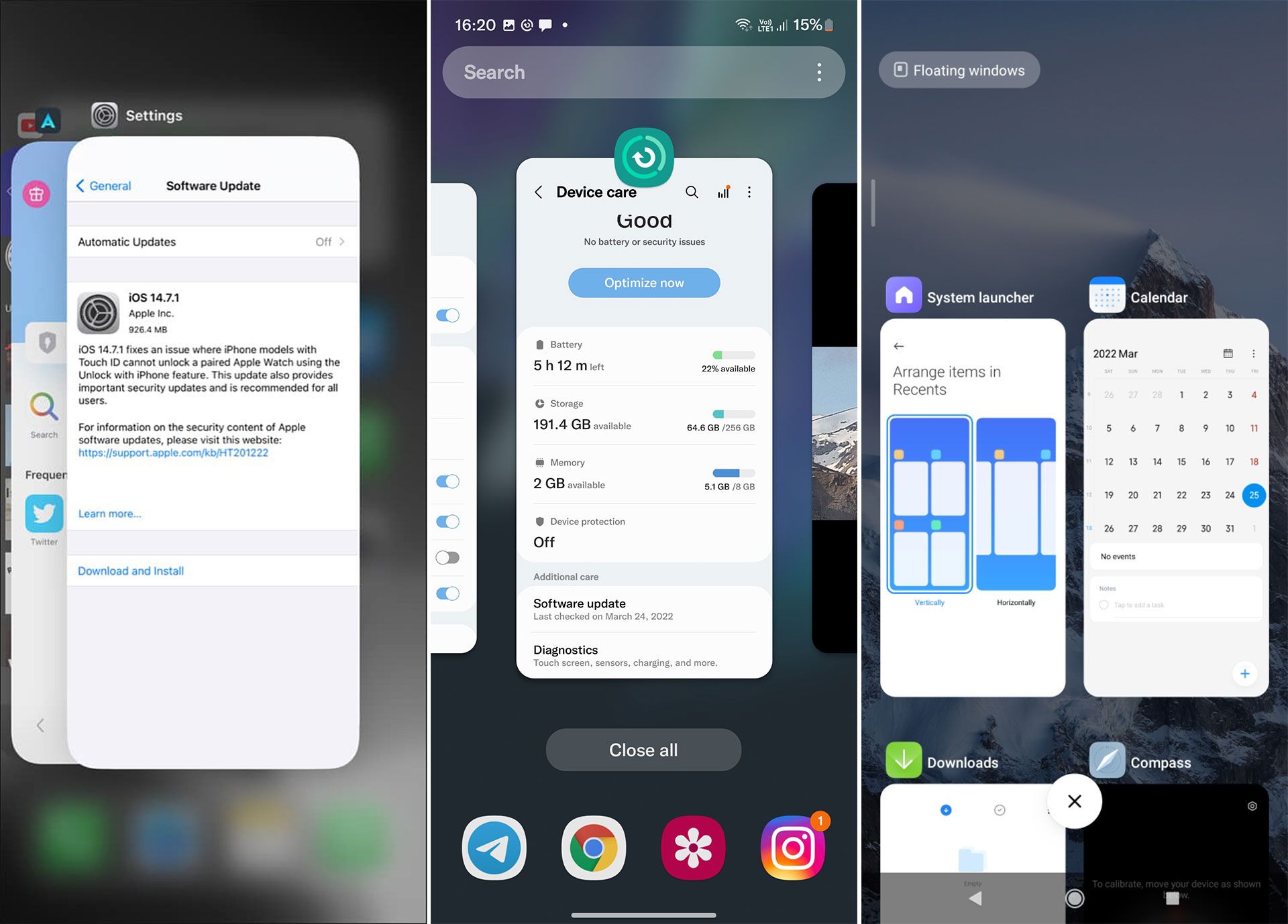
All user interfaces are equipped with a section called Recent app. When you open different apps, they do not close when you return to the main screen, and you often need to switch quickly between the two apps. Recent applications view these two tasks and are one of the most critical components of the user interface.
This menu has not changed in iOS for a long time, and one of its weaknesses compared to Android user interfaces is that it does not have the option to close all applications.
While the two user interfaces, MIUI and One UI, have been able to do this from the beginning until now.
The iPhone’s recent view menu offers almost no special features other than switching between apps and closing them. Still, there are beneficial features in the two Android user interfaces, one of which is to run two apps simultaneously by splitting the page into two or possible. Run multiple programs in the form of floating windows with the ability to resize. In addition, you can pin the desired applications so that they do not close when all applications are closed.
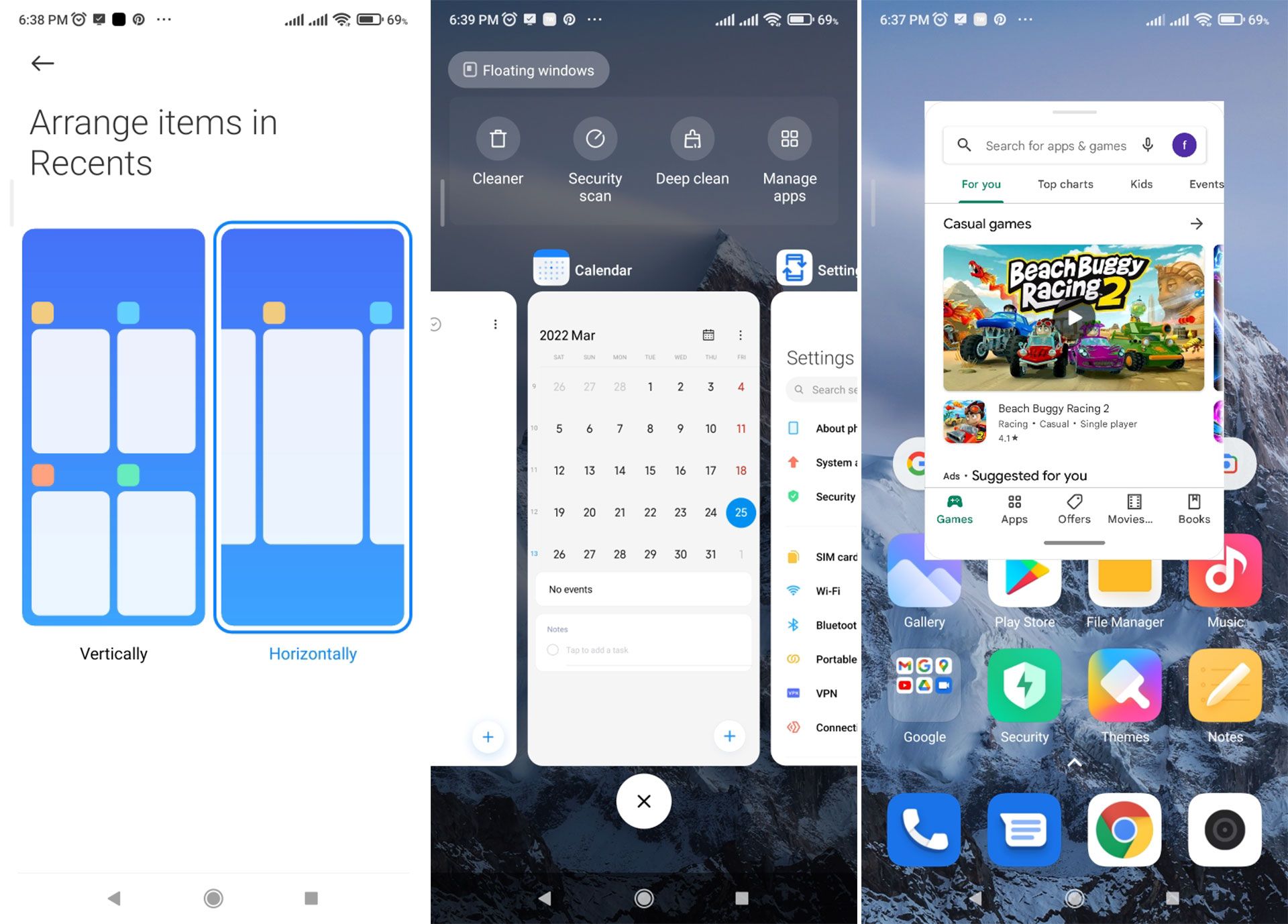
Xiaomi phones can customize this menu, and the layout can change vertically or horizontally. This personalization is not available by default on Samsung phones. Still, with the help of a program from the Goodluck family, this menu personalizes in various ways, which we will discuss in more detail in the future.
One of the advantages of the One UI in a multitasking interface is the ability to drag and drop content between some applications. Although this possibility is more prominent in tablets and large screens; However, you can use it between Samsung’s default apps and some other apps that support this feature.
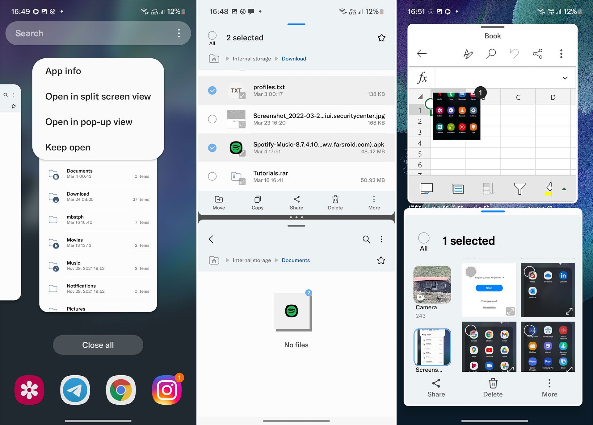
Thanks to integrating the One UI user interface with Microsoft services and applications, it is possible in Word or Excel applications to transfer text or image content from the phone or gallery file manager to these applications by dragging and dropping. You can also create two separate windows from some programs, such as a browser or file manager, and move your files between them this way.
Quick settings panel and notifications
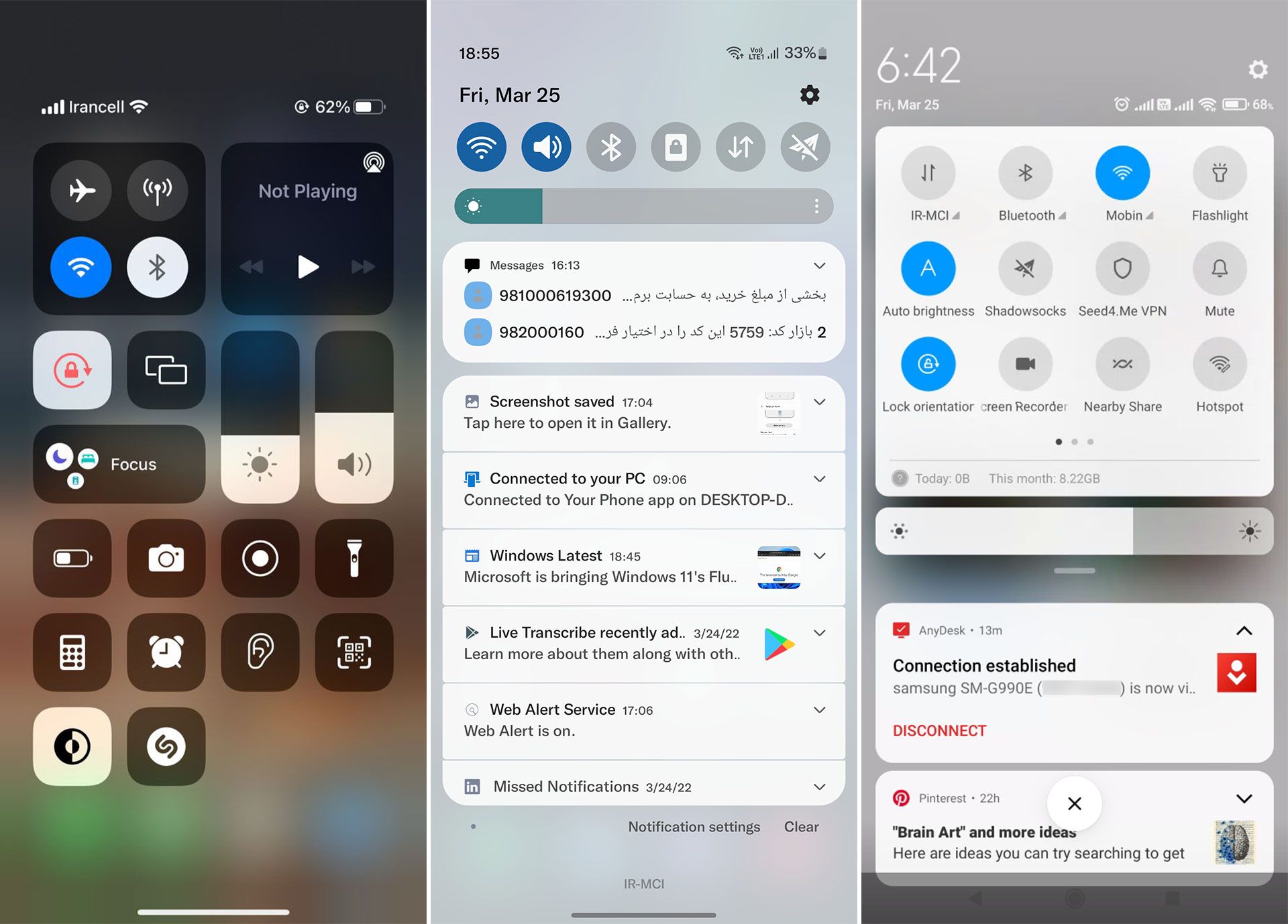
Another essential part of the user interface is the quick settings panel and notifications. This section was dedicated only to receiving messages in the early versions of all operating systems. Still, later quick-setting shortcuts make it easier for those configurations to be turned on or off several times during the day.
These two sections are separate in iOS, and the way they are accessed changed several times during different versions.
In iOS 15, you can access the iPhone Center control by swiping down the screen on the right and notifications by swiping down the screen on the left. But in the MIUI and One UI interfaces, opening this panel has not changed from the beginning, and they can access it by swiping from the top of the page on one page. Of course, in version 12 of the Xiaomi user interface, a feature has been added that can change these two parts in the style of iOS and separate them from each other.
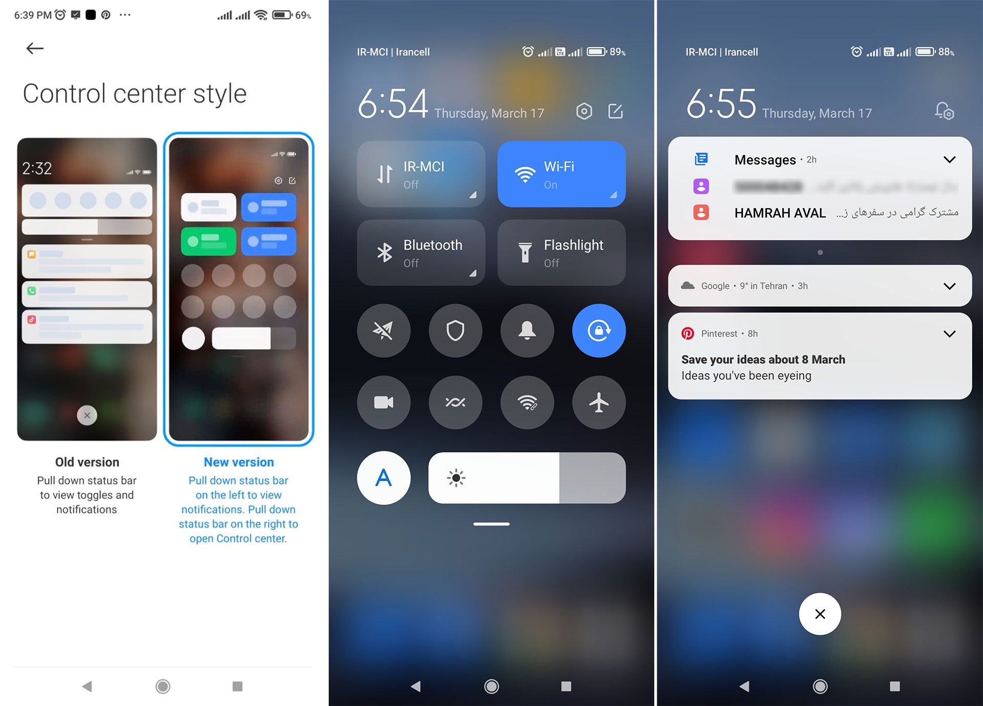
In the quick settings shortcut section, among all these user interfaces, there are some basic settings such as turning off or on WiFi, Bluetooth, mobile internet, and changing the brightness of the shared screen. However, it is possible to add more shortcuts, but the items found in the iOS Control Center can not be edited directly from the same page but must be changed through the settings and log in to the Control Center.
Fortunately, Android and iOS support the ability to add shortcuts to third-party app settings here.
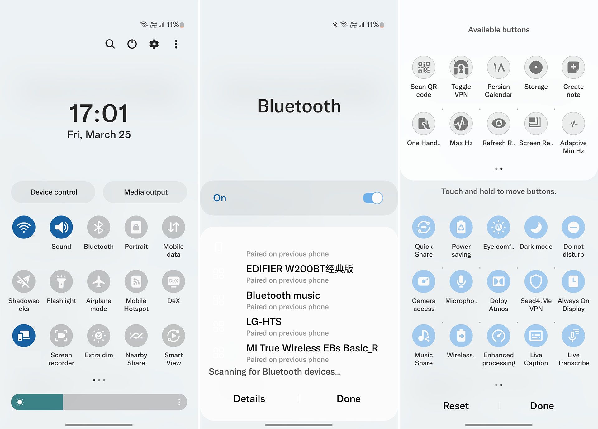
The One UI notifications panel and quick settings are designed to fit a large, one-handed display. The user enters the Quick Panel by dragging the page down, and its options are located in the lower half of the page to be easily accessed.
By touching the text below each item, you can see more options from that setting; for example, you can change the connected WiFi network or Bluetooth device in this way, and by holding this section, you can enter its settings page directly. The ability to access settings, manage IoT-based smart gadgets, search and turn off the phone through this panel has also made it perfect.
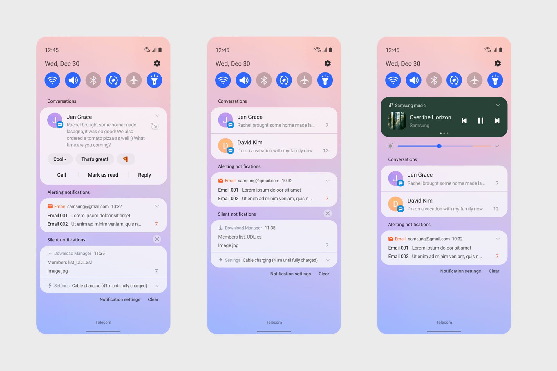
The notifications section in both Android user interfaces is designed based on the priority of ongoing activities. For example, the notification will be at the top if a song is playing.
The second section is dedicated to conversations, and the announcement of SMS programs and messengers is placed in this section.
You can set your messaging notifications in this section as a chat window and receive and send your messages without deleting the information. By expanding each notification, you can also access unique options such as to reply, delete, etc. Statements from other apps are at the bottom, and muted reports are displayed as a shrinking bar to take up less space on this page.
In general, although the MIUI user interface is based on Android, the design of these two parts is mainly based on the design style of iOS. Especially if you enable notifications and quick settings, the way to delay messages, access, and display WiFi and Bluetooth listings is very similar to iOS.
Navigation
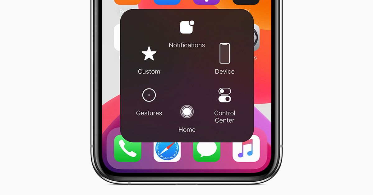
Returns to the previous menu in applications depending on the type of application. Navigation on iPhones equipped with the Home button can only be done by pressing this button. Some apps have a Back control, while others swipe from the left or right edge of the phone to the sides to return to the previous menu, and in some, it works both ways. You can access recent applications by pressing this button twice.
On iPhones that do not have a Home button, Apple used gestures and assigned a small bar at the bottom of the screen to swipe up and long swipes to return to the home screen and open recent apps. There is no other way to navigate unless you enable the Virtual Home Button using the Assistive Touch feature.

Navigation and switching between menus in One UI and MIUI are possible in the form of gestures and buttons. Unlike the iPhone, which returns to the previous menu depending on the type of application, in two Android user interfaces swiping the left or right edge of the screen in any application is possible.
And if this gesture interferes with the motions of the application itself, you can change its delay and sensitivity. Also, many people still do not feel comfortable with gestures, so that you can enable three-button navigation on Android phones.
Settings menu
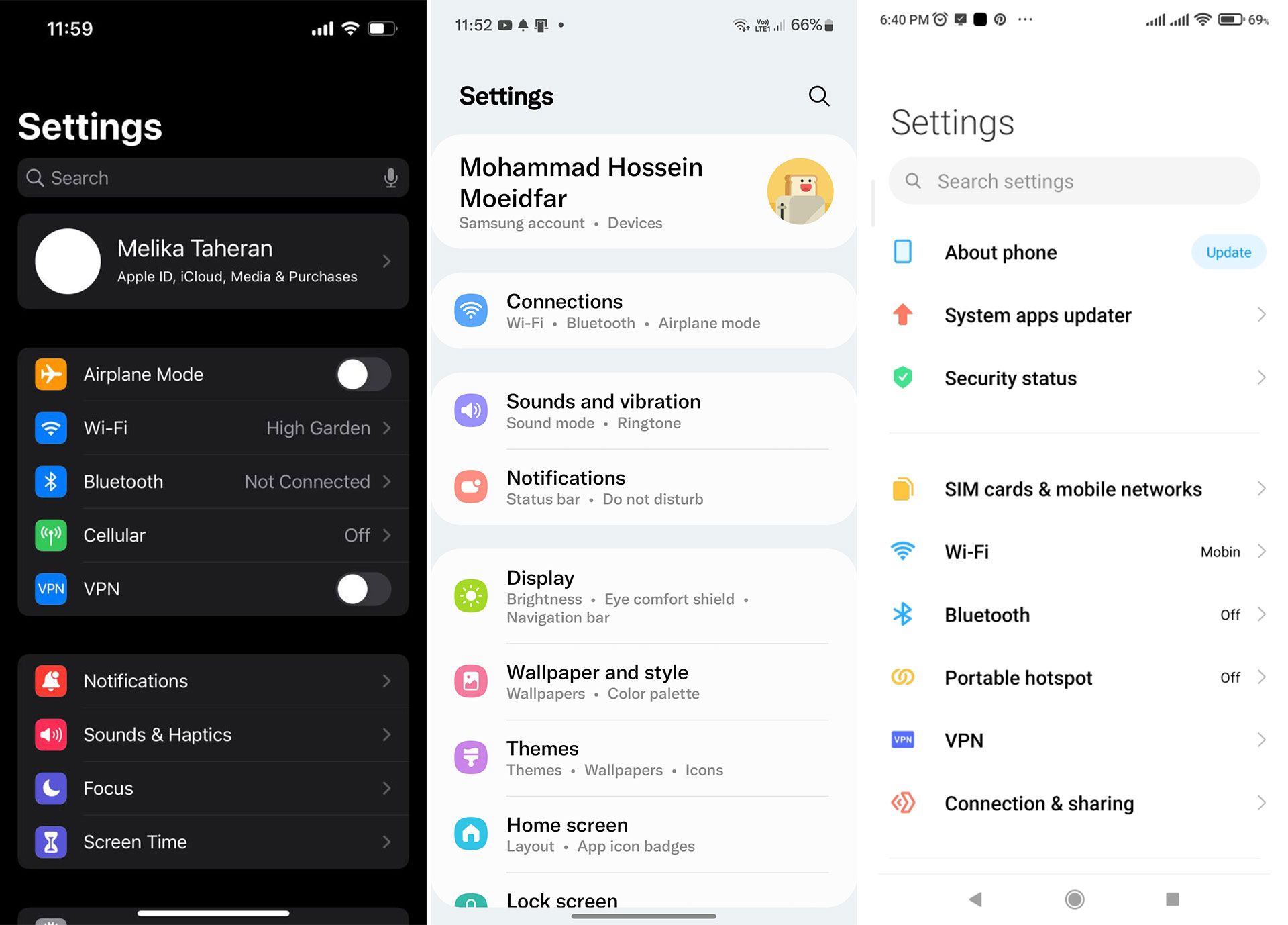
Settings are indeed categorized as part of the phone applications. Still, one of the essential parts of the user interface of any operating system is that the design and graphics of buttons and options, correct categorization, and clearness of options play an important role in not confusing users when accessing their settings.
In this regard, Samsung has done its best to organize the settings as clearly as possible, and it can say that it has achieved its goal in the One UI. Then in this user interface, all locations are neatly placed in their categories, and the user can easily find the desired setting.
In the MIUI interface, the settings are not correctly categorized as they should be, and sometimes there are multiple menus from one location to configure them.
For example, Xiaomi separates its privacy settings, access, battery optimization, and several other user interfaces from the Android operating system. Their settings are configured from two or more areas.
Unfortunately, many of Android’s core features and settings are also removed, hidden, or replaced in the MIUI UI in a different style, which may block the configuration path of some essential components.
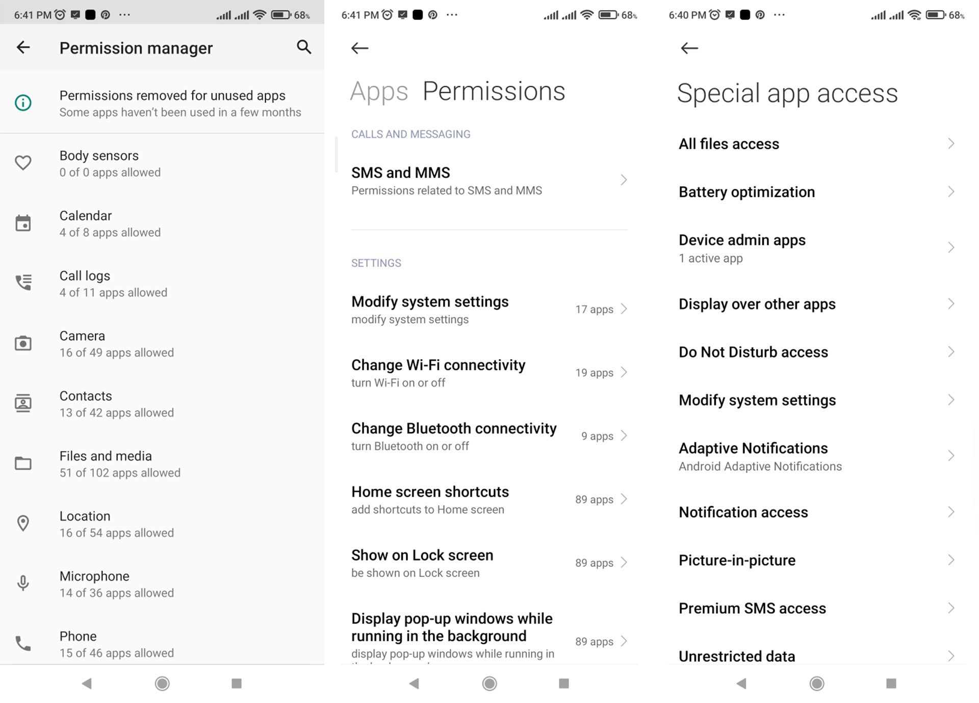
Multiplayer settings for application access in the MIUI user interface
Another drawback of the MIUI user interface is the inconsistency in some essential applications by default due to the Xiaomi handset market. In the global versions of Xiaomi phones, some of the user interface applications are replaced with Google applications or different applications that significantly disrupt the user experience. We believe that this is one of the main drawbacks of this user interface that takes it away from simplicity and integration.
It is done while Samsung phones allow the user to use the default applications or Google and will enable you to delete a similar version.
When comparing iOS settings with the other two user interfaces, the One UI and iOS settings menu styles are more similar, as different options are highlighted with solid icons. At the top of the screen is a banner for managing the Samsung and Apple ID accounts.
But in terms of grouping settings, iOS and MIUI are more similar. In general, the settings menu of Samsung phones is more organized than these two. This order becomes more apparent when the settings for the installed and default apps are placed in the Apps section instead of in the settings menu and see a long list or access the settings of third-party apps from within them.
Capabilities and facilities
Smartphone makers also add unique features to their smartphone user interface, some of which can be very useful. Many of these features can experience in different user interfaces by installing the application. Still, in general, the best experience of a part or function is when the user interface provides it by default.
IOS is a bit weaker than Android phones in this regard, and the reason is due to Apple policies. Of course, this does not mean that the iPhone does not offer extraordinary features, but many of these features are more in improving the phone user experience and accessibility capabilities.
The iPhone is one of the rare examples of phones whose accessibility features and gestures provide functional and valuable capabilities for people with disabilities or hearing and hearing impairments and ordinary people.
The two user interfaces, Android and iOS, are very close in some essential features.
For example, in privacy, Android has made many improvements. When an application accesses the camera, it is notified of its location and microphone, and access records are also displayed to the user in a comprehensive dashboard. Information on phone and app usage statistics and capabilities to help you focus more and reduce distractions are available across all operating systems.
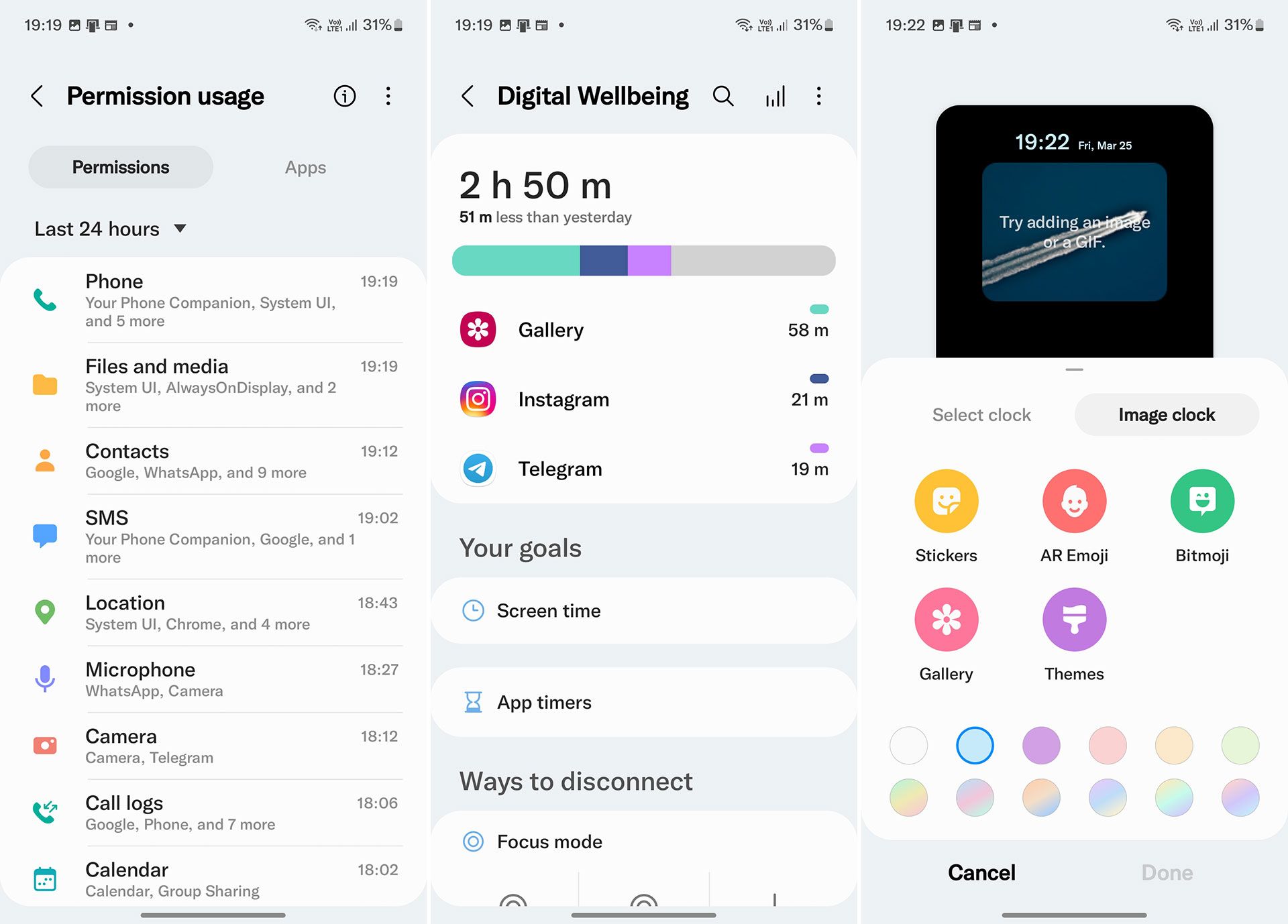
It is impossible to say all the specific features of the user interface in this article. We will examine the unique features of different user interfaces in separate pieces, but in the case of the Samsung and Xiaomi user interface, features such as Dual App / Messenger or creating a second version of applications can make a double space. Private and safe optimizers and launchers for games installed on the device mentioned.
Suppose your Samsung or Xiaomi phone has an AMOLED display. It will have an Always on Display feature, which can display the clock, the latest notifications received, or communicate a photo or a custom graphic design without turning on the display.
Edge Panel is another One UI feature that lets you quickly access several panels, including shortcuts to popular applications, tasks, people, compasses, rulers, etc. After activating the Edge Panel and selecting the panels you want, a customizable knob will appear in the corner of the screen, and if you drag it into the screen, the panels will appear.
In the apps panel, by touching an app, you will be able to open it in split-screen mode and a floating window. If you drag the app to the center of the page, the app will float in window mode, and if you remove the app to the top or bottom of the page, the app will open in a split-page way. The sidebar feature makes it easier for users obsessed with multitasking to run multiple applications simultaneously or switch between them quicklySimilarly, users in MIUI 13 can now access their favorite applications in floating windows. . This feature is customizable and supports up to 10 applications.
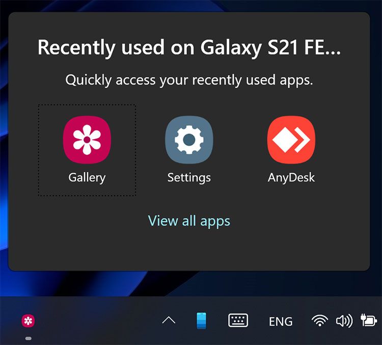
Finally, thanks to the collaboration between Microsoft and Samsung, the interaction and integration between the company’s phones and Windows is similar to Apple’s ecosystem devices. With the Link to Windows feature, you can take complete control of your phone from your computer and put content between them. Easily share. Some other features like DeX and Bixby routines are not present in all Samsung phones but are beneficial features that double the efficiency of a smartphone.
One UI and iOS UI design principles
To ensure that relationships and interactions are straightforward and user-friendly for users, Samsung and Apple follow a few principles in designing their user interfaces. It is up to the end-user to judge how successful each of these creators is in implementing their principles. In the following, we will have a brief look at these principles.
Both significant manufacturers consider focusing on the program and running work to be important in designing their user interface. One UI uses simple, intuitive designs to help the user focus on content and identify the settings and functions needed to perform tasks quickly.
The iPhone also emphasizes the integrity of the look and feel of the apps. In iOS, any application can keep the user focused on content with subtle graphics, standard controls, and predictable behaviors.
Samsung emphasizes natural interaction with the device and ease of use in this user interface. One UI with features such as dark mode to reduce eye strain, high-contrast keyboard for easy typing, lightweight and changeable font size to suit the needs of different people, increases readability and ease of viewing the page and programs.
For users to perform tasks smoothly and quickly and interact efficiently, One UI has divided the application page into two parts (the view area above, which contains the general information of the default app, and the interaction area below). It makes it easier to access items such as buttons, even on devices with large screens.
The One UI compatible design is easy to use on any device with any screen size.
Interacting with Samsung is accessible no matter the screen size, and deleting or adding items such as content and functions is only to increase usability. One UI feature and application are also adapted based on users’ features and how they use their devices. A clear example of achieving One UI design goal is the application bar that is moved when scrolling the page so that users’ needs are always available.
Thanks to this toolbar, users can access the application options with one hand by focusing on the work being done in any size of the screen. On the other hand, design consistency is an important issue that can be seen in all versions of iOS.
Apple designers believe that a compatible application should implement familiar standards and patterns using interface elements, symbols, standard text styles, and the same terms that a user expects.
Proper feedback is another principle of the iPhone. IOS built-in apps provide meaningful feedback in response to any user action.
When tapping, interactive elements are briefly highlighted, share indicators of long-term operation status progress, and animation and sound help illuminate the results of actions. Across iOS design, control is in the hands of users.
A program can suggest a practical path or warn of dangerous consequences, but the user usually makes the final decision. The best programs have the right balance between keeping users engaged and avoiding unwanted results.
In the iPhone’s interface, apps give users a sense of control by keeping interactive elements predictable, confirming malicious actions, and making it easy to cancel operations even when they’re taking place.
The above are some principles that the manufacturers claim to adhere it. Except for a few tangible cases, there is not much difference between the design principles of these two manufacturers, and most of them can be seen in both user interfaces. At the end of the day is the user experience, which shows which interface has been more committed to its principles and has been more successful overall.
Conclusion
Each user interface we have compared has its strengths and weaknesses in design, appearance, and features. iOS has an extraordinary emphasis on simplicity and a high-quality user experience. Apple’s software development team has a particular focus on this issue. It, therefore, uses the highest UI / UX standards, which can be seen in how the display of depth, the design of icons and graphic elements of the operating system, and the movements and animations are very eye-catching.
The focus of newer versions of this operating system is on further improving the user experience, and changes in its appearance are not expected.
One UI is one of those Android user interfaces in which Samsung has followed the path of purity and simplicity, but at the same time leaves the user free to personalize every part of the user interface in the complete way possible and provides advanced user features to get the most out of the phone. It should be so that the quality of the user experience is at the highest levels and useless and useless options are avoided.
Samsung has focused on doing things with one hand in the shaping process.
MIUI is one of those user interfaces that has been given a lot of importance in terms of its aesthetics and tries to bring a user experience similar to iPhones and a variety of personalizations and features for Android users so that the user does not feel any lack. Be.
UI and iOS are among the most popular. Although the MIUI interface has a lot about aesthetics, and many Xiaomi phones are interpreted as Android iPhones, this interface has some drawbacks. However, the overall performance of this interface is as good as the One.
It is up to you to decide based on the priorities, features, and comparisons made. It can say that your taste and trust in the brand is the most critical factor in choosing a smartphone based on the differences in the appearance of the One UI interface with MIUI and iOS.
What do you think about these three user interfaces? Which do you choose?
