common mistakes in user experience design
Some time ago, we talked about common mistakes in website design. Mistakes that both professionals and beginner designers may make. In this article, we want to go deeper into the topic of user experience and talk about nine common mistakes in user experience design.
The discussion of user experience and the nuances that go into it are really sweet and fascinating. Therefore, we suggest that you stay with us until the end of this article and make us happy by expressing your views and experiences.
First, we start with the definition of user experience design.
What does UX design mean?

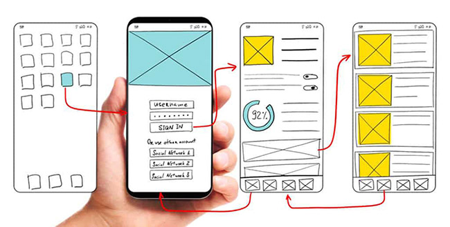
About user experience design or UX Design , hundreds of different definitions have been provided so far, and it is generally something that includes different dimensions such as visual design, information architecture, usability and interaction .
But now, in order to reach a comprehensive and common view, we have brought the definition of Oxford Journal Interacting With Computers:
The purpose of user experience design in business is to improve customer satisfaction and loyalty through usefulness, ease of use, and the good feeling we convey to them during interaction with the program.
In other words, UX design is the process of designing products (digital or physical); With the goal that these products are useful, they are easy to use and users enjoy working with them.
Who is called a UX designer?
The user experience designer is the one who must implement the mentioned things (that is, ease of use, usefulness and good feeling of the program) in the product design and make sure that the program is learnable and usable for the end user.
Visual design, content, user research, information architecture, branding and customer interaction are among the scope of work of UX designers.
Well, so far we have met UX and UX designers. In the next section, we want to point out mistakes that both UX design beginners and professionals alike may make.
You know that, prevent loss from anywhere, it is benefit. So read these 9 items carefully!
9 common mistakes in UX design
Do you agree that user experience design is a challenging task?
You need to be able to communicate effectively with different teams and people, extract useful information from data, and at the same time, get into the brains of customers and see how they interact with the product.
In the meantime, sometimes errors may occur, which are the subject of our discussion.
This is you and these 9 common mistakes in UX design
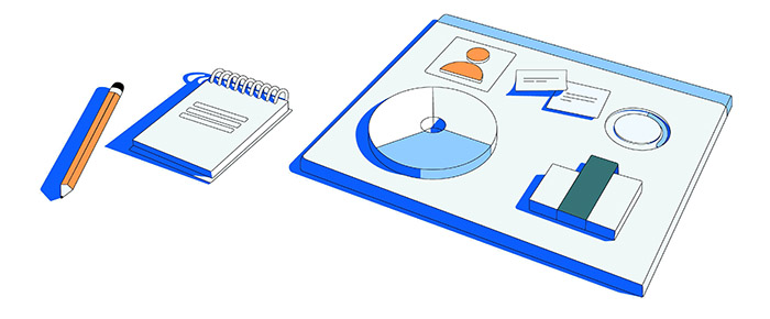
1) Relying too much on the need for data
Data has a bold and undeniable role in design; But never forget that we are the ones who have to separate the data that we need and then pull out the correct and useful information with our own analysis.
So look at data as a design tool, not something that drives design.
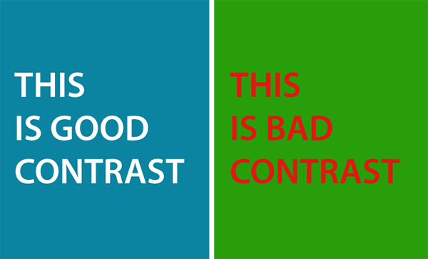
2) Not observing the contrast (Contrast)
We can examine the contrast in 3 different parts:
- Colors: Use the rules of color combination and use tools like Contrast Checker to create a better contrast .
- Sizes: Follow the hierarchy. That is, use a larger size for more important items and a smaller size for less important items.
- Alignment : In the design, consider the direction of the user’s eye; So that the user can easily find related items at a glance.

3) Confusing navigation
To distinguish a good design from a bad one, pay attention to whether everything expresses itself very quickly and intuitively or not. For example, when the customer enters the store application, can he quickly find the product category and shopping cart?!
If not, then a job is lame! It is possible that in this design, instead of paying attention to the user, too much attention has been paid to the beauty of the design and its creativity!
So remember, make product navigation as easy as possible for users. So that the user’s time is not wasted to find clickable buttons or how to use the program.
In addition, the rule of 3 clicks in design: you need to remember
Each user should not make more than three clicks to access each website page (there are exceptions, of course).
4) Ignoring the content when designing
Unfortunately, even in some UX design training courses, we have seen that professors say, make the design first and then decide on the content! Well, this is a wrong idea. you ask why
To understand the reason clearly, see the image below.
So, for the main parts of the site that you know are likely to remain the same, it is better to write the content first and then do the design.
5) Overconfidence in personal observations and opinions
Remember when we talked about data? Sometimes the opposite may also happen; It means to forget the data, reports and analysis and rely on our own personal observations.
Of course, these observations are also important; But not alone!
6) Not testing how to interact and use the program

To test the program, it is better to get the help of a researcher or UX Researcher. If you don’t have access to the user experience researcher, it’s not a problem! Try to test the product (app or website) at different scales – from the very beginning of the design to its end.
For example, select a number of random users and ask them to work with the product, then record the observations and use them for analysis.
Note that sometimes testing should be done in different environments so that you can monitor all aspects. For example , different devices, different internet speed and bandwidth , etc. , create different conditions for the participants in the product test.
7) Sacrifice everything for creativity
Sometimes designers are arrogantly involved in showing their creativity in design; Without paying attention to the capabilities of the program and the user who should interact with the program easily and quickly!
In these situations, you may look like a creative designer, but what about a professional designer? No!
Because you have ignored an important principle called the user in user experience design! So, as a skilled and intelligent designer, prioritize the user and the efficiency of the program first, and then creatively implement your ideas!
8) Being too influenced by trends
An important fact: as your experience in UX design increases, you will realize that many of those innovative and so-called cool designs that you used to see on Dribbble and Behance sites are not feasible and in short, will never become reality!
So remember to get ideas and improve your work as much as you can ; But, don’t leave the rudder of your thoughts in the hands of trends! Don’t let trends distract you from the right way of thinking.
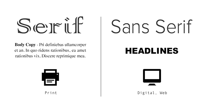
9) Using complex fonts
Font and font style are one of the most important things in UI and UX design. According to Triare.net :
Typography actually makes up 95% of web design . If you get it wrong, you’re effectively missing out on 12-20% of your potential customers. By optimizing the typography, you have also improved the app’s readability, usability, and accessibility.
Now that fonts are so important, under no circumstances use clunky or outdated fonts that destroy readability. If you are stuck between choosing a beautiful and legible font, choose a font that does not tire the brain and eyes after a few minutes of reading.

now it’s your turn
We have said what needs to be said. what is your opinion? Have you ever experienced these design mistakes? What was the result? Do you have another point or error to add to this article
