What Is Data Visualization & How Is It Done?
Data visualization is a powerful and effective solution for this problem. But what exactly is data visualization, and how is it accomplished?
In today’s world, we are constantly faced with a massive amount of information and data. Analyzing and understanding this raw data can be a challenging and time-consuming process.
What is Data Visualization?
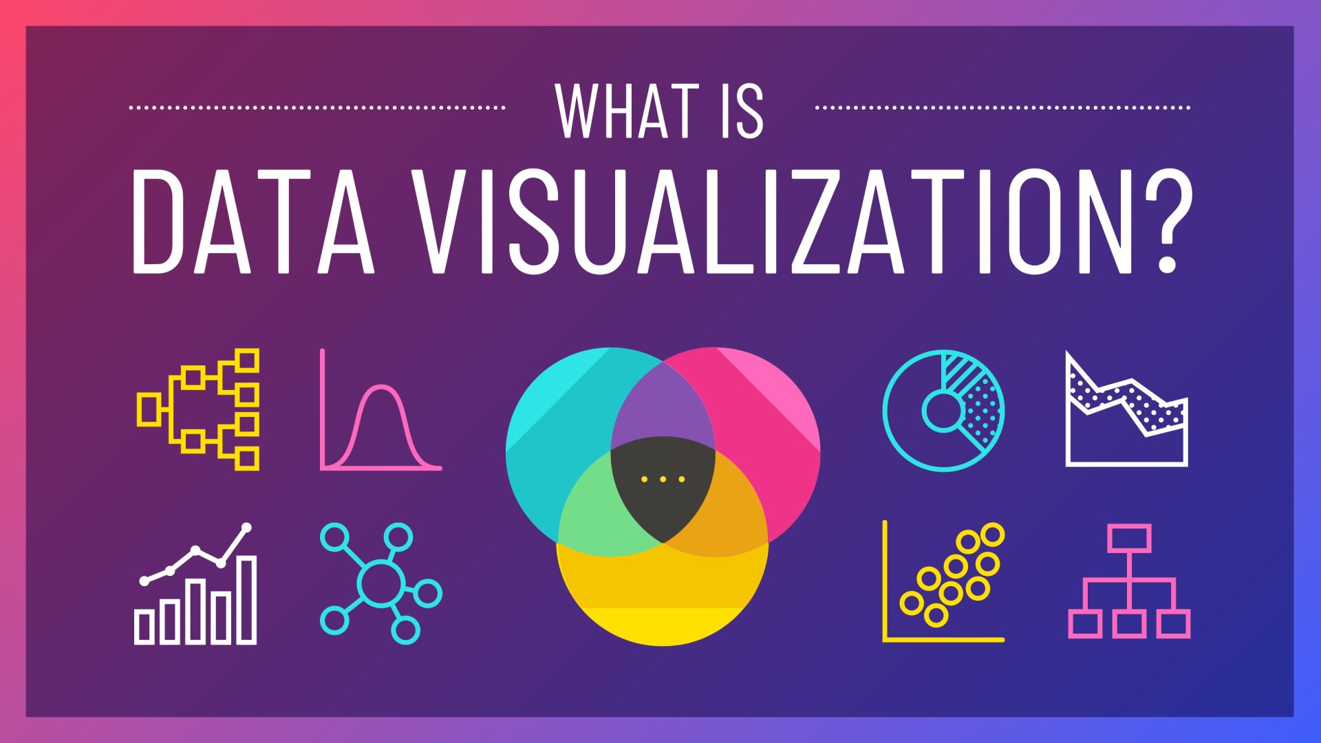
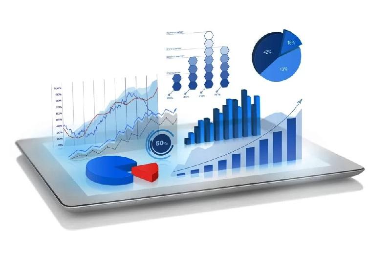
Data visualization is the process of converting raw data and information into a visual format, such as charts, graphs, maps, and infographics. The primary goal is to make complex data understandable, discover hidden patterns and relationships, and communicate insights to the audience quickly and effectively.
In essence, data visualization translates the language of numbers into the language of images, which the human brain can process much more easily.
Why is Data Visualization Important?
Our brains are naturally wired to process visual information. We can identify trends, patterns, and outliers in a chart much faster than in a spreadsheet full of numbers. The importance of data visualization lies in its ability to:
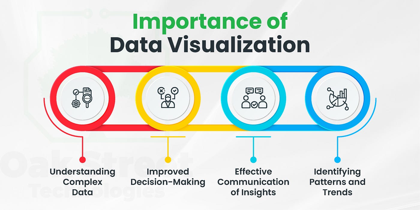
- Simplify Complexity: It transforms large and complex datasets into a simplified and understandable format.
- Identify Trends and Patterns: Visual representations make it easier to spot trends over time, relationships between variables, and patterns that might go unnoticed in raw data.
- Enhance Communication: It provides a common language for conveying information to various audiences, regardless of their technical expertise. It tells a story with the data.
- Accelerate Decision-Making: By presenting insights clearly and concisely, managers and decision-makers can make faster and more informed decisions.
How is Data Visualization Done? (The Process)
Effective data visualization is more than just creating pretty pictures; it’s a systematic process that involves several key steps:
- Define the Goal and Audience: The first step is to clearly understand what you want to communicate and who your audience is. Is the goal to explore the data, explain a finding, or monitor a performance indicator? The answer will shape the design.
- Data Acquisition and Preparation: This involves gathering the necessary data from various sources. The collected data must then be cleaned and processed to ensure it is accurate, complete, and in a suitable format for visualization.
- Select the Right Visualization Type: There are numerous types of charts and graphs, each with its unique strengths. For example:
- Bar Charts: For comparing categories.
- Line Charts: For showing trends over time.
- Pie Charts: For displaying parts of a whole.
- Scatter Plots: For examining the relationship between two variables.
- Maps: For visualizing geographical data.
- Dashboards: A collection of different visualizations to provide a comprehensive overview of key metrics. Choosing the appropriate type is crucial for conveying the message accurately.
- Design and Create the Visualization: This is where the visual representation is built using various tools. The design should focus on clarity and simplicity, using colors, labels, and scales effectively to highlight the most important information without creating confusion.
- Storytelling with Data: A good visualization tells a story. It should guide the viewer through the information, highlighting key insights and leading to a clear conclusion. It provides context and narrative to the numbers.
Technical Analysis
Data visualization is a critical discipline in the modern data ecosystem, serving as the crucial interface between complex data and human cognition. The article correctly identifies its core function: to translate abstract numbers into intuitive visual narratives. This translation serves not only for aesthetic purposes but also as a fundamental tool for unlocking insights that would otherwise remain buried in rows and columns of raw data.
A key takeaway is that the effectiveness of data visualization hinges on purpose and context. As the article outlines, the process must begin with a clear goal and an understanding of the audience. A visualization designed for an expert data analyst to explore correlations will look very different from a dashboard designed for a CEO to monitor key performance indicators (KPIs).
Choosing the wrong visual format (e.g., using a pie chart to show trends over time) can be worse than showing no visual at all, as it can actively mislead the viewer. This underscores the idea that data visualization is both a science and an art—it requires analytical rigor in data handling and creative skill in design and storytelling.
The topic’s significance is amplified in the context of Big Data. As organizations collect unprecedented volumes of information, the human inability to process it all becomes a significant bottleneck. Visualization acts as a filter, compressing vast datasets into manageable and comprehensible formats.
It enables the rapid identification of patterns, trends, and anomalies, which is the first step toward actionable intelligence. For example, a simple line graph can instantly reveal a sales decline, prompting further investigation far more quickly than manually scanning thousands of sales records.
Furthermore, data visualization democratizes data. With user-friendly tools like Tableau, Power BI, and Google Looker Studio, individuals without deep statistical knowledge can create compelling visuals. This empowers employees across different departments to engage with data, fostering a data-driven culture where decisions are based on evidence rather than intuition alone.
In summary, data visualization is more than just creating charts. It is a strategic communication tool essential for navigating the complexities of the digital age. It enables faster discovery, more transparent communication, and more informed decision-making by transforming data from an inert resource into a dynamic and accessible asset.
Conclusion
In the age of big data, data visualization is no longer a luxury but an essential skill. It serves as a vital bridge between raw numerical data and human understanding, empowering organizations and individuals to unlock the value hidden within their data and make more informed, data-driven decisions.
FAQ
What is data visualization?
Data visualization is the process of representing data in graphical or visual formats such as charts, graphs, and dashboards. It helps to simplify complex datasets, making patterns, trends, and insights easier to understand.
Why is data visualization important?
Data visualization is important because it allows individuals and organizations to interpret large amounts of information quickly, improve decision-making, identify hidden patterns, and communicate findings effectively to both technical and non-technical audiences.
How is data visualization done?
Data visualization is done by collecting and preparing data, cleaning and structuring it, and then using visualization tools or programming libraries such as Tableau, Power BI, Excel, Python’s Matplotlib/Seaborn, or JavaScript’s D3.js to create meaningful visual representations.