What is Call-to-Action?
A call to action (CTA) is an essential element in web design that encourages users to take a specific action on a website. This can be anything from purchasing, subscribing to a newsletter, downloading an e-book, or filling out a form. A well-designed CTA can significantly improve a website’s conversion rate and help achieve business goals. Stay with us for a better understanding of this issue.
What is a call to action?
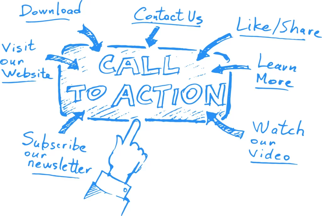
CTA stands for Call to Action. The literal meaning of the call is “invitation,” so the call to action means inviting the user to take action on the website or social networks.
A few factors in creating a call to action (CTA)
Here are some factors in creating a compelling call to action or CTA in web design, which is:
Be clear and concise
Your CTA should clearly state what you want the user to do and use simple language that is easy to understand.
Make it bold
Your CTA should be easily accessible and prominently displayed on the page. Use contrasting colors, sizes, and placement to make it stand out.
Create urgency
Encourage users to take action by creating a sense of urgency. Use phrases like “limited time offer” or “act now” to develop a sense of urgency and convince users to act quickly.
Use action-oriented language
Use verbs and phrases encouraging users, such as “take action now” or “download your free guide.”

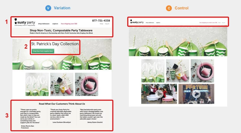
Test and modify
Test different versions of your CTA to see which one works best and tweak it over time to improve its effectiveness.
Overall, a well-designed CTA is one of the most important aspects of web design, as it can significantly impact website conversion rates and help achieve business goals. By following these tips, you can create effective CTAs that encourage users to take action and improve the overall performance of your website.
Call to action (CTAs) should be used strategically throughout the website to guide users to take a desired action.
Key sections to have a call to action
Some key areas where CTAs can be effective include:
- Home Page: The home page is often the first page users land on when visiting a website, so it’s essential to have clear and prominent CTAs encouraging users to take action.
- Landing pages: Landing pages are designed to convert visitors into leads or customers. CTAs on landing pages are prominent and convey the value; CTAsosition.
- Product Pages: On product pages, CTAs can be used to encourage users to purchase, add items to a cart, or sign up to be notified when the product is blog Posts: CTAs can be included in blog posts to encourage users to subscribe to a newsletter, download a related resource, or follow the brand on social media.
- Contact Us Page: On the Contact Us page, CTAs can be used to encourage users to contact us for support, consultation, or sign up for a demo.
CTAs should be used strategically throughout a website to guide users to take a desired action. The placement of CTAs depends on the specific goals of the website and the user journey through the website pages. The attractive and creative website is designed to action (CTA) that is attractive and creative can help capture users’ attention and encourage them to take action. Here is Apage’s background design, an effective and eye-catching CTA:
Use contrasting colors
Use colors contrasting the page’s background to make the CTA stand out. Bright and bold colors can also draw attention to the CTA.

Make it visually appealing.
Use typography and graphics to make the CTA visually .appealing. Choose fonts that are easy to read and use images or symbols to add visual appeal.
Use clear and concise language.
Use clear and concise language that tells the user what action to take. Avoid using vague or confusing language that might confuse the user.
Make it interactive
Use animated effects or animations to make the CTA more interactive and engaging.
Create a sense of urgency.
Use language that creates a sense of urgency and encourages the user to take action. For example, use phrases like “limited-time offer” or “don’t miss out.”
Test and repeat
Test different CTA versions to see which one performs best. Iterate and refine the plan over time to improve its effectiveness.
In general, designing an attractive and creative call to action requires a combination of visual design, persuasive language, and strategic placement on the page. By following these tips, you can design CTAs that effectively grab users’ attention and encourage them to take action.
Some examples of how to advertising
Here are some examples of how to use CTAs in ads:
Directing customers to a website or landing page
A CTA can direct customers to a website or landing page where they can learn more about a product or service and potentially make a purchase. For example, an ad for a new product might include a CTA that says, “Click here for more information.”

Encourage customers to take advantage of a special offer
A CTA can encourage customers to take advantage of a limited-time offer, such as a discount or promotion. For example, an ad for a clothing store might include a CTA that says, “Shop now and get 20% off your purchase.”
Persuading customers to buy
CTAs can be used to encourage customers to make an immediate purchase. For example, an ad for a concert might include a CTA that says, “Buy your tickets now, before they’re gone!”
Promote engagement on social media.
CTAs can encourage customers to engage with a company on social media, such as following them on Twitter or liking their Facebook page. For example, an ad for a new restaurant might include a CTA that says, “Follow us on Instagram for exclusive deals and promotions!”
In general, designing an attractive and creative call to action requires a combination of visual design, persuasive language, and strategic placement on the page. By following these tips, you can design CTAs that effectively capture users’ attention and encourage them to take action.
Call To Action (CTA) is a vital element in advertising that elicits a specific response from the audience. It’s an explicit instruction that encourages the viewer or reader to take immediate action, such as purchasing, signing up for a newsletter, or subscribing to a service.
In short, CTA is a powerful tool that can help attract customers and increase sales. It can encourage customers to take immediate action and help businesses achieve their advertising goals.
What is the importance of the call to action in website marketing and advertising?
A CTA (Call-to-Action) is a vital element in marketing that aims to encourage the user to take a specific action, such as purchasing a product, signing up for a service, or subscribing to a newsletter. Here are some of the critical components that make a CTA effective:
Clear and concise language
The language used in the CTA should be clear, concise, and understandable. It should convey a sense of urgency and convince the user to take action.
Strong affective verbs
Strong action verbs, such as “buy,” “register,” “download,” or “subscribe,” are more effective at getting users to take action than weaker verbs, such as “click here” or “learn more.” ”
Eye-catching design
The CTA design should be eye-catching and stand out on the page. Using contrasting colors or bold fonts can help the CTA grab the user’s attention.
suitable place
CTA placement is also essential. It should be prominently placed on the page, ideally at the top, where users don’t have to scroll to see it.

Clarity of purpose
The purpose of the CTA should be clear and aligned with the user’s expectations. Users need to know what they’re getting when they click the CTA.
A sense of urgency
Creating a sense of urgency, such as offering limited-time promotions or highlighting the rarity of a product, can help motivate users to take action.
Mobile Optimization
With more users accessing websites on mobile devices, ensuring your CTAs are optimized for mobile is critical. This includes making it easy and providing the page loads quickly on mobile devices.
CTA buttons or call to action increase the site’s conversion rate and improve it significantly. Note that attractive CTAs will have a good and positive effect on your website’s SEO by reducing bounce rates and increasing visit rates. So it is necessary and necessary to be careful enough in their design and take the required time.

