


The principles of flat design
Good design is about creating something useful that works. If the answer lies in flat design, then we do the same. But this process may not work for all projects and therefore should not be mandatory. Most designers either can’t stop using flat design principles or hate it.
Now let’s take a look at the factors that create a flat design. There are five very specific characteristics of flat design principles, and in this article, we take a look at each one and provide an introduction to “almost” flat design.
No extra effects

 Flat design takes its name from the shapes used in it. Flat design uses a distinctive, two-dimensional style that is completely flat.
This concept does not contain any details such as shadows, beveled edges, reliefs, gradients, or other means of creating depth. Every element or box, from picture frames to buttons and navigation tools, is concise and has no decorative edges or shadows.
There are no methods to make the elements look more realistic, including tricks used in squeomorphic design projects to create 3D designs. The layouts used in flat design are similar to those used in other projects, but the pages do not intersect to create a separate background image, foreground images, buttons, text, and navigation.
So what makes this method successful? A flat design has a different look and feel without all these extras. This is due to the design and placement of elements based on a precise and clear hierarchy, which makes it easy for users to understand and interact with successful projects. While many websites use flat design principles, flat design is probably more popular in mobile and application design. Despite the small screens, fewer buttons and options make using the flat user interface very simple.
Simple elements


 Flat design uses many simple UI elements, such as buttons and icons. Designers who design based on flat design principles often use simple shapes such as rectangles, circles, or squares and allow each shape to stand on its own. The edges of the shapes may be completely angular and square or curved.
Every UI element should be simple and easy to click or tap on. The way of interactions should be completely obvious to users without additional explanations in the design.
In addition to a simple design, use attractive colors in clickable buttons to entice users. But don’t confuse simple elements with simple design; the flat design concept can be just as complex as any other design method.
Need help getting started? Designmodo offers a variety of user interface kits used in flat design, From Square UI Free and Flat UI Free, a simple PSD / HTML UI kit with simple components, to Square UI and Flat UI Pro, a complete PSI / HTML UI package for app and website design projects.
Focus on typography
Due to the simple nature of elements in flat design principles, typography is very important.

 The tone of the typeface should match the overall design; A very beautiful font may look strange against an extremely simple design. Also, in an effort to create a cohesive visual and textual tone in the final product, the text should be bold, simple, and efficient.
Consider a simple set of sans-serif fonts, with different types and weights, for basic typography on a flat design site. Consider adding a new font sparingly to create an artistic effect, but be careful not to overuse this particular typeface.
The type should also show users how to use the design. Label buttons and other elements to increase ease of use and interaction.
Focus on color

Neg is a huge part of Flat design principles. Flat design color palettes are usually brighter and more colorful than those used for other sites.
Color palettes of flat design projects often contain more colors. While most color palettes focus on two or three colors at most, flat design palettes may use six to eight colors at the same time.
The colors are more bright and lack tint and tone. In the principles of flat design, primary and secondary colors are common in this style. In addition, some special types of colors are also frequently used. In this process of repeating the use of flat design, retro colors such as bright red, purple, green, and blue are also particularly popular.
Minimalist approach
The nature of the flat design is simple and works well with the overall minimalist design approach.


One important thing in the principles of flat design is to avoid using a lot of glitter in the overall design of the site. Probably just using color and simple text is enough. If you plan to add an image, choose simple photos.
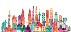
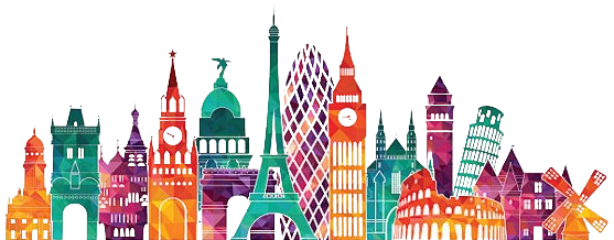
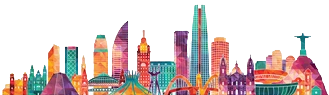
Pay attention to the image above. Some sites use flat design and have been very successful in doing this by placing elements on a plain background.
“Almost” flat design
The style that most designers agree to use is the “almost” flat design.
 The basic theme of flat style can be used in almost flat design principles, but some special effects are added to it. For example, buttons may have a slight gradient or drop shadow. Designers usually choose one effect and use it exclusively in their almost flat project.
This style provides more flexibility than some existing strictures about not using any effects in flat design.
Designers love this method because of the added depth and texture. Users like this style because it helps to create proper interaction. On the other hand, some designers are not interested in this method because the combination of two different styles lacks a precise definition of a real style.