How to Draw Charts in Excel !
Graphing in Excel is used for different businesses. Today, different office tools help us in different ways. Content generation, data categorization, data storage, and easy access to data are the most important advantages of using Office. They often replace paper sheets and heavy notebooks. One of the most important uses of Excel is to draw graphs in it. You can draw different types of diagrams with the help of this program. It is enough to know how to work with the tools available in Excel and learn how to work. This article will discuss the most important points about learning to draw graphs in Excel.
What skills do you need to draw charts in Excel?
First of all, you need to be able to implement your chart with the correct data on paper. You will specify the purpose of drawing the diagram and the data you need by doing this. Excel is a user-friendly software that people can easily work with. So you do not need to have specialized computer skills. Intermediate familiarity is enough to draw a graph. Finally, it would help if you learned drawing techniques. Finally, by gaining experience, you will design your desired diagrams in the best way.
What diagrams can be drawn in Excel?
Different applications require different diagrams. To accurately analyze the data you want, you must be able to draw graphs in Excel with different types. So, first of all, you need to know what charts can be drawn in this program.
Bar graph
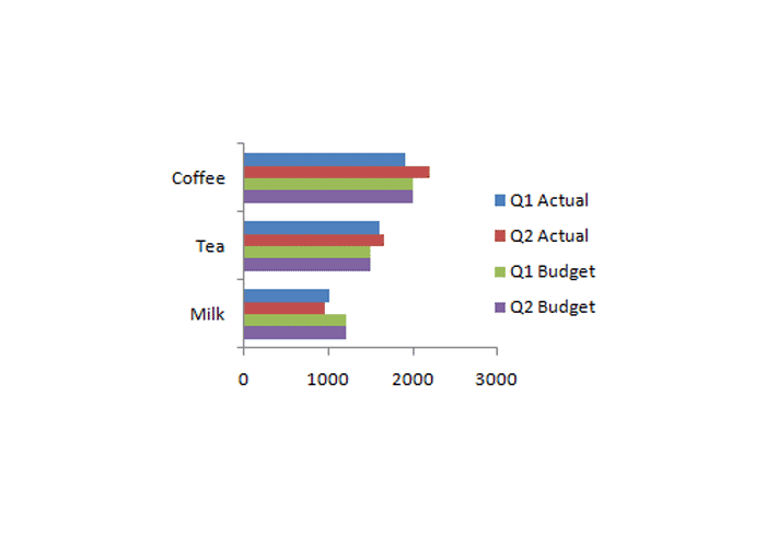
Bar and column charts are the two most widely used types in Excel. There are horizontal bar models and vertical column models.
Bar charts are used to compare different data. You can compare trends of several variables over some time.
You can compare several variables in several different time intervals in bar charts.
Linear graph
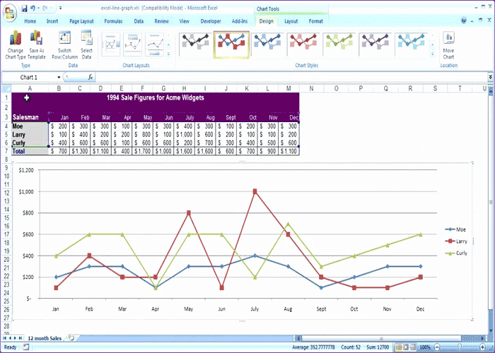
This is the best choice for you to check the trend of a variable changing over time by drawing a chart in Excel. Line charts are also good for comparing the general trend of changes in different variables in the same period.
Pie chart or cake
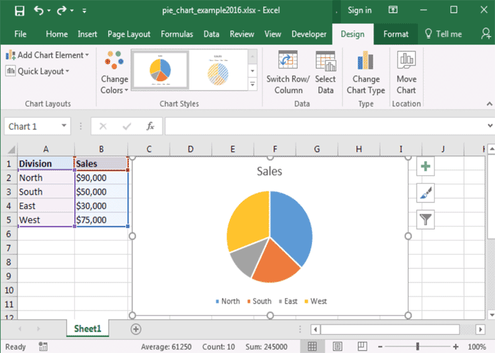
There is general data and several partial data in this diagram. By drawing a graph in Excel, it can be determined that each of these partial data contains a percentage of the total data. For example, suppose we want to specify the gender of 100 employees (general data) in a set. Of these, 25 are women (first partial data), and 75 are men. You can see a picture of the diagram of this example in the previous image.
Bar chart
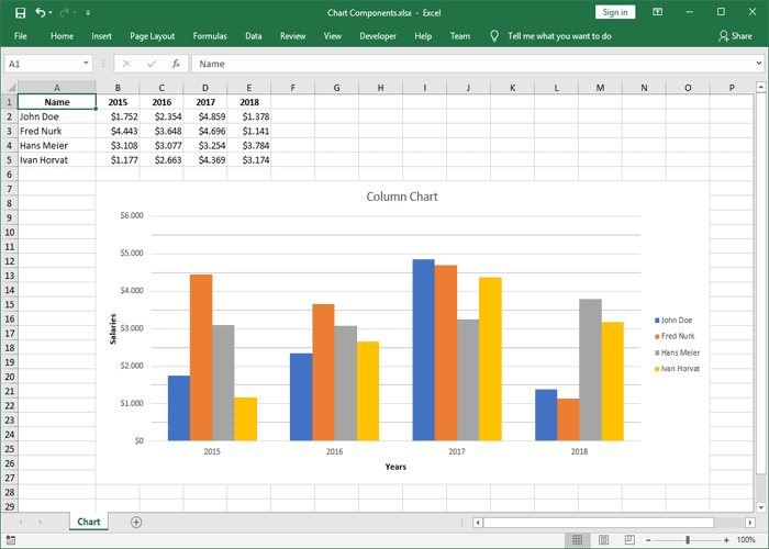
These diagrams have many similarities to bar samples. Whether you use the bar type or go for the column model depends on your data. Some people find it easier to compare vertical columns (drawing charts in Excel in columns). Others, however, prefer wide horizontal lines (bar charts in Excel).
Dispersion diagrams
In a line chart, the data points are connected in straight lines. But in the scatter plot, these lines are connected in a curve. This does not make much difference to the data. But by drawing a graph in Excel in the form of scattering, you can see the point where the variables collide with each other and their effect or not on each other.
Two-dimensional surface diagram
Area charts mean the area below the line chart for each variable. By drawing these graphs, you can compare the general trend of different variables. Imagine that you will compare the profitability of products A and B in periods x and y. Suppose product A is more profitable in period x and product B is more profitable in period y. In that case, it is difficult to tell which products are more profitable by drawing other graphs. But using two-dimensional surface diagrams, you can calculate the area approximately or accurately.
Drawing graphs in Excel can be divided into simple and specialized categories. The former was simple Excel charts. But the following are complex diagrams.
- Surface diagram
- Waterfall chart
- And radar charts
Surface diagram
The surface diagram is a three-dimensional surface. Therefore, only those who have sufficient knowledge of statistics and can read specialized charts can understand the data of these charts. There are different variables in these charts that can have different categories. It is better to postpone drawing these charts until you become a professional.
Chart drawing method in Excel software
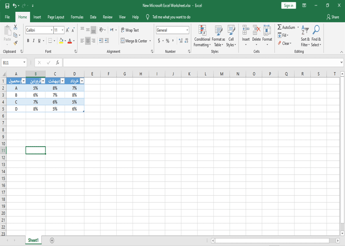
The first step in drawing a chart in Excel is to have a correct spreadsheet that later becomes a valid chart. Most tables are two-dimensional. That is, you need two variables to draw them. Imagine that you will check the profit percentage of products A to D in the first quarter of the year. So your rows are the product names from A to D, and your columns are the names of the first months of the year. In this example, we explain how to draw a bar chart for this example.
A) First, draw a table and enter your data as shown. Remember that drawing a table is the most important part of drawing a chart in Excel. Because only then will your chart be implemented correctly.
B) Then, select the table by dragging the mouse. Now go to the INSERT tab. In the CHARTS section, there are different types of charts that you can choose. Even Excel introduces the best chart for your data type.
C) Now, by clicking on the Chart Title, you can also specify the chart’s name. Like other Office programs, changing the font, text size, etc., is possible through the Home tab.
How to make changes after drawing a chart in Excel?
You will probably experience the crudest form of graphing in Excel for the first time! So you have to make changes to it afterward. These changes are applied through the design menu. In the following, we have examined the different options of this menu.
add chart elements
- Axes: Displays information next to a column or row.
- Axis Titles: Set a title for each axis.
- Chart Title: What is the chart’s title, and whether it exists.
- Data Labels: Whether the column data is inside the chart.
- Error Bars: This option indicates errors that may be present in the columns.
- Gridlines: The guidelines in the background of the chart can be specified.
- Legend: Where the chart description is displayed.
- Trendline: Used for line charts.
Other options for editing charts in Excel
- Quick layout: You can use this option to draw charts in Excel personalized way. The most practical diagram designs are in this option.
- Chart style: The chart’s appearance can be changed with its help.
- Data: This section itself has two parts. In the first part, the switch raw / column changes the position of rows and columns in the chart. In the select data section, the selected data can be moved.
- With the help of type, you can change the type of your chart.
- With the help of location, you can transfer it to other sheets after drawing the diagram.
Conclusion
This article is about the basic information you need to draw charts in Excel. It would help if you had experience and practice to draw professional charts. Therefore, if you are dealing with charts, it is recommended that you master all the options for drawing charts.


