


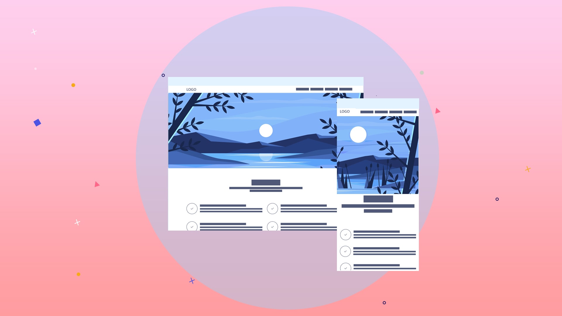
What is a Slider in Web Design:
What is a Slider in Web Design:
In this article, we want to learn about the different approaches to designing this vital part of the site, which perhaps has the most significant impact on the audience after the header of any place, and teach the best way to do this.
You read in this article
1. Full-width images with auto height
2. Full width fixed height images
3. Images with fixed height and auto width
4. Use multiple images for multiple sizes
The dimensions of the slider images of the site itself are unsatisfactory, and the administrator does not have a method to justify and explain its correct operation.
It is necessary to explain that the main issue that is being discussed is the way sliders are displayed on different devices, each of which is displayed in a certain way due to the difference in width and height of mobile devices and even desktop monitors, which may be In some ways, we lose a part of the image so that we can give a proper view to the user, or we can show the whole picture, and nothing is lost. On the other hand, we have a relatively bad experience for the user.
For example, the height of the image on mobile is shallow because the screen is vertical and sound on the desktop. After all, the screen is horizontal and wide.
In this article, we want to learn about the different approaches to designing this vital part of the site, which perhaps has the most significant impact on the audience after the header of any place, and teach the best way to do this.
1. Full-width images with auto height
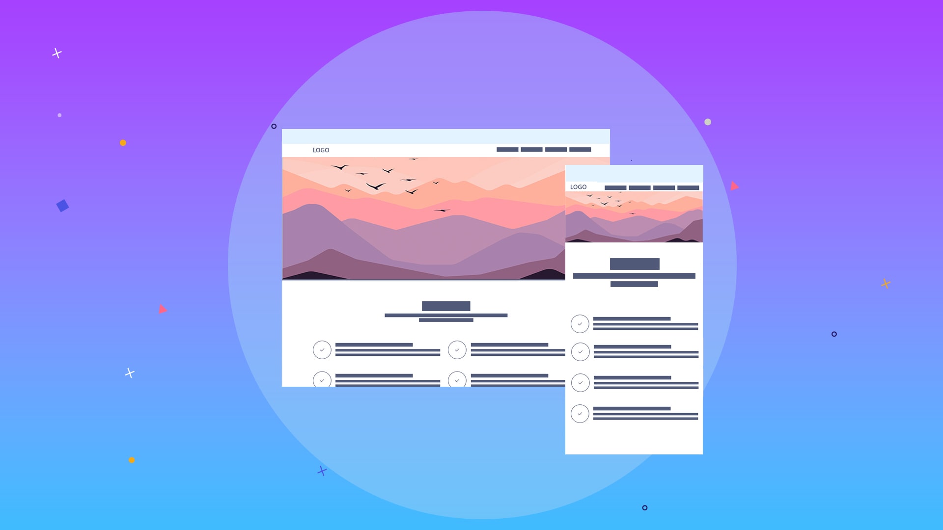
The website’s design can be done so that images of any size always occupy 100% of the entire page’s width, i.e., display the whole idea from the left corner to the right side. In this case, the height of the pictures is not in our control; how far the screen continues depends on the screen size; if the ratio of length to width increases or decreases, the height will increase or decrease accordingly.
You can consider every appropriate dimension in your particular device, which is 100% of the width and even 100% of the width and takes up the entire screen as if it is attached to the square of the image, but definitely in every Open the site on another device, or the height has decreased. The lower section has entered the page, or the size has been reduced, and a part of the image has decreased and needs to be scrolled.
2. Full width fixed height images
If you consider the same method as before but limit the height, then the complete image is always seen from the transverse side and both sides, but since the size is fixed, it is possible that in some devices, parts of the bottom or Miss the top of the image.
Because we are permanently fixed in height dimensions, and on the other hand, the image is full width, and we must have projections from the top and bottom.
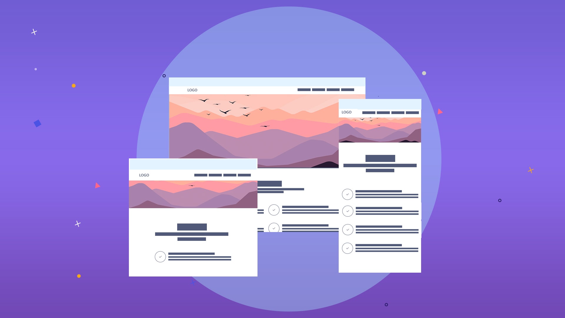
3. Images with fixed height and auto width
This method is a combination of the two previous methods, which is the most popular in Waqaa, and usually, the sites you see on the Internet are designed this way. That is, the height is always constant, which generally covers the entire space of the device, but for the same reason as explained in the previous cases, because the image is taken from the height of the phone, with the difference in the size of different devices, the idea is lost from the left and right side. And in other words, a part of the image protrudes from both sides, which means it is no longer visible.
In this case, images should be used with remarkable precision and cleverness so that the user does not feel incomplete when the image is removed from the page. It means that the primary purpose of the image and the highlight of the banner or poster should be placed in the center. For example, consider a landscape image with a house with unique and beautiful architecture in the middle and a lake or a forest on both sides.
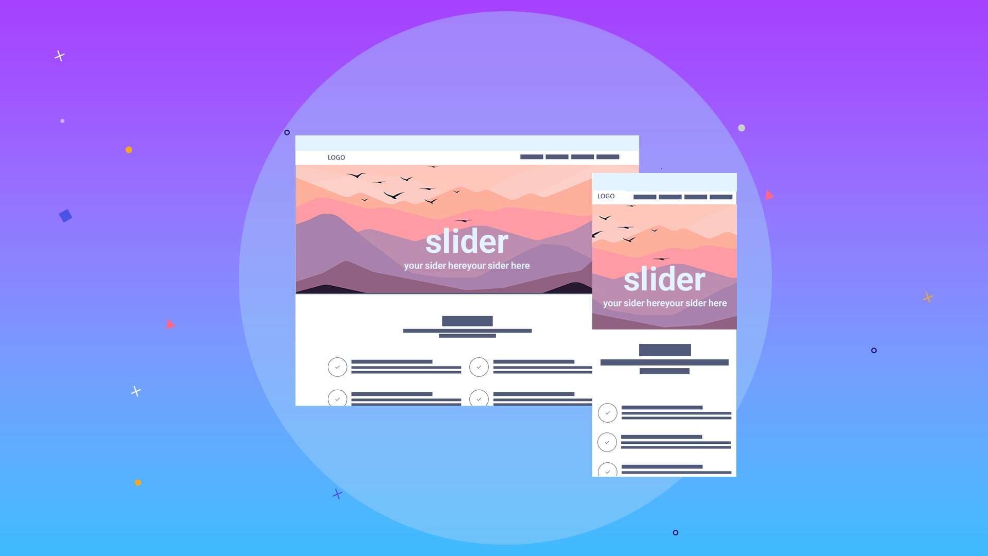
It is also an important issue that when the text on the banner is written in the form of a photo and placed in the corners, as the screen’s width increases and decreases, the text jumps out of the image. It is pretty clear that the site has a defect and has cut the picture, but if the text is not included in the image or is written in the middle, we have the complete text in any dimension.
4. Use multiple images for multiple sizes
This method is undoubtedly ideal, and every rational person likes to design and place an image in the right place for each specific device. A bit of work to create content may be more complex, and we need to design several images for each slide, but it is worth it, and this is the best choice.
Usually, the devices are divided into several parts, and this image is designed in 2 or 3 different sizes; for example, three pictures are designed with different sizes for mobile, tablet, and desktop, and the user who enters the site with a mobile phone has the width image. The camera will see a high height, and the tablet and desktop screen user will see their appearance similarly.
We in the design team use our six standard sizes:
- XS size with 360 width
- SM size with a width of 640
- Size md with width 768
- LG size with 1024 width
- XL size with a width of 1280
- Size XXL with a width of 1536
Of course, these dimensions are considered the basis of our designs, and we follow this pattern to make all parts of the site responsive. Still, for designing the main page slideshow or hero sections of the site, it is usually possible to upload three images for susceptible areas. We say it is enough, and there is no need to design for all six sizes. With these three sizes, you can create a reasonable satisfaction and experience for the user, and for general sites, two images are also enough.
It is enough to separate the image suitable for a mobile view from the idea ideal for a desktop, and you can give the user an excellent experience to a large extent.