


What are the Best Screen Sizes for Web design (2023)?
What are the Best Screen Sizes for Web design (2023)?
Another issue is adaptive website design, which differs from responsive website design. In another article, you can learn more about adaptive website design. We suggest you don’t miss the Responsive or Adaptive Website Design theme.
In website design principles, the critical issue is the screen resolution for which the design should be done. Is the mobile site design more essential than the desktop? Also, with the analysis we did in Google Analytics, it was observed that tablets have also provided significant figures in these statistics. A proper website design should be suitable for all screen sizes and not disappoint users by seeing a cluttered website.
But what is important is the difference in the percentage of different sizes that users open the website daily. If you know which screen measures occupy a more significant portion of the total statistics, you can work more on that size. You want your website design company to pay more attention to the resolution size of your website, which may be smartphones.
All these explanations are related to responsive website design, which you are probably already familiar with. If this term is new or you need to know more about it, read the article What is a responsive website design to learn everything about it. Understand responsive website design. In this article, we have examined the various dimensions of the responsive site.
Of course, another issue is adaptive website design, which is different from responsive website design. In another article, you can learn more about adaptive website design. We suggest you don’t miss the Responsive or Adaptive Website Design theme.
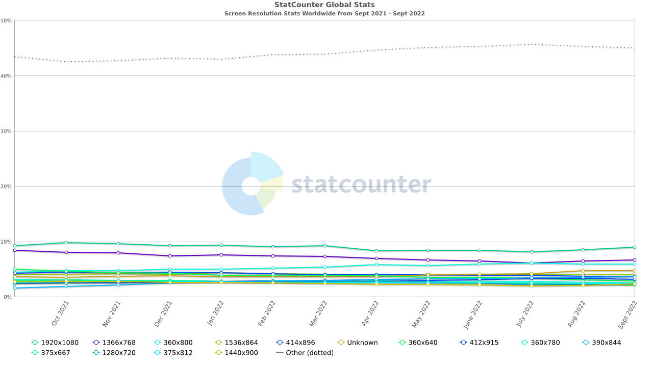
Statistics and figures of popular resolutions in the world
Look at the chart below; this chart is related to 2022, and the numbers you see show which screen resolutions have increased and which have decreased. These statistics and graphs are related to daily personal or business web browsing. There are many things hidden in the heart of this chart, and exciting results can be obtained from it. The standard screen resolution can be used for website design or any other purpose.
What is the best screen resolution in website design?
This is one of the first questions for every web designer and everyone interested in technology and communication.
Based on the Worldwide Screen Resolution Stats report, prepared from September 2021 to September 2022 and published as a chart, you can decide in 2023 which screens to focus on, also, about where we are moving in the future, and which devices will become more popular and which devices will be destroyed.
- 1920×1080 – 8.97%
- 1366×768 – 6.62%
- 360×640 – 2.84%
- 1440×900 – 2.27%
- 1280×720 – 2.32%
The most popular and used screen that opens common websites is the standard screen resolution of 1920 pixels wide and 1080 pixels high. You are surprised, but you have to accept and keep this issue in mind in your website design.
Google also gives particular importance to mobile sites and has a special bonus for SEO sites that provide a suitable display in portable mode and are considered in the site design.
Of course, it is interesting to know that the second rank for the screen is the desktop, and the 3rd rank is also in this category.
All in all, you should take responsive website design seriously, support all users, and provide good service to all website visitors.
The size of desktop screens in website design
The chart below relates to only the most commonly used desktop screens. Here is a list of the top 10 screens in the world that include the most desktop visitors.
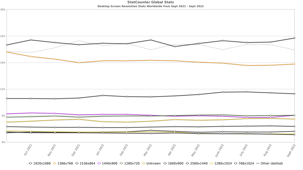
The most statistics of desktop screen sizes:
- 1366×768 – 17.67%
- 1920×1080 – 23.56%
- 1440×900 – 6.07%
- 1600×900 – 3.56%
- 1280×720 – 6.09%
- 1280×1024 – 1.86%
The standard length of mobile screen resolution
This chart is also given like the previous chart in the case of only mobile screens or smartphones. You can also check this separately and use it.
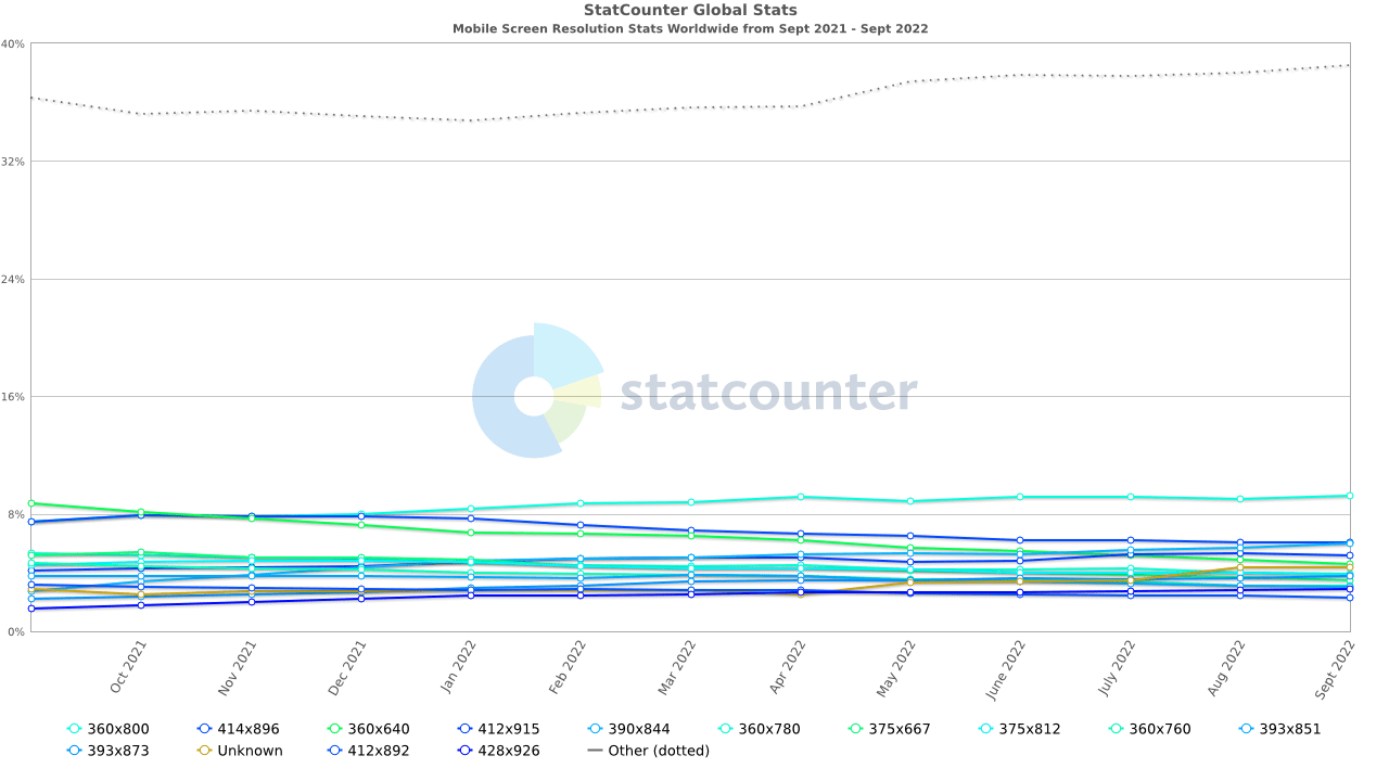
The most popular mobile screen size:
360×800 – 9.22%
414×896 – 6.01%
390×844 – 5.95%
412×915 – 4.61%
360×640 – 4.59%
Resolution size of the most popular tablets
Tablets also have their world and their users. You can see and check the most used and popular screen sizes of pills through the chart below.
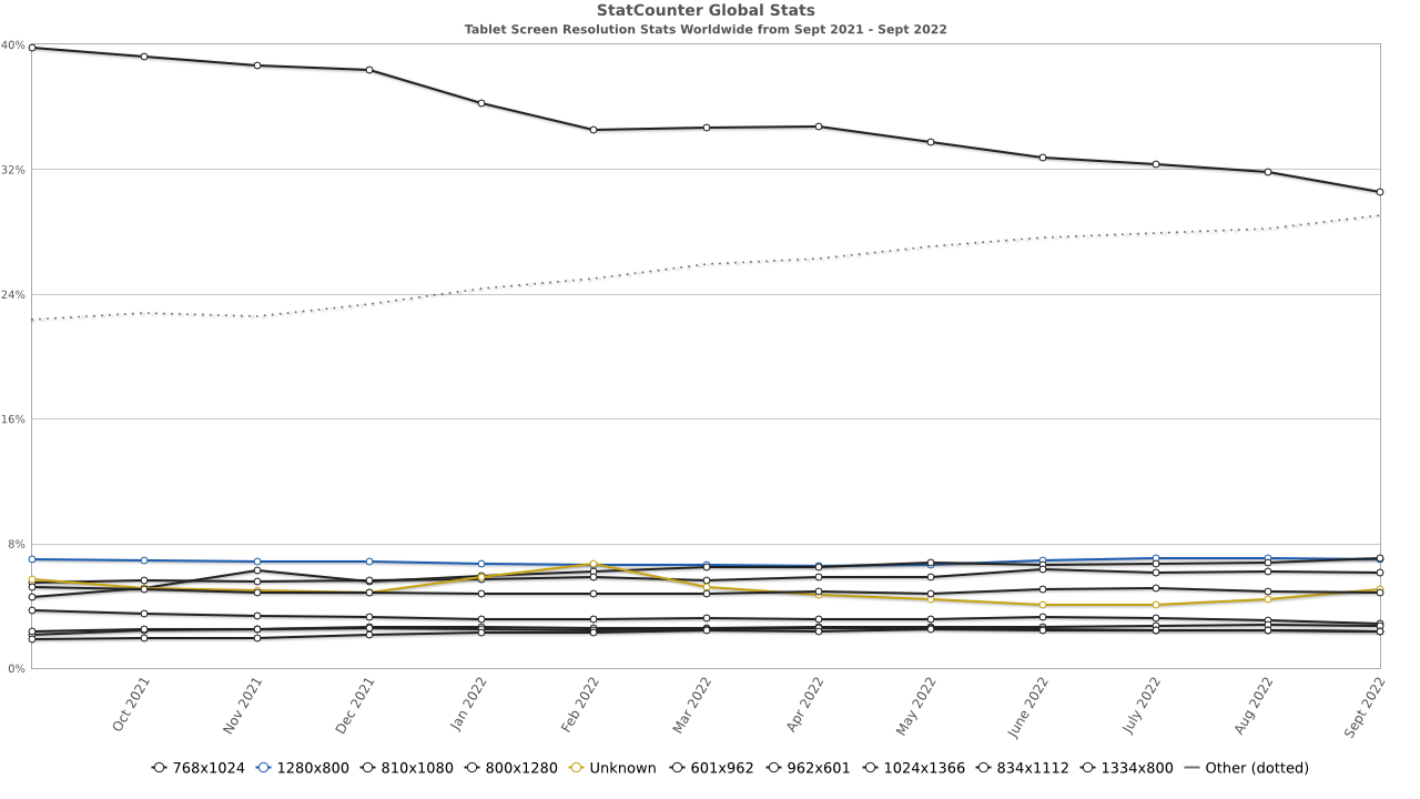
The best tablet screen size:
- 768×1024 – 30.54%
- 810×1080 – 7.07%
- 800×1280 – 7.02%
- 601×962 – 4.85%
Conclusion
The things said, and the statistics presented are about internet users who usually use the internet, such as surfing the web and visiting public sites, etc., who see thousands of different places daily and use their devices for the web. They use roundness. I hope that the given statistics and information are helpful for you and that you can use them properly. In general, knowing these things is not without grace, and many times it involves our thoughts and minds so that we can make the right decisions at different stages, even if we do not design the site and do not look at the issue from this point of view.
Responsiveness of the site is essential for SEO. Google directly tracks it, and responsive sites will have a better rank in ranking. Visitors will also notice it, and you will get more daily visits, and the same daily visits will be more critical in optimizing the benchmark site. It is different and improves your rank. No matter how we look at it, it will be essential for us to comply with the site’s responsiveness, and we must do a unique design for standard screen sizes. Compliance with all these issues can impact how to calculate the price of website design.
Frequently Asked Questions
What is the most used desktop resolution in website design?
1920 x 1080
What is the most used tablet resolution in website design?
768 × 1024
What is the most used mobile resolution in website design?
360 x 800