


Introduction of appropriate CSS and HTML frameworks
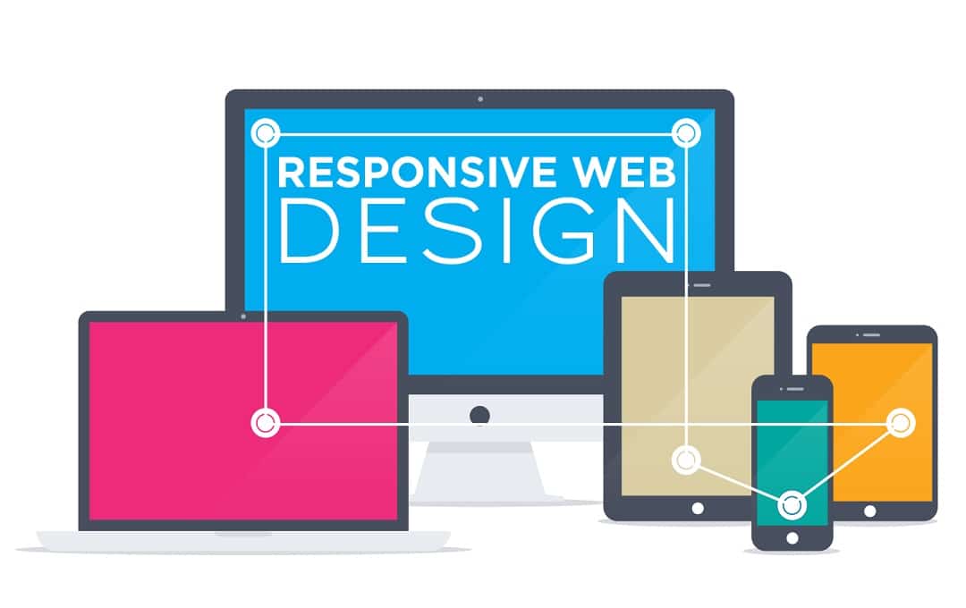
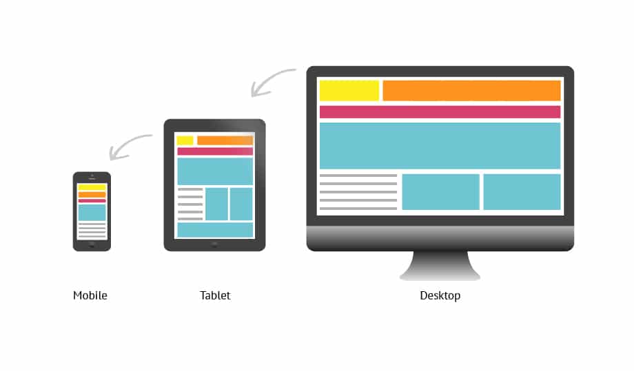
and Today, with the emergence of responsive design techniques, creating websites is done in such a way that they can be viewed in different resolutions of mobile and desktop screens. This trend has led to the emergence of responsive front-end frameworks. In previous articles, we have explained in detail about responsive website design, and in this article, the focus is on introducing CSS and HTML frameworks.
What are front-end frameworks?
In the world of website design, front-end frameworks are a package made of standardized files and codes (HTML, css, JS, . . . ) that are used for website development. The purpose of the framework is to provide a common structure that programmers do not have to rework and can use the provided code multiple times. Using the framework has reduced some of the tasks and saved time.
The concept of frameworks can be applied in different stages of designing a website. Frameworks can be backend and frontend, and in this article we will examine the types of frontend. Front end frameworks are usually made of standardized files and codes (HTML, CSS, JS, . . .) even ready-made site templates use these frameworks to build their sites.
Components of front-end frameworks
1. Contains CSS source codes to create a Grid
This component allows developers to place website design elements in a simple and flexible way, without worrying about them collapsing when displayed on different screens. By using this system, structures with 12, 16 and 24 columns can be reached. The image below shows a grid system.

2. Ability to specify Typography for HTML elements
3. Providing solutions to solve the problem of browser incompatibility in displaying sites
4. Creating standard CSS classes that are used to create a specific style in the user environment.
How to choose a suitable css framework
In terms of complexity , CSS frameworks can be divided into two groups:
- Complete frameworks
- Simple frameworks
This distinction is completely subjective and is not a proof that they are superior to each other. In choosing a suitable framework, there are things that are important to pay attention to:
- Setup speed : some of them are very easy to set up and some of them require more time to configure.
- Ease : Some front-end frameworks are complex to understand and require a lot of effort, while some are simple and easy to work with.
- Features: Some are more complex than others and offer more options.
- Can be combined with other systems
- Long term support
What are full frameworks?
These types of frameworks are easily customizable by providing more features such as forms, buttons, picture frames, HTML templates, icons and other adjustable components, and it is one of the html frameworks .
- Bootstrap
Between html frameworks and CSS frameworks, one of the powerful frameworks is bootstrap. Bootstrap uses LESS CSS. This framework experts was created by Twitter and due to its many features, it is one of the most common frameworks used in responsive designs today. Bootstrap has a 12-column grid and is well compatible with desktop systems and mobile devices.
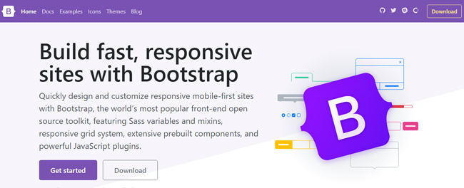
To learn more about Bootstrap, read the article What is Bootstrap .
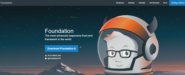
- Foundation 3
Among the front-end frameworks, an advanced framework is Foundation 3 . Foundation 3 is built on a powerful CSS engine called Sass. This feature gives Foundation 3 the ability to be very flexible so that every detail can be changed in it.
https://get.foundation/
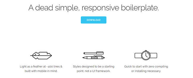
- Skeleton
Skeleton is a very beautiful framework suitable for special mobile device designs. Skeleton is a small set of CSS files that, in addition to being light, can be displayed on any screen size without any problems.
getskeleton.com
- YAML 4
A CSS framework is modular and designed to be very flexible. YAML 4 is supported in many modern browsers such as Chrome, Firefox, Opera, Safari and Internet Explorer.
yaml.de
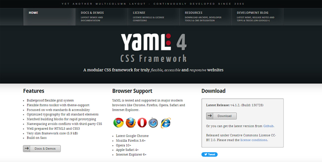
We have already talked about what Internet Explorer is .
- Gumby
Gumby is a CSS framework based on 960 pixels grid that offers different types of grids with different number of columns. This feature of Gumby makes it very flexible when designing. Gumby makes it easier for you at first by providing ready-made template creation files.
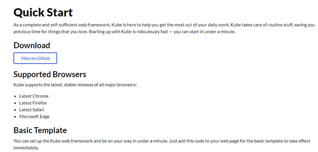
- It was
A CSS framework is suitable for advanced designs. It is very versatile and has a complete grading system. This framework offers very beautiful typography.
https://kube7.imperavi.com/
- ResponsiveAeon
ResponsiveAeon is a very beautiful framework that uses CSS3 system grid. This framework has a responsive grid based on Media Query, HTML 5 and JavaScript. To get information on what HTML is , you are suggested to read our dedicated article.
What is meant by simple frameworks?
They are generally called grid systems, but they are still a framework. These types of frameworks provide a set of definitions of a column system so that different elements can be easily distributed in this system according to the website design.
Introducing the best simple css frameworks
- ۱۱۴۰ CSS Grid
This framework is suitable for large monitors and displays perfectly in 1280 resolution. This framework uses Media Query to display on mobile devices, and in these monitors, all columns are placed on top of each other so that they can be seen correctly. This framework is basically refined for the 1280 resolution size, but it adapts well to any type of display, even mobile devices, and resizes well for any smaller size, on its own scale.
https://www.ramotion.com/agency/web-design/cssgrid/
- Mueller css framework
It is a modular grid that is used to design reactive and non-reactive layers. The basis of its work is desktop displays. In this framework, you have complete control over the width of columns, grooves and grid lines.
muellergridsystem.com
- Framework CSS A Titan
Among CSS frameworks, TITAN is a CSS framework for responsive design that is easy to use. Titan framework is presented in two types of 12 and 16 columns.
titanframework.net
- Responsive Grid System
A simple framework for designing creative styles. This framework is specially designed for mobile devices from the beginning, which has Clearfix, box-sizing features. Its size in compressed mode is less than 1 kilobyte.
responsive.gs
- Less Framework 4
A simple grid system is adaptable for designing websites. It has 4 layers and 3 types of typography, all of which are based on a single grid.
lessframework.com
- Framework css aColumnal
A CSS is a grid system that is a hybrid version of another CSS language with custom codes added to it. It is suggested to read the article “What is CSS language?”
Its flexibility is borrowed from cssgrid.net, while some of its code base is from the 960 gs framework. adapted
- Toast
Among the best css frameworks, it can be said that a css framework is very simple, but it is not the simplest. In this framework, a responsive grid with 12 columns is used, where mild effects can be applied to the design. Also, with the box-sizing feature, you can add layers and borders to the grid without causing inconsistency in other parts.
https://daneden.github.io/Toast/
- Ingrid
Ingrid is a fluid layout system and its main goal is to reduce the use of different classes in a specific section. This feature has made this framework have less disturbing elements.
- ۰ Grid System
960 Grid System is an attempt to make web design simple and effective, this feature of 960 Grid System is made possible by providing widely used sizes based on the width of 960 pixels. This framework is presented in two forms of 12 and 16 columns and can be used separately or as layers behind each other.
.gs
- Susy
Susy is based on Natalie Downe’s CSS and html system. You can use it anywhere, be it static or dynamic sites, WordPress, Django and anywhere.
https://www.oddbird.net/susy/
With the explanations provided and the introduction of the best css frameworks and html frameworks, you can choose the most suitable framework depending on the type of website design and the things you need