


How much negative space should we consider for the logo?
How much negative space should we consider for the logo? You probably heard many concepts if you are somewhat familiar with digital marketing and content creation. The most important concepts are SEO, logo design principles, negative logo space, ordering content production, etc. One of the most important concepts in graphics and logo design is the amount of negative space in logos. What is negative space, and how does it affect creating a logo? How much negative space should we consider for the logo? These questions are probably familiar to you. If you want to find a good answer to these questions, staying with us until the end of the article is better.

What is negative space in logo design?
Negative space in logo design refers to the space around an illustrated object that helps convey its meaning and definition. Simply put, negative space is an “unused space” that plays an important role in logo design. The negative space is designed indirectly, and the way the design elements and components are placed in it is very important. The logo’s final output will look confusing and crowded if your design has many components but not enough negative space. The opposite is also true, and if your negative space is too much in the design, your design will look unrealistic, and the audience will not be able to communicate and understand its meaning.
Using negative spaces in logo design allows you to use the main image of your design to add more images or concepts. That is, the audience gets the concept and main idea of the logo at first glance, and then, with a little precision, they can also find indirect and hidden images in it and communicate with them. This attractive technique helps designers attract the audience’s attention to their design by creating negative and positive space in their logo design and engaging them in finding the meaning and concept of the design. This process has a psychological effect on the audience’s minds. It will ultimately lead to the permanence of the desired logo in their minds Because the audience has spent a certain amount of time analyzing the logo design. For that reason, they will not simply forget it.
How much negative space should we consider for the logo? Explanations about the concept of negative space
How much negative space should we consider for the logo? What is negative space? Let us first examine the concept of negative space. Negative space in the term refers to the empty parts in the logo. This space is defined in smart logos in a way that highlights the main message of the logo. That is, if we use the negative space intelligently, we can convey the message of our logo to the customer more clearly and explicitly. These spaces may seem empty or negative initially, but they represent a special concept. Let us clarify the issue for you by mentioning some examples.
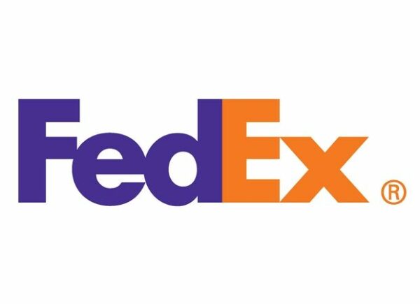
One of the types of negative space in logo design is the FedEx logo. Looking closely at the image below, you can see a space between the letters E and X, shown as a forward arrow. As you know, the nature of FedEx is air freight. This arrow points exactly to this concept and will make the collection’s message more prominent.
The second example of negative space in specialized logo design is the ZZap symbol. The image below shows that the zzap symbol is a lightning bolt. Between the two letters z that you see in this image is a negative space shaped like lightning. This negative space has been able to show the symbol of the collection to the customer intelligently.

Summary and conclusion of the article
Using this technique will make the audience pay more attention to your design and create a more attractive and memorable image in the audience’s mind. Negative space helps the audience not to forget your design easily.