


0 to 100 Psychology of geometric shapes in logo design
How can the psychology of geometric shapes in logo design affect design work? Do you want to design unique logos but don’t know what levers to use? It might be interesting to know that geometric shapes in logos can positively or negatively affect people’s subconscious minds. Inevitably, when designing a logo, it is necessary to use different geometric shapes. If you are new to becoming a designer but not familiar with the work’s principles and the ins and outs, we suggest you stay with us in this content; Because we will discuss this topic.
The growth of digital marketing in the last few years has increased so much that almost every person wants to use different tools in his hand for branding. One of the branding tools these days is to use SEO. We suggest you also read the article What is SEO in this regard? With the help of this method, you can see your website in the top links of Google. One of the techniques used in SEO is content creation. This category has caused many people to order content production these days so that they can be placed in the top links of Google.
Using vertical lines in logo design
Before any explanation, we need to share with you that every line in the logo has a meaning and cannot be easily ignored. This issue has caused many logo designers to want to learn the psychology of geometric shapes. Without knowing these things, you definitely cannot design a beautiful logo.
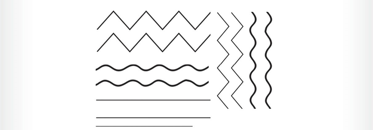
In the psychological category of geometric shapes, we must state that vertical lines express strength and professionalism at work. If you like to show off the stability or strength of a set, we suggest using vertical lines in the logo.
Using horizontal lines in logo design
At the opposite point of the vertical lines, these lines are located. Horizontal lines are considered a safe choice; Because they make viewers trust and attract attention to the logo. You may be interested to know that horizontal lines can induce relaxation.
Using curved lines in logo design
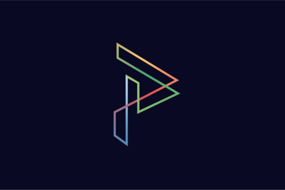
Curved lines are another category of lines that can be used in logo design. Curved lines make people’s veins feel dynamism and mobility. Most reputable brands in the world who like to create a sense of movement in their audience use very clever curved lines in their logo design.
geometric shapes with rounded edges (such as circles)
The round edge’s geometric shapes suggest Strength, participation, and flexibility. If you have noticed, the most attractive logos to many people have a circular shape. Geometric shapes in the logo can double the beauty and appeal. Most of the logo designers who have been successful in this field of work have used all the tools and lines well.
Another thing that is worth mentioning is that round geometric shapes like circles express unity. The most obvious example of this is the Olympic rings. All five continents in the world participate in the Olympic Games.
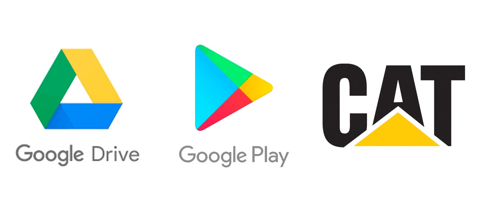
Geometric shapes with sharp edges (such as squares and rectangles)
Geometric shapes with sharp edges, such as squares and rectangles, are not of much interest to logo designers; Because if they are not used correctly and regularly, they cannot be beautiful. Psychologically, vertical and horizontal lines can create a sense of confidence in the audience, but remember that using too much of them will also be boring. This is where you should use square and rectangular geometric shapes to diversify the work; Because, in terms of psychology, geometric shapes in logo design have the same function as vertical and horizontal lines.
The concept of natural and organic forms
After you are familiar with the psychology of geometric shapes in logo design, you should look for the concept of natural and organic shapes. People who are strangers to logo design may question what natural and organic shapes mean. In response, we must say that everything we deal with in the real world is part of organic forms. The leaves of trees, spots with different shapes that we produce ourselves, and… are exactly natural or organic shapes. These shapes can be used in designing a logo suitable for any activity. To use these forms intelligently and in a completely correct way, you must first get to know the nature of a business. Knowing this, you can easily use natural and organic forms.
The concept of abstract shapes
Before we want to talk about abstract forms, we need to state what is meant by abstract art. Many great painters of the world used this style in their paintings to show off their art. In paintings designed in this style, you can’t make any correspondence between them and reality.
If you can use this concept in your business card design, you will be successful in logo design. Of course, exaggerating too much in this painting style will have the opposite effect on the audience.
What is the background of the logo design?
Before we get to the design of the logo, it is necessary to get familiar with the background or logo and see how it was created and used. It can be said that the history of the logo goes back to when the first humans tried to convey their meaning and meaning to others by carving on stones and painting on them. The word logo is taken from the Greek language and entered our language. Different emblems and logos can be seen on the old coins left from those periods, the signs on animals, and the Fiera. Even today, it can be said that most businesses have a unique logo that represents them in a way.
It is interesting to know that some prominent companies in the world sometimes redesign their logo or make changes to it, which helps their work to be seen better and seen again. These changes can be changing the type of font, the size of the logo, its color, or a general change in the shape of the logo, or redesigning the logo and presenting a new logo to the market. Continuing the discussion of what logo design is, we will come to the topic of what are the types of logos. Stay with us to learn the different types of logos.
What are the principles of logo design?
To have a good logo for your business, you need to know the principles of logo design first. Logo design has several principles, some of which are as follows:
First, the designed logo must be simple, without extra work and details. It is also important that the logo designed for your business is not limited to a specific time and can be used for a long time without losing value and credibility. The correct way of using colors is one of the important things that should be taken care of when designing a logo. In addition, the logo must be attractive in black and white, clear, and legible. Try to match the logo perfectly with the subject and content of your business and culturally align with the customs of society. Note that, as mentioned at the beginning, these are only some of the principles of logo design.
What are the characteristics of a professional and strong logo design?
After answering the question of the principles of logo design, we come to the issue of the characteristics of a professional logo. As said at the beginning, the logo is a brand’s identity, which is why its design is important. Let us explain the importance of this issue with a simple example: if you do not know the personal characteristics of a person, such as his name, how do you talk about him? Obviously, with the help of his appearance characteristics, such as a girl with blonde hair and black eyes or a boy wearing red shoes. The effectiveness of a logo for a business is the same. That is, when consumers see your logo, they should be able to relate to it and imagine your brand.
When you see a tiger jumping, the Puma brand is generally associated in your mind, or when you see the Nike brand tick mark, it comes to your mind unconsciously. For the logo design to be powerful, it must be special, and the name or trademark of that brand must be used in it. The logo’s color is also very important and should match the type of brand. For example, red indicates high energy and boldness, green induces nature and growth, and blue symbolizes peace.
What are the types of logos?
In the continuation of the topic of what logo design is, we will come to the types of logos. There are many types of logos, but they are generally grouped into three main categories. These three categories are image logos, written logos, and combined logos. In the following, we will give a brief explanation of each.
- Image logo: These logos include icons and symbols. In their design, a series of simple shapes and different images are used that are associated with that company or product, or business. Generally, visual logos are a little more complicated and indirect than written logos, and the viewer needs to interpret them.
- Written logo: which is also called logotype or word symbol. In this type of logo design, the name of the brand or business is somehow transformed into a visually attractive symbol with the help of font combination and changing its size and layout as well as creativity. The important thing is that these writings must be completely legible and recognizable.
- Combined logo: As the name suggests, these logos are created by combining text and images.
Last word
In this context, the psychology of geometric shapes in logo design was discussed, and how to use them in logo design. We hope you get the most out of reading this article.