What is Call to Action or CTA?
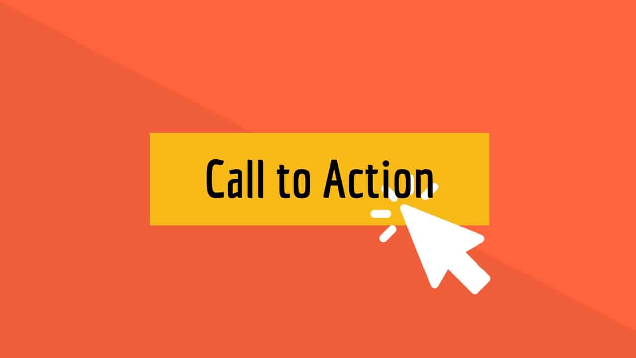
A call To Action, or CTA, is a plan or tool designed to get the fastest response from people who are targeting a particular topic. This design is mostly used in the field of business and internet businesses.
If you cannot direct customers and contacts to your website in a direction that is beneficial to you, you probably will not use Call To Action. Or maybe you are not using Call To Action or CTA properly and efficiently.
If you want people who come to your website to see your products, if you want to get them to buy, or if you want to get more information from customers, you need to use the right CTA. Otherwise, most of your efforts to attract the audience will be in vain.
Do not worry if you are a little confused by the topic and do not know exactly what Call To Action is or how to use it effectively. In the following, we will fully explain the purpose of the topic called Call To Action and how to use it.
CTA definition
The CTA or call to action is used to grab users’ attention or turn leads into customers on the web. The main purpose of the CTA is to motivate or encourage visitors to take a specific action. You will encounter a CTA anywhere, including on websites, apps, or social networks where you are invited to take action.
The call to action can be implemented in the following ways:
- Linear
- Button
- Form
- Pop-Up
- Slide-In mode
- Sidebar mode next to the web page
- News
- Sharing on social networks
The choice of the above options depends on your goal and the location of the CTA, so always try to specify what you want to achieve through the CTA in a well-defined way.
As mentioned, Call To Action is an effective business tool used as part of a marketing branch or marketing strategy. With CTA, you can reach your target market and get the response you want.
A call To Action is usually used in the last step of dealing with the customer. It may also be used during a process such as watching products or reading an article on the site. After all, using the CTA takes the audience to the next level that they want, and that benefits our business.
Although using Call To Action has its do’s and don’ts that greatly impact directing customers to our destination, you should not think that CTA alone can affect all of our customers and contacts. Because in the first place, attractiveness is the issue that we intend to lead the customer to.
Why do some people not use Call To Action?
Call To Action makes customers aware of their next step in interacting with our business. Still, many business owners and businesses today have not yet realized the importance of using it, and They do not use CTA in their business.
They can not use the CTA for two main reasons.
- These business owners probably believe that if their customers are attracted to their products or want to learn more about their business, they know what they need to do.
- They may also be worried that Call To Action might annoy their potential audience and cause dissatisfaction.
However, the reason for not using the CTA, the lack of this tool in a business sales and marketing strategy, is to lose an audience that could be profitable for the business. To put it more bluntly, this loss can mean a loss of money or revenue for a business.
When to use Call To Action?
So as a business owner, do not assume that your audience will automatically know the path to a product, service, or whatever is beneficial to you and follow through if they wish.
Do not leave text ads, banners, images, articles, site landing pages, and what you expose to the audience without a call to action. Please do not believe that the audience will determine what steps to take after encountering the content published by you. Be transparent in what you publish to attract the audience and expose them to the audience until you become an actual customer. It would help if you did not leave him in the middle hoping that he knows what he has to do.
Whenever your business is in front of an audience, ask them to take the next step and take the next step in interacting with your business. This next step makes sense for any business. For example, for sites that publish articles, the next step may be to ask the audience to refer to and read an article related to what they were reading.
For a Forum Analytics website, where people discuss a particular topic and share their opinions and experiences, the next step can be to direct the audience to fill out a comment form on those topics. Be special.
For an online store, the next step after the contacts enter the first page can be to direct them to the page of best-selling products or discounted products.
Consequently, when we refer to the term “next step” in the description of Call To Action, we mean the destination or goal that, if the audience is directed to, the desired profit of the business will be achieved.
How to use CTA
Today, the most common use of call-to-action tools is in product sales. You’ve probably seen phrases like “add to cart,” “order now,” “place an order,” “buy this item,” and the like on sites and online stores.
Of course, buying products is not the only issue in which Call To Action can be useful. Especially if the products and services have a significant price, it is probably impossible to encourage the audience to place an order and buy the products with a simple “Order Now.”
But call to action can also be used in such situations. For example, instead of using less favorable terms such as “place an order,” you can use phrases like “call now for your order to get a discount.”
A call to action can be used for any business and in any field of activity. If you want to get the emails of the contacts who come to your site and this is a beneficial topic for your business, it is enough to use a call to action such as “subscribe to the newsletter.” In this way, people enter their email in a place that you have significantly embedded in the site for this purpose, and you can make a list of emails registered by the contacts. So you have reached the main and useful goal of your business.
Or, to increase your social media visitors and followers, you can use phrases like “Follow us on Facebook to read more content” on your site.
You can also use a phrase like “click to read more” to get visitors to your site to spend more time there and not leave the site for a while.
Learn more about commonly used phrases like Call To Action
In general, the terms used for Call To Action are command, action, or action terms.
- Sign Up
- Register
- Call
- Subscribe
- Donate
- Buy
- Order Registration
- Share
- Follow
- Download Click for
What are the features of a strong Call To Action?
First and foremost, make sure that every page of your website, every conversation you have with customers about selling products, every text, every image, every ad, and everything about your business exposed to the audience, is a call.
If you are a blogger, invite your audience to view or read another post that is related to this content at the end of each post.
But in general, one of the ways to have a strong and useful Call To Action is to use it to make customers, and audiences feel afraid of losing an achievement. It is as if they are missing out on a good opportunity in their lives if they do not do what you ask them to do.
Phrases like those below are good examples to help you better understand this.
Amazing discounts (occasional offers that are repeated over long periods, for example, once a year)
Black Friday offers with 50% discount (percentage offers)
You only have 12 hours (offers that are limited in time and will expire soon).
To see which of these phrases comes to your mind is most useful in your business; You can change them from time to time and study the audience’s attitude towards them. This way, you will know which one is more profitable in your business.
Benefits of using Call To Action
In addition to all the explanations provided and as a summary, if we want to present all the benefits of a call to action in one sentence, we must say:
Call To Action is an effective tool in marketing strategy that helps turn more of your potential customers into actual customers.
CTA Indexing
As mentioned earlier, the best way to increase CTA efficiency is to be aware of its purpose. It helps you determine the right place to put your CTA. Hubspot has divided the call into action into eight sections, but at a glance, it can be seen that this list has three main categories, each of which we will explain below:
1- Increase content
This type of CTA is usually used to promote and deliver content to an audience above the sales funnel. When a person first visits your website, your whole focus is on turning them into customer leads through existing content so that you can receive your ads on an ongoing basis by receiving contact information. Do.
In other words, visitors at this stage are not yet considered customer leads, but after seeing excellent CTAs and quality content, they become lead customers. These types of CTAs are very simple suggestions related to the page’s content. Slide-In is another type of CTA for content promotion that has many uses.
2- Generate conversion rate
This type of CTA targets buyers in the middle or bottom of the marketing funnel. This model of CTA directly targets the customer persona so that visitors can be led and then turned into real buyers.
The forms and buttons on the Landing-Pages are prime examples of this type of CTA. Buttons, while seemingly small elements play an important role in attracting leads. Buttons like Download Now are very clear instruction that persuades the audience to take a specific action step by step.
3- Business oriented
This type of CTA is more of an advertising aspect that sometimes has nothing to do with the content on the page. For example, you can place promotional CTAs, webinars, or upcoming company conferences on different pages of your website. Of course, it is always better to consider space for the share button on social networks. Pop-up ads are also the best way to display important information to visitors if used properly.
The most important thing when using a CTA is to set a goal to determine the right place to place it. In fact, after deciding on the type and location of a CTA, you should focus on its design and appearance. Here are 15 practical examples of CTAs that you can use to inspire your website.
15 practical examples of CTA
1- Evernote Company
CTA Button: Signup
As soon as visitors enter the main page of the Evernote website, they will understand the message Remember the Everything in it. The design of this website is so simple that users can understand the benefits of using this application and easily register in it. In addition, the green color of the CTA main and sub buttons is similar to the color of the company logo. It motivates customers to click on it.
2- Dropbox Company
CTA Button: Signup for Free
Dropbox is known for its simple design and negative space (Negative Space) in the appearance of its website so that even the graphic designs on the main page of the website are small and concise. The simple design and negative space on the main page of this website have caused the CTA button with the phrase Signup for Free to be in front of the eyes of visitors more than any other element.
3- OfficeVibe company
CTA Button: Subscribe
This website uses Slide-In mode to display CTA. If you look at the company’s news magazine posts as a scroll, a banner will appear as a slider at the bottom of the page with a subscribe button. Another interesting point is that the text in this section is completely related to the post’s content on the page; In other words, by opening the post related to business management, a CTA with the text related to the same category is displayed for the visitor.
Of course, some experts believe that the CTA is not pleasant to the audience as a slide and prevents them from reading the rest of the content. Still, the example in OfficeVibe magazine is very desirable to continue reading the content by watching it.
4- Netflix Company
CTA Button: Join Free for a Month
One of the problems that most users have before registering and buying a monthly subscription from different companies is that they can not cancel their subscription if they are not satisfied. Netflix has canceled its Cancel Anytime monthly subscription just above the CTA button to address subscribers’ concerns. Note that the red color of the CTA buttons is the same as the color of the Netflix logo.
5- Square Company
CTA Button: Get Started
When designing a CTA and the design of the button, you should also consider other elements such as background color, images, and text around the button. Aware of this, Square website designers have placed the Get Started button in the middle of a simple and ordinary image to show the ease of use of the company’s products. If you look closely at this image, the color of the bank card matches the CTA button, which persuades users to click on it.
6- Prezi application
CTA Button: Give Prezi a try
Prezi application design is also done in a minimalist way. Apart from the green dinosaur and dark brown visible on the screen, the only other color that can be seen next to the black and white design is the light blue color of the CTA button, which is the same as the color of the logo of this application. The main and secondary CTA buttons with the titles Give Prezi a try and Get Started in light blue are perfectly placed on the main page, and both of them lead the user to the subscription purchase page.
7- Full Bundle Company
CTA Button: Our Work
Full Bundle has also used a lot of negative space in the design of its website home page to highlight the CTA button so that the phrase “Our Work” in white can be easily seen on a dark background. Their selection for the CTA button is also very strategic because they are primarily trying to increase online customers. Through this, they can share their portfolios with customers in cyberspace.
8- Panthera Association
CTA Button: Join
The company seeks to attract users interested in wild cats worldwide and uses special languages and phrases such as Join the pride today to find its target audience. The main page of this forum website looks very simple and has a form consisting of two simple sections and a Join button.
9- EPIC Company
CTA Button: Let’s start a new project together
People at EPIC use the homepage of the website to display their portfolios. When you enter the company’s website, various portfolios of this company will be displayed in animation. Of course, there are other buttons, such as viewing the customer’s website on this page. But the main CTA button with a very sincere phrase. Let’s start a new project together at the bottom of the page.
10- Aquaspresso Company
CTA Button: Send Me Specials Now!
Although your main goal in using Call To Action is to persuade visitors to do something specific, the best CTAs do this in a useful way to your audience. Coffee maker Aquaspresso has done just that through Pop-Up on its blog homepage.
Users go to a company’s blog to view products, so business owners usually use different methods such as CTA with the phrase Check out our most popular products! Encourage visitors to buy the product. But Aquaspresso has come up with a very creative way to bring more benefits to users. The company has included Call To Action in its blog with the phrase today’s specials to send them the list of products of the day in exchange for receiving an email address.
The use of the phrase “offers” today also subconsciously evokes the rarity of the company’s products in the audience’s minds. For this reason, people prefer to buy these products.
11- QuickSprout Company
CTA Button: Are you doing your SEO wrong? Enter your URL to find out
People generally do not like to make mistakes. So the slide-shaped CTA button on the QuickSprout website has such a high click-through rate that users can see errors and problems by entering their website URL. The language of this Call To Action is that most users are persuaded to click on it.
In addition, placing a slide-shaped CTA in the middle of a blog post is one of the most effective techniques for attracting visitors. Most websites put a CTA button at the end of their posts. At the same time, research shows that most readers only follow 60% of an article.
12- Treehouse Company
CTA Button: Claim Your Free Trial
Many companies allow users to use their services and products for free, using Start Your Free Trial terms. Still, the Treehouse website uses Claim Your Free Trial to attract users. However, the difference in these words seems very small. The word Claim evokes the limited time of this special offer in users’ minds.
13- OKCupid Company
CTA button: Continue
The OkCupid website does not look very attractive, but its details make its design shine even more. The action call button is light green. The phrase Continue, which is located in the background in dark blue, subconsciously evokes the simplicity of the registration process in the user’s mind. Seeing this CTA, the user feels that the registration process is fun and will not make him nervous by asking for too much information and commitments.
14- org company
CTA Button: Countdown Clock
There is nothing like a timer to motivate users to do something specific. After a short time on Blogging.org, users encounter a pop-up and a timer that offers them a limited-time offer. But the interesting thing about a timer is that the usage time is 2 minutes. It shows one of these suggestions to users.
As you can see in Example 10, this causes users to buy rare products subconsciously. Of course, keep in mind that nothing special will happen after the time is up. The Pop-Up will remain in place.
15- IMPACT Branding & Design Company
CTA Button: What We Do
The use of incorrect language and tone in the CTA gives readers a sense of coercion. But IMPACT’s training approach is excellent because it shows users how to work before putting pressure on them. This Call To Action is very attractive because they have not even used a grammatical verb on their website. However, the CTA button of this website has a very high click-through rate.


