

What are the most important colors in website design? What are the best colors in website design? When building a website, pay attention to the visual elements of the site, especially the color scheme. Choosing the right colors is important because 21% of visitors leave a website with strange colors. Choosing the right one can be challenging since there are so many website color schemes. In the previous article, we also explained the second 10 items for your shopping server companions, and now the next 10 items are at your service:
21. Red and yellow
This is an image of the Make Us Care website with a red and yellow color scheme. A vibrant color scheme is perfect for a playful website. As Make Us Care shows on its home page, the combination of red and yellow makes for a fun and bold website. Yellow symbolizes happiness, while red evokes strong emotions, including passion and power. While both red and yellow are strong colors, they pair well together. Pairing the unique typography with white makes the text easily readable against a striking background.
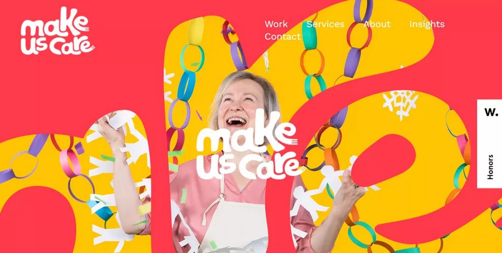

Colors Used: Coral Red (#FE3A4A), Poppy Gold (#FEC501)
22. White and purple
Adding a pop of color is a great way to make a predominantly white website more appealing. The color scheme of Liberty London’s website uses purple as an accent for a monochromatic palette. As a royal color, purple matches the overall theme of the luxury e-commerce website. Using purple for essential elements makes the website minimal. Dominating the rest of the website with neutral colors like white and black will help the purple stand out. This website color scheme increases the impact of the home page on visitors and leads to more conversions.
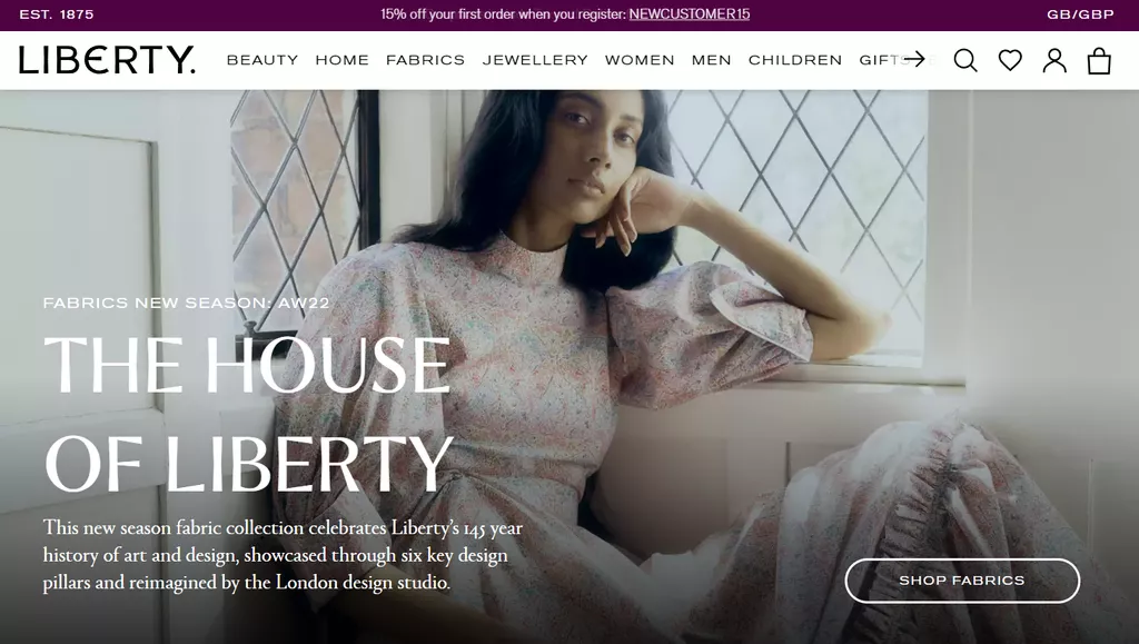

Colors used: purple (#4F0341), white (#FFFFFF)
23. Beige and red
Due to color trends, some shades are strongly associated with a certain era. If you’re looking for a ’90s theme, consider the Pertinens website’s color palette for inspiration. This website uses beige as the main color and red as an accent. Using red on a mostly blank website lets the bright color grab visitors’ attention easily. Beige evokes a strong sense of integration with the OS, as many old electronics are that color. In addition, bright red was a popular color in the 90s. To make the website more interesting, Pertinens added a 1990s office image. It’s a smart way to decorate a website while keeping the theme and color scheme consistent.
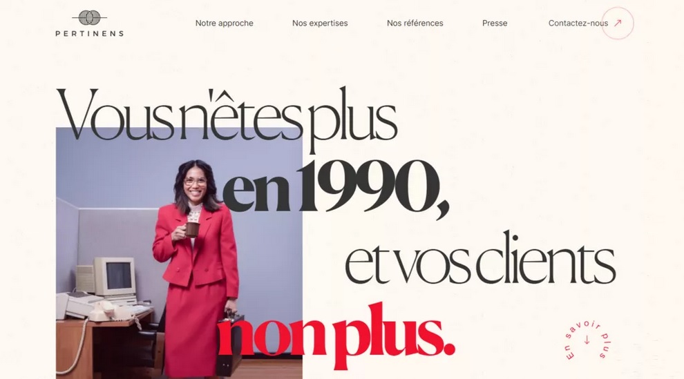

Colors used: light beige (#FDF8F0), crimson (#F0122D)
24. Shades of blue, white, purple, and red
Using a bold color can make your website powerful. Pair a bright accent color with a desaturated color palette to achieve visual balance. For example, the website of supplier company Imprint Genius uses light blue and red-purple as accent colors. It uses pale blue as the background color to create a sharp contrast. Contrasting colors add depth to isometric web design. Using bright colors against a pale blue background also helps make the image stand out. Despite being subtle, the red-purple stands out thanks to the primarily cold color palette. This color palette makes the homepage light but eye-catching.


Colors Used: Light Blue (#EFFAFD), Royal Blue (#4A8BDF), Eggplant (#A0006D)
25. Blue and white
If you can’t decide between blue and green, choose blue. Green has two colors, making it ideal for an eco-friendly tech company like Prinoth. The color scheme of the Prinoth Pak Pak website consists of blue and white. Teal creates a sophisticated, informed impression and matches this website’s zero-emission innovation. Although the background and foreground objects are blue, the different shades distinguish them. A deep blue background allows foreground elements in lighter colors to stand out. Light blue and white make the CTA and text stand out. Overall, this minimal website color scheme is perfect for a clean and modern website.


Colors used: cardin green (#0C1A1A), navy (#6ACFC7)
26. Bright orange and reddish
As CIRCUS Inc. It shows that sometimes, you might just need one color for your web design. This marketing company uses bright red and orange colors for its Chinese website. The difference in color makes the shades of orange look distinct despite being the same color. This composition also resembles the Chinese flag and keeps the website’s theme consistent. Using two bright colors together makes the website look lively and bold. As for accent colors, the company simply chooses black and white to contrast with the light background. These neutral colors won’t distract you and help maintain the warm tone of the website.
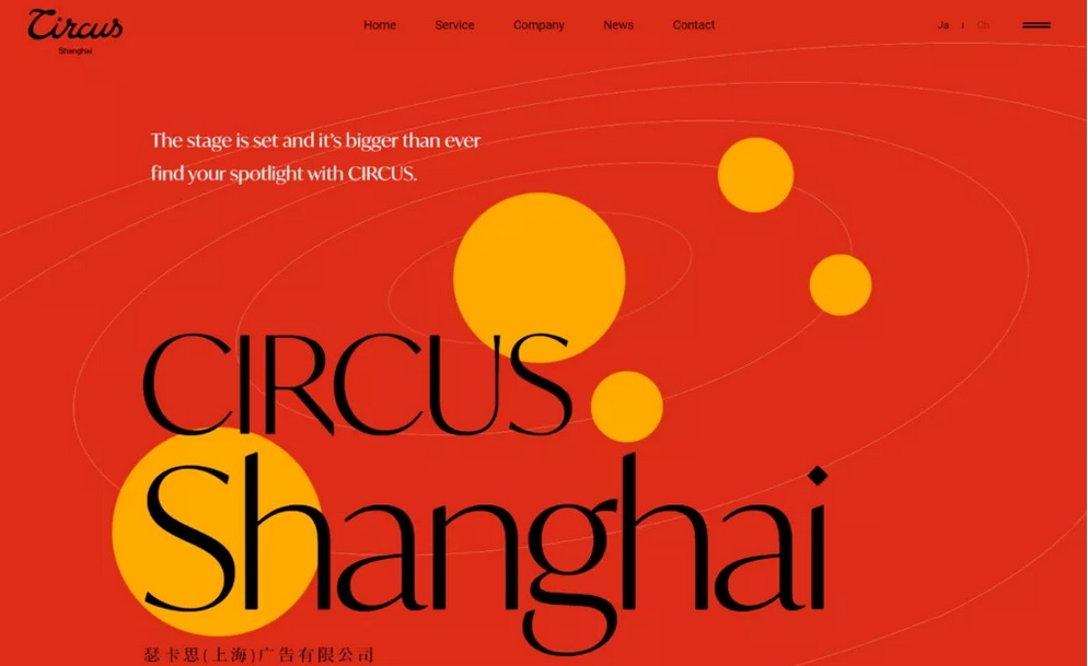

Colors Used: Orange (#FFAB00), Harley Davidson Orange (#DD2E18)
27. White, purple, and orange
Flat web design has recently become popular among companies. This type of design is suitable for a professional but casual website. However, choosing flat website color schemes can be difficult due to design limitations. Flat websites are usually minimal and have bright colors against neutral backgrounds. They usually remove any shading or color. If you are looking for the beauty of flat web design, look at Mila’s site. The color scheme of the website of the French real estate company consists of only three colors: white, purple, and orange. Purple and orange match this flat website and give it more vibrancy. Using purple for the CTA for a mostly simple website effectively grabs visitors’ attention.


Colors Used: White (#FFFFFF), Sunset Orange (#FF5841), Red-Purple (#C53678)
28. Yellow, brown, and purple
Consider Kelsey Dake’s portfolio website color palette if you’re looking for unique web design color schemes. The illustrator dares to combine different bright colors to make the website fun and lively. The website’s color scheme consists of brown and yellow. Brown is a calming color, making it a great option to contrast aggressive colors like yellow. The artist also features two purple images on his homepage for variety. Purple works best with yellow because these colors are on opposite sides of the color wheel.
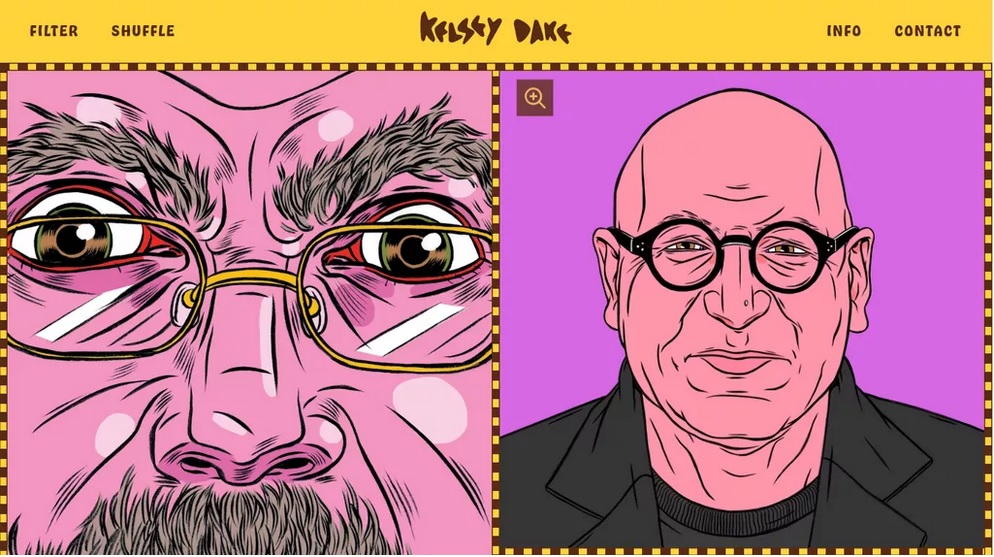

Colors Used: Sunny Yellow (#FFD43A), Baker’s Chocolate (#582C12), Medium Purple (#D668E3)
29. Deep purple, orange, red, and pink
Using too many strong colors can make a website look too flashy. However, Inside the Head’s website pales in color with four main colors: dark purple, orange, red, and pink. Interestingly, this website’s main colors differ depending on the page. As for the landing page, all colors are used almost uniformly. Inside the Head has a simple layout and design that allows for complex website color schemes. Too many bright colors can complicate the website and distract visitors from its content. Using white for text and navigation buttons also maintains the site’s usability. It is critical for a website that relies on user navigation to provide information.
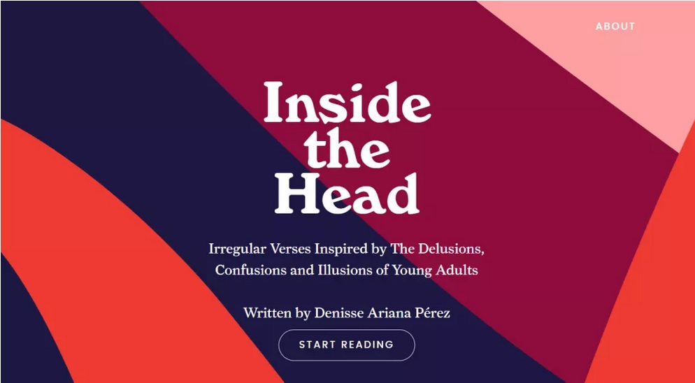

Colors Used: Sunny Yellow (#FFD43A), Baker’s Chocolate (#582C12), Medium Purple (#D668E3)
30. Brown and beige
Engineered Floors uses a combination of brown and beige for the color scheme of its web design. Both brown and beige are natural colors that give you an organic and relaxing feeling. Beige is a neutral color, but it gives the room warmth when paired with brown. This combination creates a cozy and homely color palette. This color scheme also adds more value to the homepage. Website visitors can learn the tone of a company’s brand through its website colors. In addition, the website uses deep gray for texts and icons to facilitate user navigation.


Colors used: Narvik (#EAE7DD), Sorrel Brown (#99775C)
The result of website coloring is essential in web design. The right color combination makes your website aesthetically pleasing and offers other benefits. This article discusses why choosing the right color for your website is critical. We have also provided 30 website color schemes for your inspiration. Remember, your website must perform well to provide the best user experience. Use a reliable hosting service to ensure your website is always fast and available.
FAQ
What does this part cover?
It describes the final ten of the 30 important color combinations used in website design, explaining how each palette works and why it’s effective.
Why is choosing the right colors critical in web design?
Appropriate color schemes boost aesthetics, support brand identity, improve readability, and reduce visitor bounce rates.
How are these color examples structured?
Each example includes specific hex codes and insights on how the palette influences the look, mood, and user experience of a website.