


The Psychology of color in web design
Every day, thousands of factors influence our moods, attitudes, choices, and decisions. For most people, color is one of the most powerful. Colors evoke human emotions instantly, creating powerful images in our minds faster than we can comprehend. It is clear that site designers should be familiar with the psychology of colors in order to create a user interface, both practical and emotional. In this article, we are going to examine the principles of color psychology and its effect on user behavior.
Although we have tried to compile a complete and comprehensive guide to color psychology in this article, the topic is so broad that web designers are advised to take specialized courses to better master it. One of these courses is the website design training series, which is presented in the form of a video in the course, and website designers can increase their mastery of this topic by passing it.
What does the psychology of colors mean?
Color psychology is the study of how colors affect our emotions and behaviors. As soon as we perceive color, our brain and endocrine (hormone-producing) system receive this input and release hormones throughout the body. As a result, this unconscious interaction has a powerful effect on our emotions.
The Color Research Institute found that people unconsciously make judgments about an object, person, or environment within 90 seconds of initial viewing. Furthermore, an incredible 62% to 90% of this judgment is made based on color alone. Consequently, designers should study and understand the psychology of colors in UX/UI design.
While color theory helps designers understand the nature of colors and create harmonious color combinations, color psychology deals with our minds and emotions. In addition, colors can not only attract the attention of users, but also retain users for longer than black and white images. As a result, colors increase the longevity of UX/UI design.
Why does color affect emotions?
Why colors affect how people feel is not clear. There are a number of elements that can influence how a person feels when faced with a particular color. One of the important factors is the personal connection with a color. For example, if a person’s favorite stuffed animal was blue as a child, they may prefer blue throughout their lives. Or conversely, if the same person had an accident with a blue car as a child, he might have a strong negative emotional reaction to the color blue throughout his life.
However, due to universal human experiences, it is possible to predict how most people will respond to a given color. For example, the color green is often associated with nature and growth because most people have seen plants grow. Blue is almost universally relaxing because it is associated with things like the sky and water.
Other effects are cultural. For example, the color purple is still associated with luxury, as it was very expensive and rare in many ancient cultures and was therefore only used by royalty. It is not a natural association in itself, but it has been an important part of the cultural essence for so long that it has become part of the human psyche.
The psychological effect of colors on performance
It’s not just mood and emotions that color psychology can influence. Color can also affect performance in very interesting ways. For example, in a study published in the Journal of Experimental Psychology, researchers found that the color red negatively affects performance. When participants were given a red number (rather than green or black), they performed 20 percent worse on the tests than those given other colors. This is a significant difference and can be used to influence the user experience.
This does not mean that red will always hinder performance. In a study on athletic performance, red clothing appears to confer an advantage. During the 2004 Olympics, athletes competing in four different sports (Greco-Roman wrestling, freestyle wrestling, boxing, and taekwondo) were randomly assigned blue or red protective clothing or equipment. The red-faced men won in 19 out of 29 weights. Similar studies across soccer competitions also found a similar advantage for teams wearing red.
Basic principles of color psychology
The psychology of colors includes six basic principles:
- Color has meaning.
- The meaning of color is based on biological and environmental experiences.
- Perception of color automatically leads to human judgment.
- The judgment makes a person show behavior related to that particular color.
- Color affects.
- The meaning of color and its effect is determined by the concept.
By understanding these basic principles, designers can apply them to specific business and social goals.
Psychological effects of colors
The human eye processes and decodes color in the blink of an eye, enabling designers to enhance visual hierarchy and draw attention to specific elements. This is why learning the psychology of colors is an essential part of UX design education. Let’s explore the meanings of some of the most important and commonly used colors:
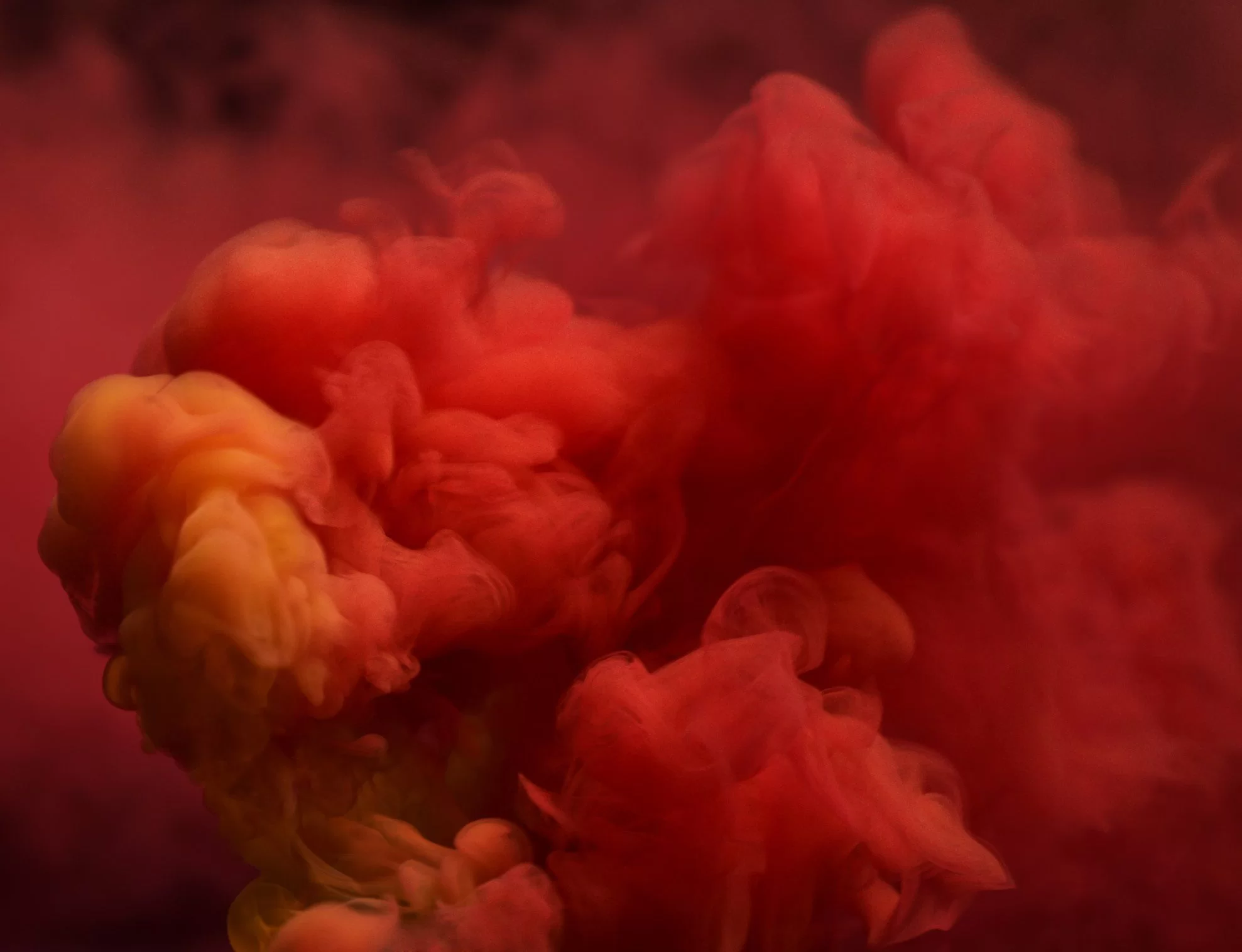
The psychology of red
Red is the first recognizable color for babies. As one of the brightest colors of the day, it attracts a lot of attention. The color red has a wide range of meanings, but they are all associated with energy and power. Depending on the concept, it can be about love and passion or anger and danger. Since this color stimulates high tension, using too much of it may be tiring for the eyes and even cause anxiety. Red color should be used wisely in your designs!
The psychology of blue
Blue is the color of trust and stability, which is often associated with reliability and competence. It is very popular in business and banking software. However, compared to warm colors, blue may seem dull.
The psychology of yellow
Yellow will forever be associated with the sun. It is the color of friendship and happiness and can be very inspiring. However, according to the principles of color psychology, excessive use of yellow color can lead to negative perception and create fear in people.
The psychology of green
Green is strongly associated with nature. It is called the color of balance and harmony. This color is also associated with youth, growth and renewal. The color green is often used in designs related to “green” topics: the environment, sustainability, environmental protection, and healthy food.

The psychology of purple
For a long time, purple was a rare pigment, so only the wealthy could afford it. This historical background strongly associated it with luxury, royalty, and monopoly. It mixes the energy of red and the reliable balance of blue but can be distracting when overused.
The psychology of brown color
Brown is associated with the earth and forest. Because of its natural origin, brown is considered the color of security, protection, comfort, and stability, and is often used as a background color.
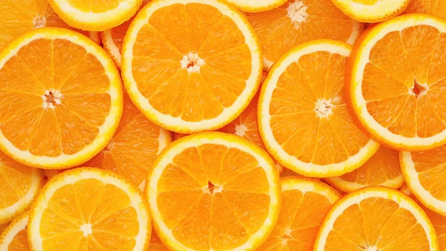
The psychology of the color orange
Orange is said to combine the power of red and the joy of yellow, so it is an energetic and positive color. Orange is associated with motivation, vitality and enthusiasm. Also, it is often used in design to create feelings of fun and adventure.
The psychology of pink
Pink is the color of love, intimacy and sensitivity. Historically, this color is associated with the female gender and is strongly associated with youth, sophistication and femininity. As a result, pink is the color of choice when considering color psychology for products and brands targeting girls and young women.
The psychology of black
Black, like red, has a wide range of meanings, from tragedy to mystery, from tradition to innovation. It usually goes well with any color. It is useful in creating contrast, so it is popular as a background color, especially for web and mobile interfaces based on visual content. Black is often associated with exclusivity and prestige.
The psychology of white
White has long conveyed the meanings of innocence, purity, and clarity. It is often associated with a blank sheet of paper or an untouched canvas that engages one to generate new ideas. However, excessive use of white can also lead to reactions such as emptiness and loneliness. White, a popular background color, adds space to interfaces and creates a solid foundation for readability.
The psychology of gray
Gray is often on the cool end of the neutral color spectrum. Using a variety of shades of gray in design creates a sophisticated and elegant look because it makes other colors stand out.
Psychology of colors according to demographics
When choosing colors, paying attention to demographics is very important. Color perception and psychology varies by gender, age, and culture, so it’s important to consider the demographics of your users.
Color preferences based on gender
Gender has a huge impact on color preference and color psychology, so it’s important to know and understand the differences. The Color Assignment research group conducted one of the most well-known studies, which is summarized below:
- Cool colors > Warm colors: Additionally, both genders prefer blue, green, and their respective colors.
- Blue is the #1 color for all genders: Both men and women chose blue as their favorite color. Women also show more interest in different shades of blue: sapphire, cerulean, lapis lazuli, beryl, etc.
- Brown and orange are not so popular: brown is less popular among men, while orange is the least popular among women.
- Men love pure colors, women love undertones.
Color preferences based on age
The age of your audience is also a factor in determining the choice of color. Children usually like warm colors like yellow and orange. According to the book Psychology of Color and Color Therapy (written by Faber Byrne), as people get older, they prefer cooler colors to warm colors.
In addition, children are more likely to change their color preferences because their tastes are not well-defined, while adults tend to stick to their favorite colors.
Color preferences based on culture
Culture has a major influence on color psychology, so be sure to consider this when choosing your color scheme. Let’s explore some key findings below.
- Blue is considered a masculine color in the West, but the Chinese consider blue a feminine color.
- In Chinese culture, white represents death and bad luck, while orange is associated with health.
- Yellow symbolizes holiness and commerce in Hinduism.
- In Latin America, red symbolizes war and the military, especially when combined with black.
These insights make you realize how important it is to determine the product’s target audience and consider it when choosing colors.
How does color affect consumer behavior?
As mentioned earlier, color can affect performance, but it also affects the overall behavior of users. Countless case studies have been conducted to compare the effectiveness of different color choices on things like call-to-action (CTA) buttons. HubSpot conducted a case study on the effect of changing the button color from green to red on website performance and got some very interesting results. A designer’s gut reaction might be that green works better because it’s associated with “go” while red is associated with “stop” and might cause people to pause before clicking. But the results showed the opposite: the red button performed 21% better than the green button. However, in other color psychology case studies, green is significantly better than yellow or orange.
Logo design is another area where color selection is very important. Brands pay experts thousands (and sometimes millions) of dollars to find the right color for their identity, one that evokes the right emotions and actions in customers, while also distinguishing itself from industry competitors. If you are interested in brand identity design, logo design, and graphic design in general and need specialized training, Faradars offers a variety of logo design courses and other graphic design-related courses that can be a good starting point for you.
Conclusion
Color psychology is a powerful tool for creating a positive user experience. This is what makes a product really shine and delight users. Whatever color scheme you have in mind, be sure to test it on your target users and make sure it works.