


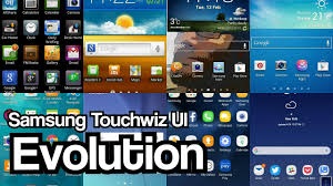
Take A Look At The Evolution Of The Samsung Mobile UI: From Touchwiz To One UI
Samsung Has A History Of Designing And Creating Mobile Interfaces For More Than A Decade, And The Brand Entered The Field Before The Advent Of Smartphones.
In This Article, We Are Going To Briefly Review The Evolution Of Samsung Mobile User Interfaces.
Many fans of Samsung phones agree on the efficiency of the software of the new phones of this company. The new UI of Samsung phones, the One UI, has many useful features and does not have many default applications (Bloatware). In addition, as promised by Samsung, one of the best Samsung software updates for this user interface will release soon; Of course, the user interface of Samsung phones has not always been so attractive, and they have had problems; Especially the TouchWiz user interface.
Don’t miss this article if you want to know how Samsung got into the mobile industry or when the mobile software features it introduced came into being. Continuing along laid off, the mind has to be informed of the evolution of Samsung’s mobile interface.
The emergence of the TouchWiz interface
After creating TouchWiz, users thought that TouchWiz was the same as Android and had many similarities. The origins of Samsung software shells go back to the years before the advent of smartphones. Launched in 2009, the Solstice was the first phone to have a TouchWiz user interface, and the next model, the Solstice 2, was launched in 2010 with TouchWiz 2.0.
The third version of this user interface was released with the first version of Android, and the Galaxy S phone was released in 2010 with the TouchWiz 3.0 user interface. After releasing this version of its user interface, Samsung chose an approach completely different from the basic Android structure. The brand designed its skin largely based on Google’s feature set and created a unique look for its software skin. For example, in the early versions of TouchWiz, it was possible to reorganize home screens, create organized shortcuts, and select custom widgets that were not available on any other phone at the time. Widgets were a feature of the TouchWiz index.
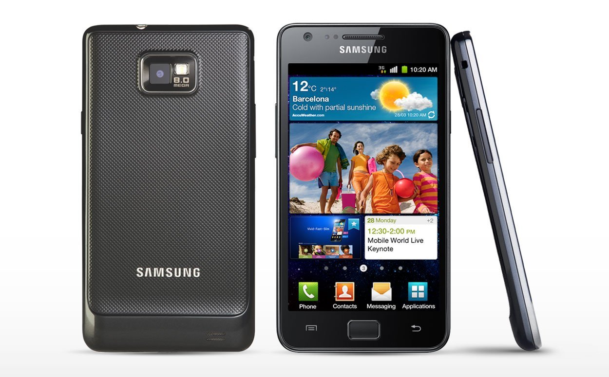
Samsung has continued its changes to TouchWiz by creating TouchWiz 4.0 based on Android 2.3 Gingerbread and using it in the very popular Galaxy S2. This version of its user interfaces in the Galaxy S3 with Android 4.0. Used. Samsung’s user interface included new features such as gesture browser control, S voice virtual assistant, image-in-image mode, and the ability to split the screen into two sections and use apps simultaneously.

Meanwhile, Samsung has changed the design and appearance of the TouchWiz skin on the Galaxy S3. With these changes, the phone’s graphical user interface became more stylish and green, and Samsung called this interface the TouchWiz Nature UX user experience “TouchWiz Nature UX.” One of the hallmarks of this new interface was the effect of creating waves of circular rings in the water (when a drop falls on some water or blows around the water) on the lock screen. Such an effect may now seem quite simple and have no particular appeal, But at that time, it attracted a lot of people’s attention.
The Galaxy S2 and S3, with their attractive user interfaces at the time, became Samsung’s launching pad in the mobile industry and paved the way for Samsung’s current superiority. After the release of these phones, the attractive features of Samsung’s user interfaces emerged one after another. In addition to Android, Samsung launched its handsets with pre-installed apps such as chat on, social hub, music hub, and several other apps.
TouchWiz Nature UX 2.0: A fresh start
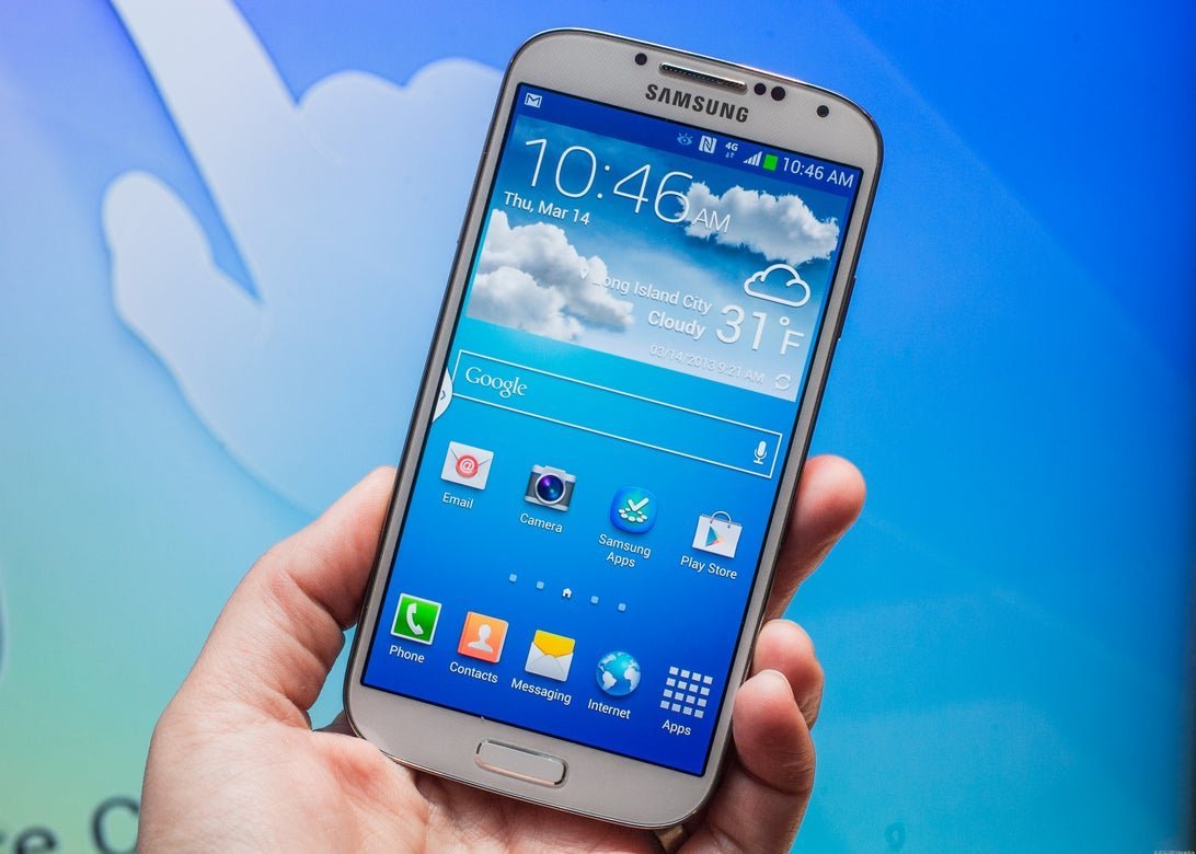
By launching the TouchWiz Nature UX user interface, Samsung has created a second version, TouchWiz Nature UX 2.0, on the Galaxy S4, allowing further changes to the phone’s user interface. Thanks to its new user interface in its new flagship phone, the brand created features such as eye-tracking for automatic scrolling of web pages. Thanks to the attractive feature, Galaxy S4 users could scroll web pages up or down just by looking down or up at the phone screen; But Samsung’s eagerness to create hardware features in its new handsets has drawn criticism from critics of the brand.
Critics have argued that there are unnecessary pre-installed features and applications in Samsung phones, including gestures, the ability to pause video playback if the user is not looking at the screen, and Samsung’s proprietary S Translator. As you navigate through the settings menu, it gets harder and harder.
In general, it can say that the TouchWiz Nature user interface was not only a heavy Android shell but also had many features that made it heavy. Samsung has continued to create new features in various software versions. Using the Nature UX 2.5 user experience, the brand completely changed the Samsung Knox security environment’s look and created One hand mode for the Galaxy Note 3.
Nature UX 3.0 simplified the Samsung UI and reduced the complexity of the settings menu for the Galaxy S5 at the time, But the brand added a toolbox to its shell and My Magazine.

Samsung has introduced its new interface on the Galaxy S6 with the same name as TouchWiz and TouchWiz 5.0 for this phone. The new hardware design also paved the way for new software changes. Samsung then took effective measures to eliminate annoying UI noises, simplify various settings, and simplify the Multi window icon and Multbox box icons.
However, Samsung also removed some unnecessary apps in its new relationship and directly modeled Android Lollipop (Android 5) in making changes; Of course, the specific color of the user interface elements remained.
TouchWiz became known for having new features in each new version, But Samsung realized its mistake and corrected its approach. The brand introduced the TouchWiz 6.0 and TouchWiz Grace UX user interfaces with a more streamlined structure; So the Galaxy S6 and S7 came with better user interfaces, and Samsung began a whole new user interface design project.
Samsung Experience: A New Generation
The new versions of TouchWiz were no longer different from the original versions, and the different versions were not recognizable. That’s why Samsung called the Galaxy S8 UI the Samsung Experience. Samsung’s new user interface came with Android 7 and Android 8 and used various Samsung phones in different price ranges.
In Samsung’s graphical user interface, which had a completely different look, the shape of the icons and the color spectrum of the user interface of Samsung phones changed completely. These changes made the user interface of Samsung phones look more up-to-date, more stylish, and more like Android than ever before.
Of course, Samsung also made its own customizations in this user interface and re-used some of the Edge UX user interface elements used in the Galaxy S6, including the always-on display, game launcher, and Other elements in the user interface mention; Even in this interface, the back button on the left was located on the right, just like other Android phones.
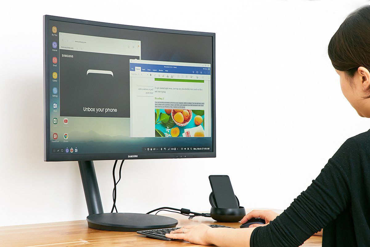
For the first time, Samsung has introduced Bixby, its proprietary virtual assistant, as one of the most important parts of the Samsung ecosystem in the Samsung Experience UI. It was possible to use a new gadget called Samsung Dex (Samsung) and some Samsung phones in this user interface. This gadget is actually a kind of base that supports a mouse and keyboard, and you can use your phone as a desktop computer.
Of course, none of these features made a big difference to Samsung’s user interface. Subsequent updates of Samsung phones to Android 8 slightly changed the handsets that supported this version of Android, and some features were improved, including the release of version 2.0BXB and Secure Folders; But in general, we did not see a significant change in this version compared to the first version of Samsung Experience.
Samsung had learned a lot after launching various versions of TouchWiz. Samsung Experience users had more choice about the features they wanted to use. Although this interface was still a bit crowded compared to the base version of Android, But experts in the field seemed to like Samsung’s new user interface, and the company launched several of its flagship handsets with it.
One UI: Enter a new era
After Android 9, Samsung once again introduced its new user interface with a different name and introduced the beta version of Samsung Experience 10.0 called One UI 1.0. At that time, it was released with the flagship Galaxy S10. Samsung has made many changes to its new generation UI, making it simpler and more user-friendly.
In fact, facilitating a larger screen was one of the main purposes of creating the One UI. In its new user interface, Samsung changed its custom menus and applications and arranged the layout of the most important elements to access them with the thumb easily. Then, in fact, in the One UI interface, the balance between custom features and ease of use greatly improved.
The One UI retained many of the features of the Samsung Experiment, and the Dex-based capabilities significantly improve. A Dark Mode also adds to this version, which darkened all sections when activated. It was also possible to use gestures instead of navigation buttons in the One UI. Users of this user interface could also assign a special Bixby button to a new task.
The One UI 2.0 user interface with Android 10.0 adds to Samsung’s proprietary skin, which uses for Samsung’s digital wellbeing capabilities and wireless base (in version 2.5). In this version, small changes make in the user interface, which includes a lock screen or Dynamic Lock Screen (change wallpapers each time the lock screen is displayed) and some other features; Of course, the appearance of the new version of One UI was almost no different from the previous version, and users did not feel any significant difference when working with it. In addition, the shell of this version was suitable for taking advantage of various features.

At the time of writing, 3.1 is the latest version of One UI and has undergone minor changes from the original version. The notifications panel is semi-transparent in this version, and the volume control buttons are located on the phone’s right side. In addition, the animation graphics of all sections are executed in a completely smooth manner. Overall, both Samsung and its customers seem to have been satisfied with all three versions of the One UI over the three years since its inception.
Finally, during the years that it has been designing and creating TouchWiz, Samsung Experience One UI, I have to say that Samsung has always created the latest top features in its phones in different versions of Android.
Different versions of TouchWiz did not have a good user interface due to their pre-installed applications. Still, we have to admit that Samsung has always been eager to take advantage of the latest features and capabilities and has never been short on that. The company has performed relatively well in making positive changes to the core of its user interface. It has always allowed its users to experience the new features and capabilities of different user interfaces and versions.
What do you think about the evolution of Samsung Mobile Relationships? Are you still interested in a special skin that belongs to the era of classic skins used in older phones or not? We’d love to hear your thoughts on this.