


How to Show Specific Content to Mobile Users in WordPress
Sometimes viewing the content of a WordPress website on mobile gives you a different experience. This can be good or bad, depending on the situation. However, many sites now try to display certain content on mobile.
There is a very easy way to display a WordPress page in mobile content. You don’t have to mess with any code; you have the right tools and be willing to do a little editing.
Let’s look at how to display specific content for mobile devices.
Do you want to build a WordPress site, and are you planning to buy cheap WordPress hosting? Just click on the banner below and visit the WordPress hosting plans of Ded9.com.
Why should we show specific content on mobile in WordPress?
Special layouts of posts and pages for mobile are very popular. Google introduced AMP a while back. While this is mostly for search optimization, they have created a stone for website owners to pay more attention to how their content is displayed on mobiles.
Most pages and posts in the mobile version of WordPress will automatically display correctly because of the theme. Today, most WordPress themes are optimized for mobile.
That being said, some posts and pages may be too full of content for mobile users in WordPress to view properly.
Another thing to think about is that you may want to display different versions of a page or post on mobile devices for different reasons. It may be that you want a different style or look or want the information to vary according to the device being used.
Instead of worrying about a bunch of code, we’ve found a great plugin that lets you edit your regular pages and posts to create mobile versions for display.
This plugin allows you to display specific content on mobile easily.
Specific Content for Mobile
The Specific Content for Mobile plugin allows you to easily create specific pages and posts for mobile users in WordPress. This is a great plugin if you want to add, remove or redesign certain content to display differently based on mobile versions.
There are some rules you need to follow, but in general, the Specific Content for Mobile plugin allows you to successfully create different versions of pages and posts for manual viewing.
According to the author, this plugin is very lightweight and compatible with Gutenberg Block Editor, Classic Editor, and all WordPress page builders.
Let’s take a look at how to install and activate the plugin, as well as how to use it.
You first need to install and activate the plugin to split your posts and pages and start displaying content specific to mobile devices. You can do this by going to the plugins page located in the WordPress admin dashboard. Just search the plugin name, and it will come up.
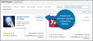
After installing and activating the plugin, you will be automatically redirected to your plugins list.
However, the plugin has now added a tab for mobile versions of posts and pages. This tab is located in the editor. Let’s look at how to get there and what you need to do to display mobile content to your WordPress users.
Edit WordPress posts and pages to display specific content on mobile
As mentioned above, this plugin is very lightweight. There is no main settings page for the plugin. It simply adds an edit tab and button to the posts section and edit section of your WordPress admin dashboard page.
To access your pages, click Pages > All Pages. This will take you to all the pages you have in your admin area.
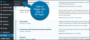
You are now in the pages section of your admin area. Navigate to the page you want to edit. You will see a set of editing options appear. These options depend on what you have installed.
In the image below, you can see that I have installed both the block editor and the classic editor. You will also notice that there is now an option to “Create Mobile Version” of the desired WordPress page.
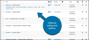
So, you can click on that link, or you can click on the block link or the classic editor. All you have to do is edit the page to show it to mobile WordPress users.
For this example, we’ll use the block editor. So we click on that link, and now the corresponding page is open. This page is the current version displayed for both desktop and mobile users.
The current version of the page
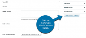
Go to the bottom right of the page. You can see that there is now a dropdown tab titled “Mobile version” with Mobile version. Click on the “Create Mobile Version” button in that dropdown list.
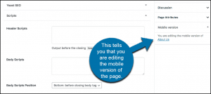
What happens is that a copy of the page is created that is only for mobile viewing. Now you can edit this page as you like. All edits you make will be available to those using mobile to view your WordPress site.
You’ll know you’re editing the mobile version because the mobile dropdown will let you know.
Edit the page as you like. When you’re done, click the ‘Publish’ button to add the page’s mobile version.
To confirm, exit the editing area and look at the page list in your admin area. You will see that a mobile page version has been created and is now available to edit whenever you need.
Edit pages
You have successfully created content specific to mobile users. You can do this for any page you want.
Creating content specific to mobile devices can be one of the most important aspects of site design and configuration. This is especially true when you want to show different items or information based on the type of device someone is using to access your website. Mobile access to websites has continued to increase over time, so giving people a good view of your WordPress content is important.