


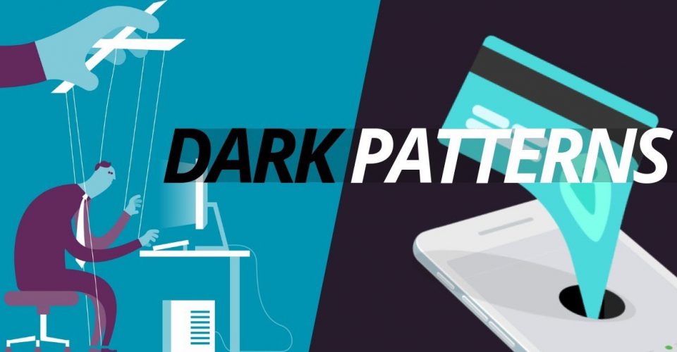
Everything You Need to Know About Dark Patterns
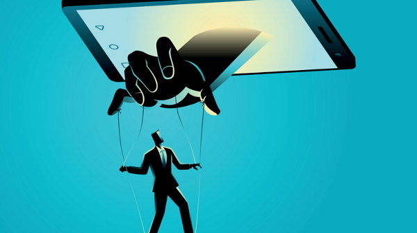
Dark patterns are everywhere. Small tricks are displayed to you on home pages, in applications, along in various pop-ups. Items that indicate the completion of an operation. These things, which are called dark patterns, have a negative impact on the user experience. They confuse and bore website users. Ultimately you have to decide to stay away from such patterns. The little benefit you get from the wrong clicks or interactions won’t actually be that good for you.
Here we are going to introduce you to these patterns and reveal many examples to you so that at the end of this article you will realize the problems of such design and you will remove them from your website.
What is the dark pattern?
When you use the web, you don’t read every single letter on every page. You explore the body of the paper and check based on your assumptions. When a company wants to cheat you, it can use this mode. In such a way that they show something that the reality is something else.
Such a design technique forces users to do something they don’t want to actually have ethical problems. Such an approach will cause your analysis system to get artificial data and figures. Therefore, the reports of user interaction statistics, etc. will not be real.
In an article discussing dark patterns, Hoa Loranger says, “Any short-term benefits a company may have gained through dark patterns will be lost in the long term.”
A variety of dark patterns.
Dark patterns popularly fall into five categories of deceptive design techniques:
1. Deliberate misleading
In such a case, the design purposefully tries to focus the users on something as a distraction from something else. Most of the time, such a situation is displayed in the form of dropping unwanted information to a website. But the most common form of such misdirection is the popular “no” button technique that ultimately leads to approval. In fact, the design in this case tries to show that there is only one right option for you. This issue can even be seen in applications and games
For example, in them, the “Buy more coins” button appears in a large size on the screen, and the “No, I don’t want” button is placed in the corner of the screen with a very small font. Clicking and choosing this button is usually a difficult task!
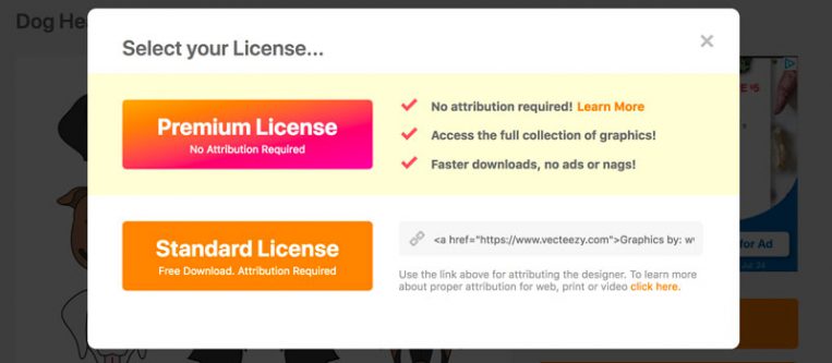
The above image presented is really a trick for two reasons: first, such a pop-up is displayed after clicking on a link titled “Free Download” and the second is that the “Premium License” option is designed with more emphasis, and in The first option is placed.
2. Hidden ads
When an ad appears as content or an element of navigation, such a theme is also a scam.
3. Mandatory continuity
Many websites try to charge you for something (that can be obtained for free right there).
4. Growth through spam
Usually, websites try to persuade you to connect your email address or social networks to the website. With this, you can play online with friends you know. After doing this, you will come across the category of spamming and information that is definitely a dark pattern. It seems that such an issue leads to the development of the company, but in reality, it is not.
5. Hidden costs
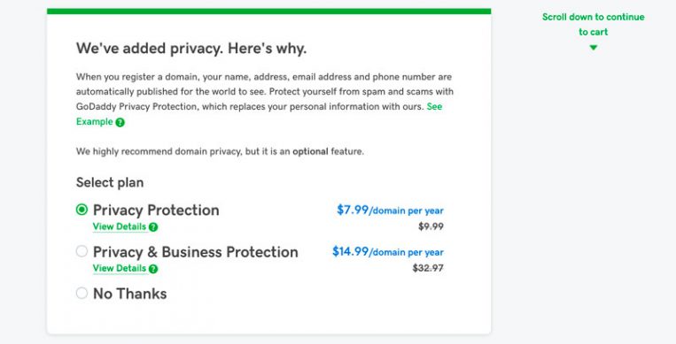
Additional items and fees that appear at checkout are also dark patterns, although they are not very common, they still happen. Some other websites, even though they offer discount coupons, hide it from the eyes of users. Look at the GoDaddy website below, the Privacy Protection option is being added to their purchases without the user intending to use it.
Basics in UI design – Avoid dark patterns
UI is the heart of website design and functionality. Dark patterns are UI tricks in websites and applications that make the user completely random to register, for example, to buy an item. The main purpose of dark patterns is to hide the intentions of the website or company that the user is on. Various companies use dark patterns by taking advantage of the dual readership path feature. “The truth of this feature is that users do not fully read the content of your page”.
In this trick, a fraudulent company tries to hide the reality from the eyes of the users and make it difficult for the users to find it by making certain words larger. “For example, they put practical information related to the topic at the bottom of the page.” This is a great way to trick users who don’t read a web page properly into identifying companies with those fancy phrases when the company’s goal is something else. Dark patterns are very dangerous for users because they involve users in a process, which was not really desired by the user, such as buying a product or subscribing to a booking form.
Some websites may not know that they are selling their products using tricks. For example, seeing forced advertisements, which the user always has to close first to see the content of the website, is one of the tricks that most websites use. However, these dark patterns are less and less accepted by the user.
Fake confirmation or Confirm Shaming
One of the topics that have recently become common in websites that follow dark patterns is the use of fake verification. This happens when a user enters the website, before seeing the main content he was looking for, he is faced with an email input form with tempting sentences next to it. For example, you enter a website, and when the website loads you are greeted with a mysterious offer.
Roach Motels
Roach Motels are another tactic in the world of dark patterns. Its name means cockroach bait, which is given to users by Internet fraudsters. Roach Motels is one way to encourage the user to register or subscribe. Just get bogged down in forms, it’s extremely hard to get out and unsubscribe. Roach motels very easily and deceptively encourage the user to fill out the forms, but it must be said that it will be almost impossible for you to remove your name from their list.
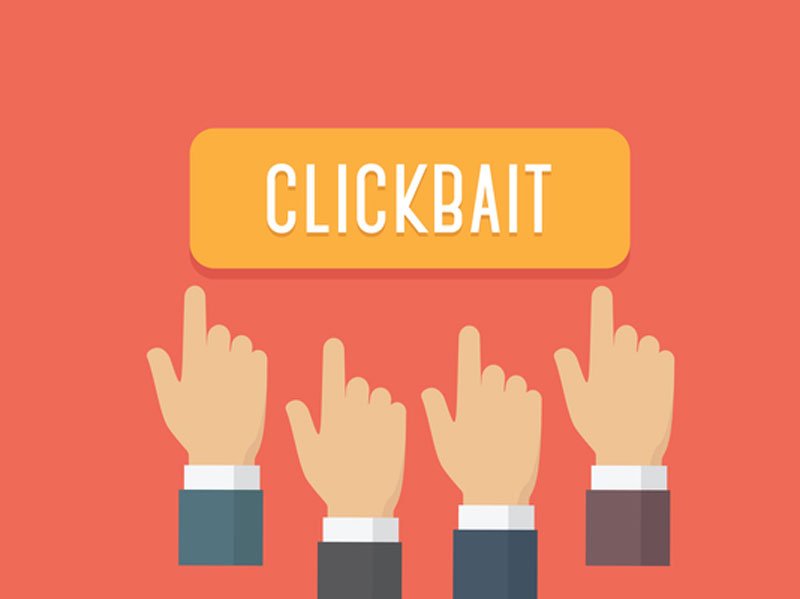
Clickbait
Clickbait is an old tactic that was developed to trick users. Although this tactic is very old, they still use this tactic to deceive users. Clickbait refers to when you read a text and come across various links, links that make you eager to click in terms of content or design. By clicking on any of the links, you enter a page that has nothing to do with the main topic.
For example, you should note that you want to read an article about SEO. In the text of this article, you will come across sentences like 10 things that will make you the first link of Google “which of course will appear as links for you”. By clicking on the link, you will enter a page that has nothing to do with SEO at all.
Fascinating content
Many have become experts in writing deceptive content. Deceptive content confuses the user and ultimately leads him to take a specific action. The most obvious place to put enticing content is when you want to unsubscribe from a marketing email or newsletter. Many websites put these contents in the unsubscribe section, of course, they confuse the user so much between different pages and offers, that sometimes the user misses the whole thing.
Avoid dark patterns at all costs
Dark patterns try to trick people, a process that is difficult for the user to avoid. Dark patterns lead the user down dangerous paths and sometimes leave them in confusion. As a web designer, I suggest you stay away from dark patterns as much as possible.
If you believe marketing tactics are ultimately questioning ethics, you need to take a new path. Visitors, search engines, and most social networks penalize and deal with dark patterns. If you trust the credibility and reputation of your brand, avoid doing these patterns.
Why dark UI templates are bad for business
The purpose of dark user interface patterns is to take advantage of human psychology in a negative way. Therefore, this work makes the company unethically profit from the customers’ pockets.
Examples of this mode can be seen in mobile ads that encourage the user to perform the “Swip” action and after that, a second tab is opened, or the mode where a part of the website is hidden and the user is told that with Clicking on this part will show the hidden part and various other things.
Short term benefits
The idea that you use user actions in an unethical way for the profit of the company is incomplete and incorrect. These benefits happen in the short term, and in the long run, the company has lower conversion rates because customers become aware and can understand the risks that come with them.
Some companies look for a shortcut to reach more benefits in less time, but they don’t realize that in the long run, this will cause their trust and brand credibility to decrease.
Users feel frustrated and angry after realizing that they have taken steps they don’t really need. Users do not want to continue browsing the website by losing their privacy through these dark patterns. These patterns are against the user experience and do not meet the user’s needs.
Sustainability and growth in the long term
Designers today make decisions based on data, so the design process today has become less subjective. However, in some scenarios, it is better to follow design principles and rules for the long term. With this, we can be sure of our success. Try to build the foundation of your company on honesty and truthfulness, because the truth will soon be revealed to the customers.
and at the end
While dark patterns are everywhere, we suggest you avoid using them. Apart from this, try to identify them. There is no long-term benefit to dark patterns.
In order to create trust and honesty with your users, try not to use tricks and techniques to harm the customer in your design.