

Should different colors be used in logo design? Undoubtedly, this important question has always occupied the minds of many people, especially novice and amateur designers. As you know, logo design is a big deal in the world of digital marketing today. Therefore, many content production companies and graphic teams are working on logo designs of different qualities. For simple and professional logo design work, there are dos and don’ts that amateurs usually don’t know about.
For example, one of the most important questions for beginners is, should different colors be used in logo design? If you are new in this field and intend to start your professional and serious activity, it is better to familiarize yourself with the principles of this field before starting. In this article, we try to reveal to you the meaning behind the colors in different logos. So it is better to stay with us until the end of the article.

Should different colors be used in logo design? What is the philosophy behind this?
Should different colors be used in logo design? You must have seen and even examined the logos of different companies many times. Some logos have a simple design, and others have special and attractive colors. If you look at these logos with the eyes of an ordinary person, you may think that only the taste of the designer has caused the formation of these colorful and attractive logos, but this idea is only partially true. Yes, designers play a significant role in the attractiveness of designed logos, but the psychological role of colors in logo design cannot be ignored.
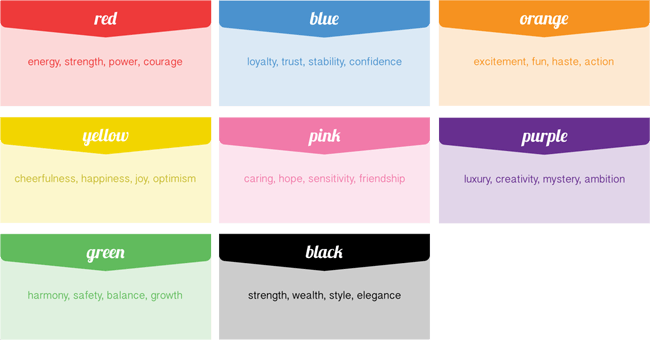
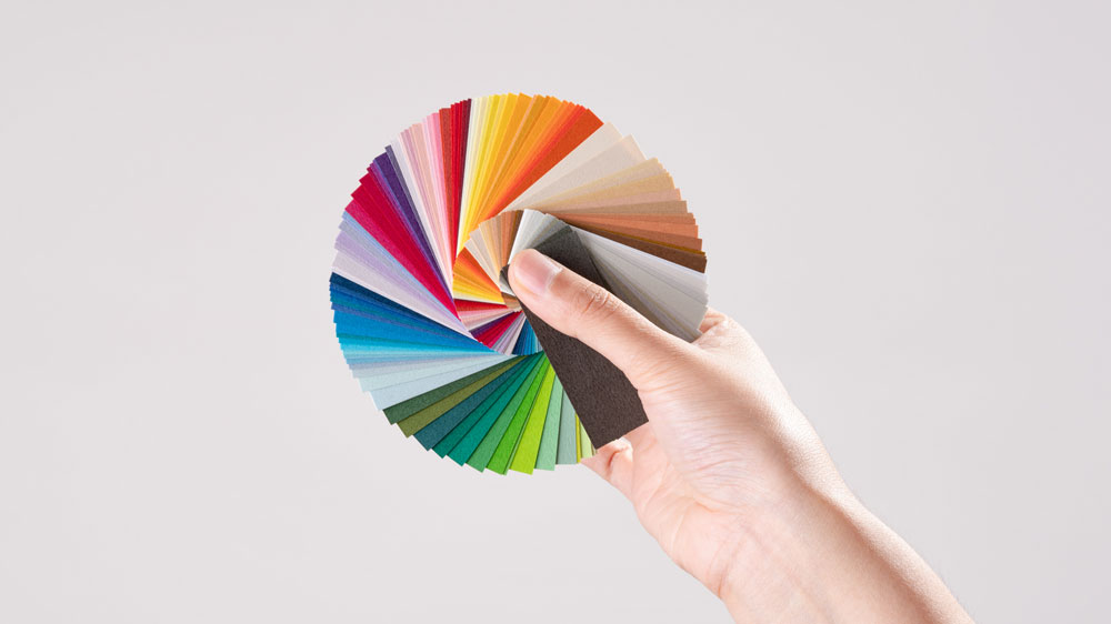
If you are somewhat familiar with the psychology of colors, you must know that the role of colors in logo design is undeniable. According to the rules in the psychology of colors, each color can have a special meaning and create different emotions in the viewer’s mind. Therefore, not only in order to produce content but also in the field of logo creation and design, special attention should be paid to colors. On the other hand, as a graphic designer, you should know which colors are compatible with each other or complement each other. Or you need to know what colors contrast with each other. You should be familiar with the concept of the color circle and how to make the best color combinations from it. All these principles will help you design attractive and unique logos and provide them to your customers.
What is the best combination of colors for logo design, and how can it be recognized?
So far, we have given you explanations about the question, “Should different colors be used in logo design?” We learned that colors can convey different messages to the audience. As a beginner designer, this question may be formed in your mind: what is the best color combination for creating a logo? Which color combination in logo design gives you the winning card? We must say that there is no definite answer to this question. In fact, the type of brand and the company’s field of activity are of great importance in choosing the color for the logo design. As you know, the logo is a way to communicate with the audience, so its design should be such that it can overshadow his feelings. In the following, we mention some crucial points in choosing the right color combination for the logo.
Attention to scope: should different colors be used in logo design? When you want to design a logo for a reputable and official company, it is better to use fewer colors in its design. For example, consider the logo of reputable brands such as Adidas, Puma, Benz, etc. All these logos have a combination of simple and stylish colors along with the high creativity behind their design. Using a special color, such as silver or gold, can give your logo a special appeal. For example, the golden color in logo design is a symbol of success, wealth, power, and intelligence. Therefore, using it in the design of official logos can help make your logo more attractive.

Consider the audience: The next point is to consider the target audience. Imagine that you are going to design a logo for a popular toy or stationery brand. The target audience in such works is often children and teenagers. So, it is better to use happy and attractive colors for logo design.
Attention to the psychology of colors and the color circle: The last point in designing a logo with different colors is to pay attention to the color circle and the psychology of colors. You should know that each color has a special meaning. According to the meaning of each color and the feeling it creates in the audience, choose the best color combination for logo design. Of course, please note that it is better to use three colors for the logo design.
Should different colors be used in logo design? Investigating the meaning of different colors
In examining the question of whether different colors should be used in logo design, we came to the point that each color has a specific and unique meaning. Earlier, we explained about the golden color. In this part of the article, we would like to introduce some of the best colors in logo design and explain their meaning to you.
Silver: Silver is one of the colors used in official logo designs. This color symbolizes prestige, modernity, wealth, etc. For example, Chevrolet used a combination of silver and blue colors for its logo, which shows the stability and reliability of this collection. Peugeot can be mentioned among other reputable companies that have used silver color for logo design.
Red and orange: Red and orange colors are warm and full of passion. It is very appropriate to use these colors in sports team logos, children’s themes, etc. Coca-Cola and Amazon are the best examples of these colors.
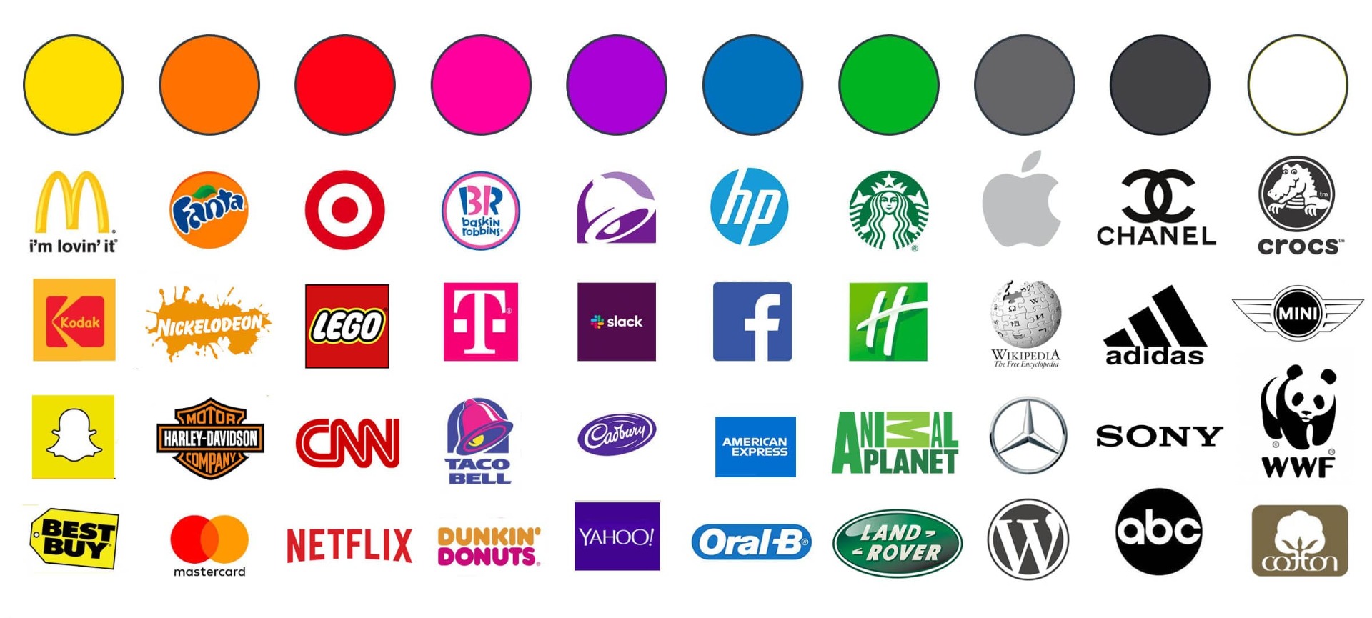

Blue: Blue is the color of peace and tranquility. This color evokes sublime human feelings. If you work in the field of printing and books, the best option for you is to combine blue with complementary or contrasting colors. Skype, Twitter, PayPal, etc., are among the best examples of blue color.
Summary and conclusion
In general, it is better to use complementary or contrasting colors in the color theme for logo design. The contrast makes your design stand out and creates a wonderful effect in it. Up to this point, we have tried to provide you with a suitable answer to the question of whether different colors should be used in logo design. To check the concept of SEO, order a professional logo, etc., you can refer to content creation collections.