


Comparison of infographics and motion graphics
Comparing infographics and motion graphics is very important. Because unfortunately, many beginner designers and ordinary people are unfamiliar with the differences between these two graphic arts. To learn about the differences between infographics and motion graphics, we must first get to know their concept and characteristics. In this article, we are going to compare infographics and motion graphics and explain the concept of each of them. So if you intend to increase your information on this matter, you can accompany us until the end of the work.
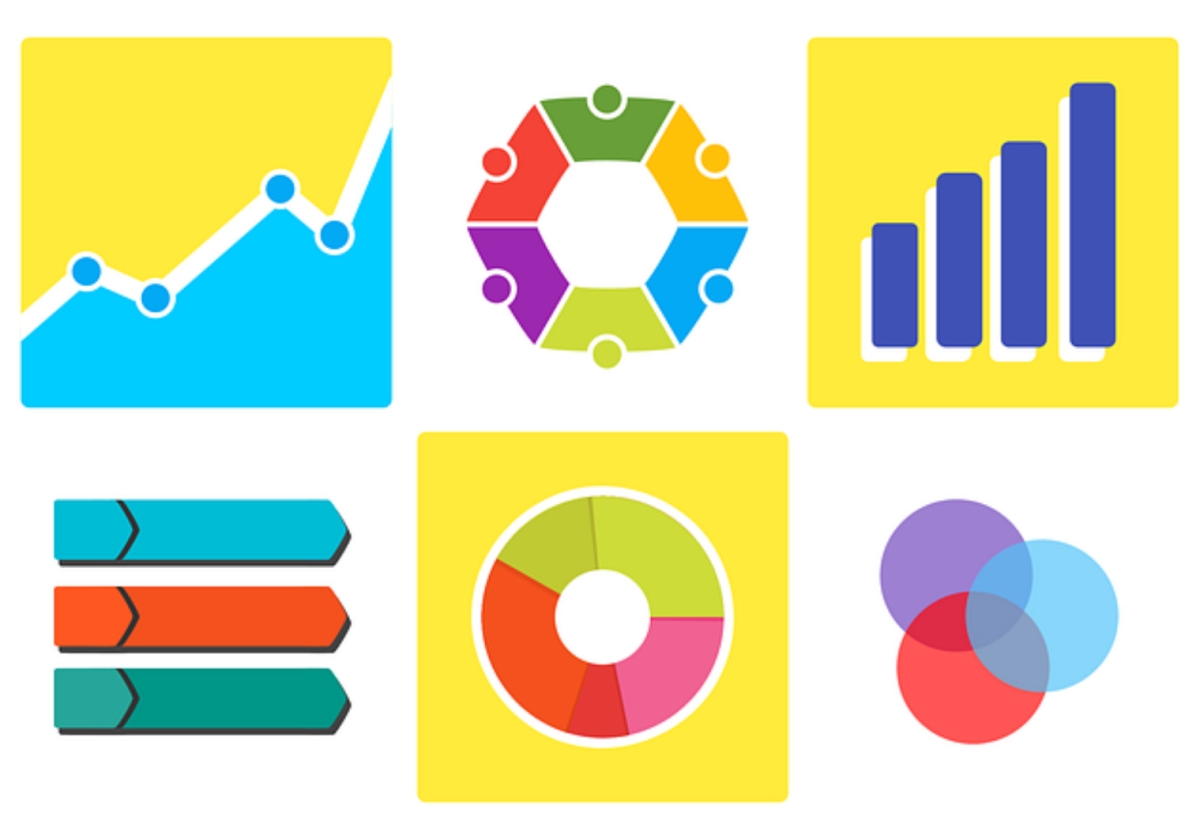
A brief definition of infographics
When comparing infographics and motion graphics, it is better first to get acquainted with their concepts and definitions. In this part of the article, we will provide you, dear designers, with short explanations about infographics. This graphic content includes images, text, effects, etc., providing information. This word consists of two parts: info and graphics. As you know, info means information in English. Therefore, infographics can be defined as graphic images containing information.
What is meant by motion graphics?
In comparing infographics and motion graphics, we should examine the motion graphics concept. If we want to examine this word from a linguistic point of view, it consists of two parts: motion and graphics. Motion means movement and graphics’ meaning is the same as graphic images. Motion graphics can be used to produce moving images, and by editing, adding effects, sound, music, etc., they can be turned into engaging content.
What is the difference between infographics and motion graphics?
So, after reviewing the definitions and concepts, we will return to the main topic of comparing infographics and motion graphics. These two cases differ in many aspects, and we will introduce some of the most important differences to you.
Purpose of use
In comparing infographics and motion graphics, the first and most obvious difference is the purpose of each content. Making motion graphics is usually done for business promotion, the introduction of services, etc. This is even though the creation of infographics is usually done to provide statistical information about a specific topic.
Structural differences
The second difference in comparing infographics and motion graphics is their structure. These contents are structurally very different from each other. As mentioned, motion graphics include moving images with sound, effects, etc. But infographics are just images that present you with information.
Construction tools
Another difference we encounter when comparing infographics and motion graphics is the construction tool. Premiere Pro, After Effects, etc., are usually used to create motion graphics. While Canva, Photoshop, etc., software is usually used for infographics.

Which one is more popular in marketing?
After comparing infographics and motion graphics, we should check which is more popular in recovery. We must say that in marketing, advertisements must be designed in such a way that they attract the attention of the audience. Information and statistical data are more useful for technicians, specialists, and experts, but motion graphic content can attract people’s opinions in the best possible way. Motion graphics content includes moving images, sound, music, etc. Therefore, it is more attractive to the audience.
Color psychology is very important in motion graphics. For this reason, you can establish a special relationship with this type of content. Therefore, it can be said that motion graphics are more suitable for advertising and marketing than infographics.
What is a motion infographic?
Motion infographics or infomotion is a combination of infographics and motion graphics. Statistical data and information are displayed to the audience through animated graphics. This type of content makes the position more understandable and simple for the audience. Information is mostly used in scientific seminars, educational content, etc.
Use cases of infographics, motion graphics, and motion infographics.
As mentioned, one of the most important criteria for comparing infographics and motion graphics is the application of each of them. The contents that are made in the form of motion graphics are mostly advertising. New businesses, famous businesses, service groups, etc., use these attractive graphic contents to introduce their products and services to customers.
Infographic content is mostly used in internal organizational meetings, scientific and research seminars, books and magazines, etc. This type of content includes tables, charts, text, images, etc. So it is very suitable for such cases.
Information is a combination of both. Therefore, they have a greater impact on the audience. The influence of motion infographics in digital advertising and marketing is very high. In addition to advertising, these contents provide the customer with statistical and detailed information about the product. In this way, they can easily win the trust of the customer. This type of content is also very suitable for presentations on social pages.
Infographic design tools and animated graphics
In comparing infographics and motion graphics, we pointed out that there are different tools for creating each of these contents. As mentioned, programs such as After Effects and Premiere Pro can be used to create motion graphics. To get to know how to create motion graphics in After Effects and how to create motion graphics in Premiere Pro, how to create motion graphics in Premiere Pro with a visual guide in the upcoming article, we will give you explanations about how to create motion graphics in Premiere Pro and motion graphics production.
Of course, educational articles have a wide range of topics. For example, you can answer the question, how much do graphic designers earn? Search in our educational articles. In addition, if you feel that you have talent in the field of motion graphics design, you can participate in the motion graphic designer employment test.
Programs like Adobe Photoshop, Infogram, Canva, etc., are usually used to create infographics. Making infographics is much easier than motion graphics. By installing this software and simple tutorials, you can design attractive infographics.
Five important points of color psychology in motion graphics
The psychology of colors is of particular importance in motion graphics. You may be interested to know that each unique calligraphy and color combination can have a special effect on people. According to the psychological theory of colors, it can be understood that color combinations affect the mind and psyche of the audience. A professional graphic designer, knowing this, should try to use the psychology of colors to improve the quality of his motion graphics.
Designers who consider the psychology of colors while creating motion graphics can attract the audience’s attention to their work in a special way. If, as a beginner graphic designer, you are interested in learning about the psychology of colors and their impact on animated graphic design, it is better to stay with us until the end of the article.
A brief guide to color theory
As we said, the psychology of colors is very important in motion graphics. To understand this issue, it is better to introduce you, dear designers, to color theory. You have probably come across the remarkable success of some of your colleagues in making motion graphics. You should know that such successful people must be familiar with the principles of color theory. This theory is a set of principles and rules related to the psychology of colors, culture, color combinations, etc. The first step is to get familiar with the color circle.
The circle or color wheel shows the relationships between colors. According to this circle, colors are divided into three main, secondary, and mixed categories. The main colors are yellow, red, and blue. Secondary colors are the colors that are created from the combination of primary colors. Mixed colors are also the result of combining primary and secondary colors. The color wheel helps you find complementary colors easily and create a special harmony in your design.
The effect of colors on the attractiveness of motion graphics
You must have thought about the effect of the psychology of colors on motion graphics. The answer to this question is clear. A colorful design can increase the attractiveness of your content and thereby increase the attraction of your audience. Of course, you should be careful what color to use where. If you want to use colors without paying attention to harmony and psychology in your design, your content will not be attractive and effective for the audience.
The importance of choosing a color suitable for the type of motion graphics
As the previous content section said, simply making motion graphics colorful will not make them attractive. Rather, the designer must pay attention to the psychology of colors and harmony while choosing colors. To succeed in this task, it is better to consider the topic of the content and evaluate its audience. For example, if the content you want to produce is for children, you can use happy colors and their complements. In this way, you can draw the audience’s attention to your work in a special way.
How to choose the perfect color combination?
Now maybe this question is formed in your mind, how can we choose a suitable color combination for our graphic design? You can use color palettes for this. To make your work easier, you can use software like Adobe. On the other hand, some designers use color palette generators. These palettes are created automatically. There is another way to choose the right color combinations. You can be inspired by different photos and images and choose a unique color combination for your design.

Examining different colors psychologically
As we said, the role of color psychology in motion graphics is undeniable. Now let’s introduce you to the effect of different colors on people’s minds, behavior, and psyche. In the following, we will introduce you to some of the most used colors and their characteristics.
- White color is a symbol of purity, purity, and hope.
- Blue color can inspire calmness, loyalty, and coldness in the audience.
- Green is a reminder of nature, growth, freshness, and envy.
- Red color can inspire passion and anger in the audience. It is also a symbol of friendship and love.
- Black is a symbol of mystery and power. Of course, it may also evoke sadness.
- Purple is also a symbol of spirituality, ambition, and royalty.
- Yellow color is a combination of warmth, happiness, and energy.
Types of graphic design in terms of color harmony
Dear designers, you should know that animated graphic design is divided into several types regarding color harmony. The first type is monochrome design. In this type, a palette with a base color is selected. The other colors in the palette are light and dark examples of that base color. The second type of palette is similar. In this type of palette, three similar basic colors are used. Other colors in this palette are light and dark examples of these three basic colors. In the third type, contrasting colors are used as base colors. These palettes are called supplements. The triple palette is also known as the last example.
Five tips for using colors in motion graphics design
Now that you are familiar with the role of color psychology in motion graphics, it is better to teach you some golden tips. By learning these tips, you can be more successful in your work.
1. The first point is to create a balance. You can use the 60-30-10 rule to achieve balance. Use 60% of the main color, 30% of the secondary color, and 10% of the mixed color in your design.
2. When producing motion graphics, you must also pay attention to contrast or color contrast. You should know that contrasting colors can play a special role in attracting the audience’s attention. To create contrast, choosing colors that are far apart in the cycle is better.
3. You can use gray and black colors to highlight your motion graphics. Of course, it is better to use these colors in the background of your work.
4. Pay special attention to color stability. Let us clarify this for you with an example. Suppose you used a fawn cat in the frame of your content. It would help to choose the same color for your work in the next frame. Changing the color even slightly can detract from the elegance of your work.
5. Be sure to pay attention to the psychology of colors. You should know that colors convey certain meanings to the audience. For this, you can use the guidance we have placed for you in the middle sections of the content.
Conclusion
In this article, we tried to compare infographics and motion graphics. First, we examined the meaning of each of these contents. With the explanations given about each of these contents, we can understand that motion graphics and infographics differ in some cases. The general structure, the tools used for construction, the use and purpose of construction of each, etc., are known as the most obvious differences. In the rest of the article, we tried to give you explanations about animated infographics. Then we explained the use of each of these contents for your dear ones.