


Color psychology of business and brand
The color psychology of a business or brand is one of the most important in branding or even the world of marketing. Maybe that’s why hours are spent choosing business names, colors, and slogans today because today’s keen audience expects more from you than ever before.
In the following article, we have addressed this concern, and we will tell you about the psychology of business color and everything you need to know about it. Do not forget that colors can change the mentality of your audience, and it is smart that in every section, Try to choose the most appropriate color from your business.
Color psychology of business
Business color psychology means that out of the approximately 16 million computer colors and about 20 primary colors, you have to determine which color is supposed to be the main color of your business, and people will remember your business when they see it!
So in the following, we will examine the effect and meaning of each color from a psychological point of view to understand which color is suitable for your current business and brand.
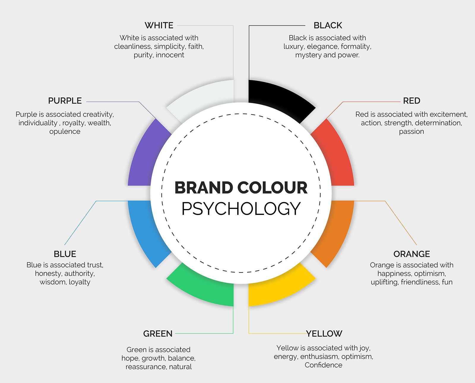
The meaning of different colors in the color psychology of business
Well, let’s start with the important and main colors.
Red
This color symbolizes passion, appetite, danger, warning, and even love. If you will use this color, then it is better to use it for restaurants, deli shops, and any business in the food industry.
Famous companies that have used this color include McDonald’s largest fast-food chain.
Green
Green symbolizes health, nature, peace, and tranquility. This color is suitable for businesses in health, nature, and companies whose tranquility is one of their slogans.
One of the famous companies that have used this color is Spotify.
Blue
Blue symbolizes trust, confidence, independence, faith, and strength. This color should be used in businesses that want to show their customers that they are reliable and have the necessary power.
Famous companies that have used this color include Twitter, WordPress, Pfizer, Intel, and NASA.
Yellow
This color symbolizes optimism, energy, warmth, childhood, and transparency. If your business is in youth, communications, and entertainment, it is not bad to use yellow.
Famous brands that have used this color include Nikon, Ferrari, CAT, and IMDB.
Purple
It is one of the most influential colors in the business world and usually means creativity. Purple symbolizes innovation, wisdom, respect, wealth, loyalty, and power.
Famous brands that have used this color include Yahoo, T-Mobile, and Syfy.
If you have a creative company and try to show creativity and innovation in all stages, be sure to use this color.
Orange
Orange is a symbol of enthusiasm, passion, intimacy, and self-confidence. This color is suitable for creative businesses, youth businesses, and online stores.
In general, orange makes the audience eager and motivated, and this color can be considered one of the best colors for CTA or action buttons.
Famous brands that have used the color orange include Firefox, Fanta, Amazon, and Gulf.
Gray
We come to one of the most influential colors that some people mistakenly ignore! It is interesting to know that gray has been the choice of many valuable brands such as Hyundai, Benz, Wikipedia, and Apple (now their logo color is no longer gray!)
Gray is a symbol of being up-to-date, calm, luxurious, balanced, and strong. This color is suitable for businesses that want to offer their audience luxury and special products or services.
Famous brands that have used this color include Hyundai, Benz, Nissan, Honda, etc.
Black
Now we come to one of the most influential colors in the human world. Although many people do not like this color (of course, young people today have a strong tendency to this color), black is a deep and influential color by many It has been selected by brands, especially the largest brand in the world, namely Apple.
Black symbolizes sophistication, power, security, will, and formality! This color is suitable for businesses in fashion and clothing, music, and luxury brands.
Famous brands that have used this color include apple, Nike, Puma, Adidas, Louis Vuitton, etc.
Do I have to use one color for all stages of branding ?!
The answer to this question can not be definitive, yes and no!
Most of the world’s leading brands have a primary color and use this color always and everywhere (most of the time in most places!) You also have to choose a color and always remember its code. But not everything has to be the same color! Instead, it is better to have one or two complementary colors and use the colors in some of the main designs, websites, logos, social networks or billboards, and business cards. But you do not have to use these colors everywhere!
It can even be said that you do not have to tolerate this color forever. If you thought that you were not careful in choosing the color so that your brand does not grow, change the brand’s color!
In general, cohesion and integration are very important in branding. Still, creativity and momentary decisions are also important. Come back whenever you feel that you have gone wrong in a branding stage!
The last word
The color psychology of business is extremely important! Colors change people’s moods! And each color can convey a lot of concepts to your users. Be smart in choosing the color of your business and brand and use the psychology of color.